Release of Vanilla framework v3.0
Bartek Szopka
on 10 January 2022
Tags: code , css , CSS framework , Design , design team , Vanilla , vanilla framework
We’ve just released Vanilla v3.0 – a new major update to our CSS framework. It includes a few significant updates and improvements around spacing variables, responsive breakpoints, a new expanding search box and various updates to existing components. Important aspects of the release include dropping a noticeable chunk of deprecated styles and components and removing IE support.
In this blog post we will cover the most important changes introduced with Vanilla v3.0:
- Refactoring of spacing variables
- Tidying up of responsive breakpoints
- Dropping IE support
- New expanding navigation search box
- Summary of removed styles and components
Refactoring of spacing variables
We’ve always put a lot of attention into making sure components in Vanilla are consistently spaced and that all text and block elements align properly to our baseline grid. To make it possible while keeping the framework flexible, we used to have quite a large number of spacing variables in our SCSS code. These were used to add various amounts of horizontal or vertical spacing to the elements.
We also had separate variables for “inner” and “outer” spacing. These turned out to be confusing, as it wasn’t always clear for more complex components if the given space should be considered “inner” or “outer”. The other aspect that made Vanilla spacing complicated was the density multiplication factor that could be changed on a framework level. It affected some of the spacing variables (that we called “scaleable”), but not the others. It was not widely used and was the source of some confusion and bugs.
For Vanilla 3.0 we decided to refactor the spacing variables and reduce the number of them. We did this by removing the separation of “inner” and “outer” spacing, merging different variables that share the same values and removing the density multiplier and all variables that it affected. We still kept separate variables for horizontal and vertical spacing (to make it clear which values should be used in given directions), but they all follow the same naming conventions. So, “small” horizontal spacing has the same value as “small” vertical one.
Alongside this work, we also cleaned up and refactored some spacing related mappings.
This allowed us to reduce the number of our main spacing variables from 20 to around 10 with much more clear and consistent naming.
You can learn more about spacing in Vanilla in our docs or check our migration guide about how to update spacing variables in your project for Vanilla v3.0.
Tidying up of responsive breakpoints
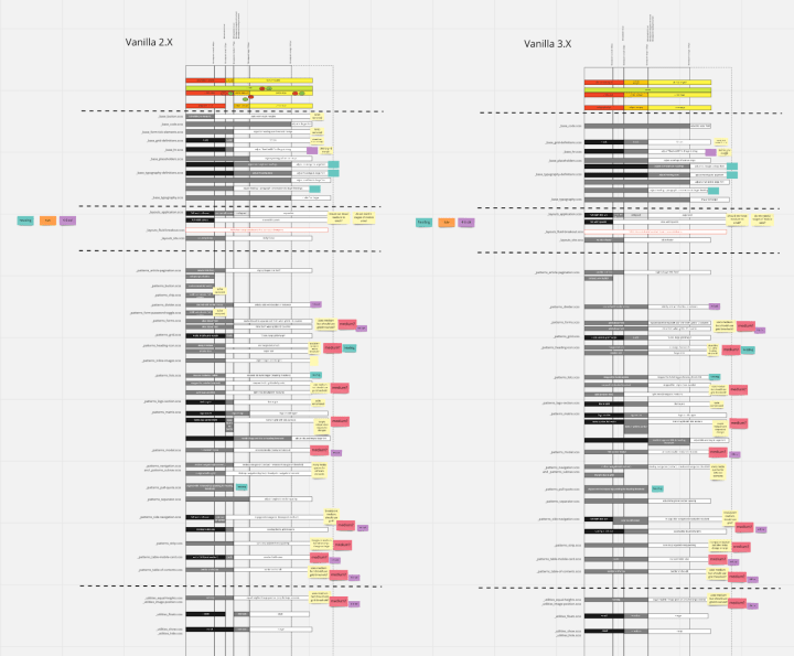
While working on updates for Vanilla v3.0, we noticed some inconsistencies in the way different parts of the framework were using media query breakpoints. It seemed that different components and utilities changed their responsive behaviour or style at different breakpoints, making it harder to understand how screen size affects the style or layout.
We did an extensive audit of all our components and utilities that used media queries. We then simplified the way Vanilla handles responsive changes and fixed any inconsistencies we found.

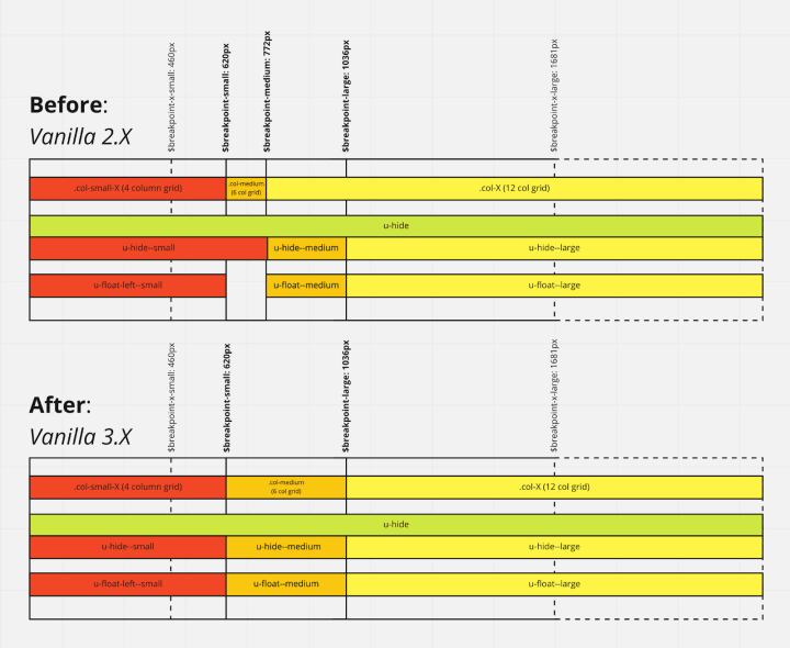
The biggest change was to remove the ‘medium’ breakpoint which was the main source of inconsistencies. Some components used it as their max-width value, others as min-width.
By dropping it we now have only 2 main breakpoints in Vanilla 3.0: $breakpoint-large and $breakpoint-small, and they divide the possible screen widths into 3 ranges:
- small screens (smaller than
$breakpoint-small) - medium screens (starting at
$breakpoint-smalland smaller than$breakpoint-large) - large screens (from
$breakpoint-largeand bigger)

Additionally, some components that require more granular responsiveness can still use $breakpoint-x-small (to target mobile screens in portrait mode) or $breakpoint-x-large (to target large widescreen displays).
You can learn more about media query breakpoints in Vanilla documentation or read about how to migrate breakpoints to Vanilla 3.0 in our guide.
Dropping IE support
One of our main priorities in Vanilla is to make sure our styles work across all browsers. With CSS features moving forward, keeping Vanilla compatible with Internet Explorer has required additional effort and code. With Microsoft moving their focus to their new Edge browser, the number of users still on Internet Explorer has been significantly dropping.
In 2021 across all our Canonical websites we had almost 50 million visits, of which less than 5500 have been visits from Internet Explorer, which is less than 0.01%.
This small number of Internet Explorer users of our sites led us to the decision to remove Internet Explorer from browsers supported by Vanilla starting with release v3.0. This allowed us to remove many of the custom styles and fallbacks that we had to maintain, most notably complete separate implementation of the grid (that used flexbox instead of the CSS grid).
New expanding search box
Vanilla v3.0 doesn’t contain a lot of new features or components because we’ve been adding them regularly during the development of Vanilla v2 releases. One of the few new features introduced specifically in this version is the new expanding search box.
In Vanilla v3.0 we removed some old deprecated styles around the main navigation component, which allowed us to implement new features for it.

The expanding search box was first introduced on the ubuntu.com website. With the effort of guest developers (thanks Min and Fran!) who joined the Vanilla squad, it was refactored to Vanilla standards and upstreamed as a part of the framework, now published in v3.0.

Summary of removed styles and components
One of the main reasons we started planning the v3.0 release of Vanilla was to remove a large number of deprecated styles and components. Introducing a major version update allows us to finally get rid of some legacy code. This means we can clean up the codebase and reduce the size of the Vanilla CSS file.
Almost 20 different features, variants and components have been removed from Vanilla in release v3.0. Most of them already had their new recommended equivalents implemented in v2.0.
Most notable would include:
- Removed the inline images component and replaced it with a more reliable logo section.
- Removed styling of the base checkbox and radio input elements in favour of their component versions.
- Updated the HTML structure and class names of the navigation, breadcrumbs, accordions, notifications and some other components.
- Merged the sub-navigation component into the main navigation component.
- Removed the code copyable and code numbered components in favour of the new code snippet.
You can learn more about all the legacy styles removed from Vanilla 3.0 in our documentation.
So there we have it, Vanilla v3.0 in a nutshell. Head over to our docs to get started today. Learn about what’s new in Vanilla 3.0 or see the migration guide.
Talk to us today
Interested in running Ubuntu in your organisation?
Newsletter signup
Related posts
How we ran a sprint to refresh our design website, Part 2
Part 2 of our series on how our team created content for our design website. Get insights, tools, and lessons to help you run your own design sprint.
Improving our web page creation workflow: how structured content is slashing design and development time
Co-authored with Julie Muzina A year ago, during our Madrid Engineering Sprint, we challenged ourselves to dramatically reduce, or even eliminate, the need...
How we ran an effective sprint to refresh our design website, Part 1
Part 1 of how we ran a design sprint to refresh our website. Sharing what worked, what didn’t, and lessons from designing for open source in mind.
