Vanilla 4.0 release
Bartek Szopka
on 18 July 2023
Tags: Design , Release , typography , Vanilla , vanilla framework
Last week we released a new major version of the Vanilla framework. Vanilla 4.0 introduces the elements of the new style used for a current rebranding of Canonical’s brochure websites, including typography changes of headings utilising new variable Ubuntu font, wider grid width, removed rounded corners, some updated colours, and updates to any related components.
We treat Vanilla 4.0 as an interim release that includes elements of new branding but keep the support for the old style of components as well to allow for easier and more granular migration on our biggest websites. Therefore there are no significant breaking changes or removed components.
But even without breaking changes, because of quite significant visual differences introduced by updated typography and wider grid, it is recommended to properly QA templates and pages, especially if there are any custom styles built on top of Vanilla.
Below we explain in a bit more detail the most important aspects of the Vanilla 4.0 release.
Heading typography
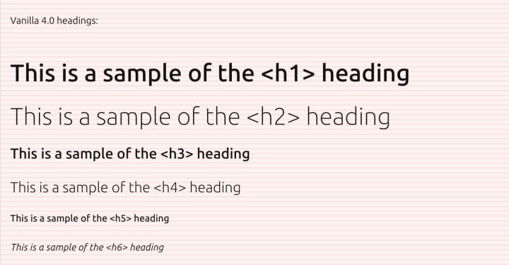
Vanilla 4.0 introduces an updated heading hierarchy, with fewer font sizes and carefully selected weights, which are possible thanks to the new, variable version of the Ubuntu font.
The table below lists font sizes, and their intended use (please note, some of the styles are limited to small screens, while others are for larger screens).

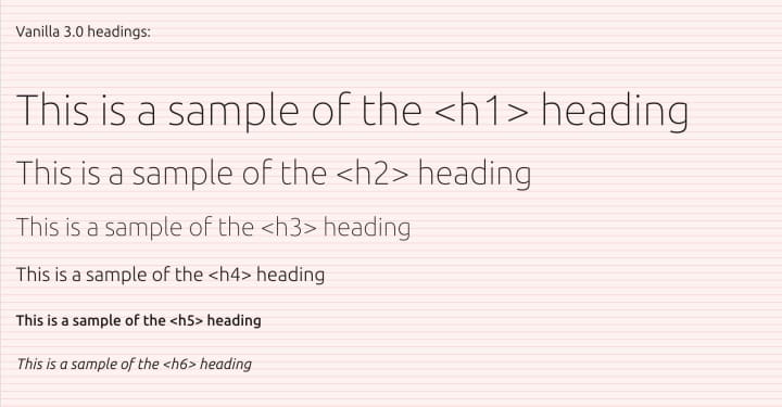
Below is a comparison of the heading styles in Vanilla 3.0 and Vanilla 4.0.


New components for brochure sites
To help build brochure sites in the new style we implemented a couple of new components or variants of existing ones. These include new grid shorthands and sections for building layouts and spacing, or horizontal rules for better visual separation and vertical rhythm.
We’ve introduced a simpler grid system of 25% increments, on which the new layouts and components are based. The system aims to create a more consistent and coherent look.

Paper background
Another aspect of the new style is the new light grey background colour that we call paper background. It will be used on all the pages in place of the previous white.
Alongside that change we also adjusted the default text colour to pure black, to increase the contrast and readability and provided some updates to the dark theme.
More on Vanilla 4.0
To learn more about changes introduced in Vanilla 4.0 you can check our detailed migration guide or release notes on GitHub.
Aspects of brochure site layout and components are also explained in our brochure site documentation.
Already using Vanilla 4.0
Some of our websites are already using Vanilla 4.0 and some aspects of the new brochure site style.
The Snapcraft store pages have been recently refreshed with the new style. You can read more about Snapcraft redesign on their blog.
The Canonical career pages have been one of the first redesigned in the new style, and the whole Canonical website has been just recently completely rebranded with Vanilla 4.0 and the new style.
And in the upcoming weeks and months, many other Canonical sites will be getting upgraded to Vanilla 4.0 and refreshed with the new design.
What’s next in Vanilla?
While the official release of Vanilla 4.0 is an important milestone for us, providing a foundation for the migration of all our Canonical sites to the new style, it’s by no means finished or complete work. Many elements of the new style are still being designed and fleshed out, a lot of existing components need to be reviewed and refreshed, and new components, templates and examples need to be created to provide a library of reusable blocks. And this is the work that we plan to do along the lifecycle of Vanilla framework v4.
A future release of Vanilla 5 will likely mark the point when we will be able to fully remove the legacy components and styling from Vanilla and provide a cleaner and more streamlined taste of Canonical design.
Talk to us today
Interested in running Ubuntu in your organisation?
Newsletter signup
Related posts
Improving our web page creation workflow: how structured content is slashing design and development time
Co-authored with Julie Muzina A year ago, during our Madrid Engineering Sprint, we challenged ourselves to dramatically reduce, or even eliminate, the need...
A deep dive into our grid system and typography for the A4 format
We recently redesigned our whitepapers as part of our broader rebranding project. Let’s look at some of the ideas behind our approach to layout and...
From inspiration to impact: design students from Regent’s University London explore open design for their dissertation projects
Last year, we had the opportunity to speak at Regent’s UX Conference (Regent’s University London’s conference to showcase UX work by staff, students, and...
