Why the first impression matters
Canonical
on 28 September 2015
We believe that the first impression matters, especially when it comes to introducing a new product for the first time. Our aim is to delight the user from the moment they open the box, through to the setup wizard which will help them get started with their new device.
Devices have become an essential part of our everyday lives. We choose carefully the ones we want to adopt, taking into account all manner of factors that influence our lifestyle and how we conduct our everyday tasks. So when buying a totally new product, with unfamiliar software, or from a new brand, you want to make the first impression count in order to seduce and reassure the user that this product is for them.
The out of the box experience (OOBE) is one of the most important categories of software usability. It essentially says how easy your software is to use, as well as introducing the user into your brand through visual design and tone of voice, which can convey familiarity and trust within your product.
How did we do it?
We started to look at research around users’ past experiences when setting up a new device and there feelings about the whole process. We also took a look at what our competitors were doing, taking into account current patterns and trends in the market.
After gathering research we started to simplify as much as possible the OOBE workflow, taking into consideration the good and the bad things. Once we had analysed this, we started to define the design goals for the project, which included:
- design for seduction
- simplicity
- introduce the brand through design
- transform the setup wizard
What did we change?
In order to create a consistent experience across all devices, we drew together common first experiences found on mobile, tablet and desktop, these included:
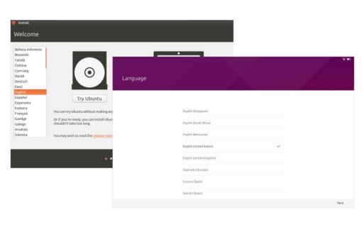
- choosing a language
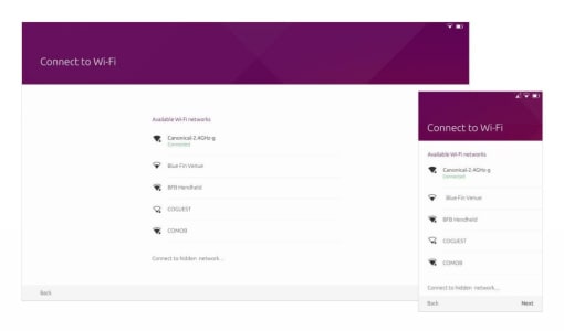
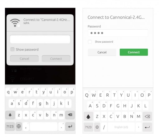
- Wifi setup
- choosing a Time Zone
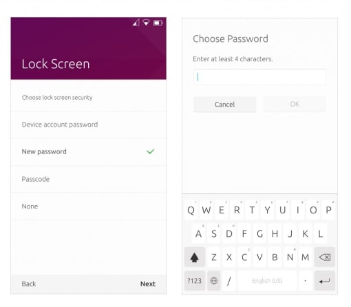
- choosing a lock screen option
One of the major changes we wanted to achieve was to give the user the same experience across all devices, moving us closer to achieving a seamless convergent platform.
What did we achieve?
We achieved our main aim in creating the same visual experience across all devices.
Primary and secondary screens
We defined two types of screens: Primary screen (left), Secondary screen (right)
The secondary screens created more space for forms, which helped us define a consistent and intuitive animation between screens.
Dialogs
All dialogs were transformed – where possible – into full screen dialogs. We kept them to only communicate confirmation or error messages.
Desktop installer
The desktop installer was simplified and modernized for a less time consuming experience.
The implementation of the OOBE has already begun and we cannot wait for you to open the box and experience it on your new Ubuntu device.
UX Designer: Andreea Pirvu
Visual Designer: Grazina Borosko
Talk to us today
Interested in running Ubuntu in your organisation?
Newsletter signup
Related posts
Showcasing open design in action: Loughborough University design students explore open source projects
Last year, we collaborated with two design student teams from Loughborough University in the UK. These students were challenged to work on open source project...
Design and Documentation clinics at FOSDEM Fringe 2026
FOSDEM is one of the biggest and most exciting open source events of the year, held at the Solbosch campus of the Université Libre de Bruxelles (Brussels),...
Open design: the opportunity design students didn’t know they were missing
What if you could work on real-world projects, shape cutting-edge technology, collaborate with developers across the world, make a meaningful impact with your...


