Wallpaper design for Xenial Xerus 16.04
Grazina Borosko
on 28 April 2016
Tags: Design
April marks the release of Xerus 16.4 and with it we bring a new design of our iconic wallpaper. This post will take you through our design process and how we have integrated our Suru visual language.
Evolution
The foundation of our recent designs are based on our Suru visual language, which encompasses our core brand values, bringing consistency across the Ubuntu brand.
Our Suru language is influenced by the minimalist nature of Japanese culture. We have taken elements of their Zen culture that give us a precise yet simplistic rhythm and used it in our designs. Working with paper metaphors we have drawn inspiration from the art of origami that provides us with a solid and tangible foundation to work from. Paper is also transferable, meaning it can be used in all areas of our brand in two and three dimensional forms.
Design process
We started by looking at previously released wallpapers across Ubuntu to see how each has evolved from each other. After seeing the previous designs we started to apply our new Suru patterns, which inspired us to move in a new direction.
Ubuntu 14.10 ‘Utopic Unicorn’’

Ubuntu 15.04 ‘Vivid Vervet’

Ubuntu 15.10 ‘Wily Werewolf’

Step-by-step process
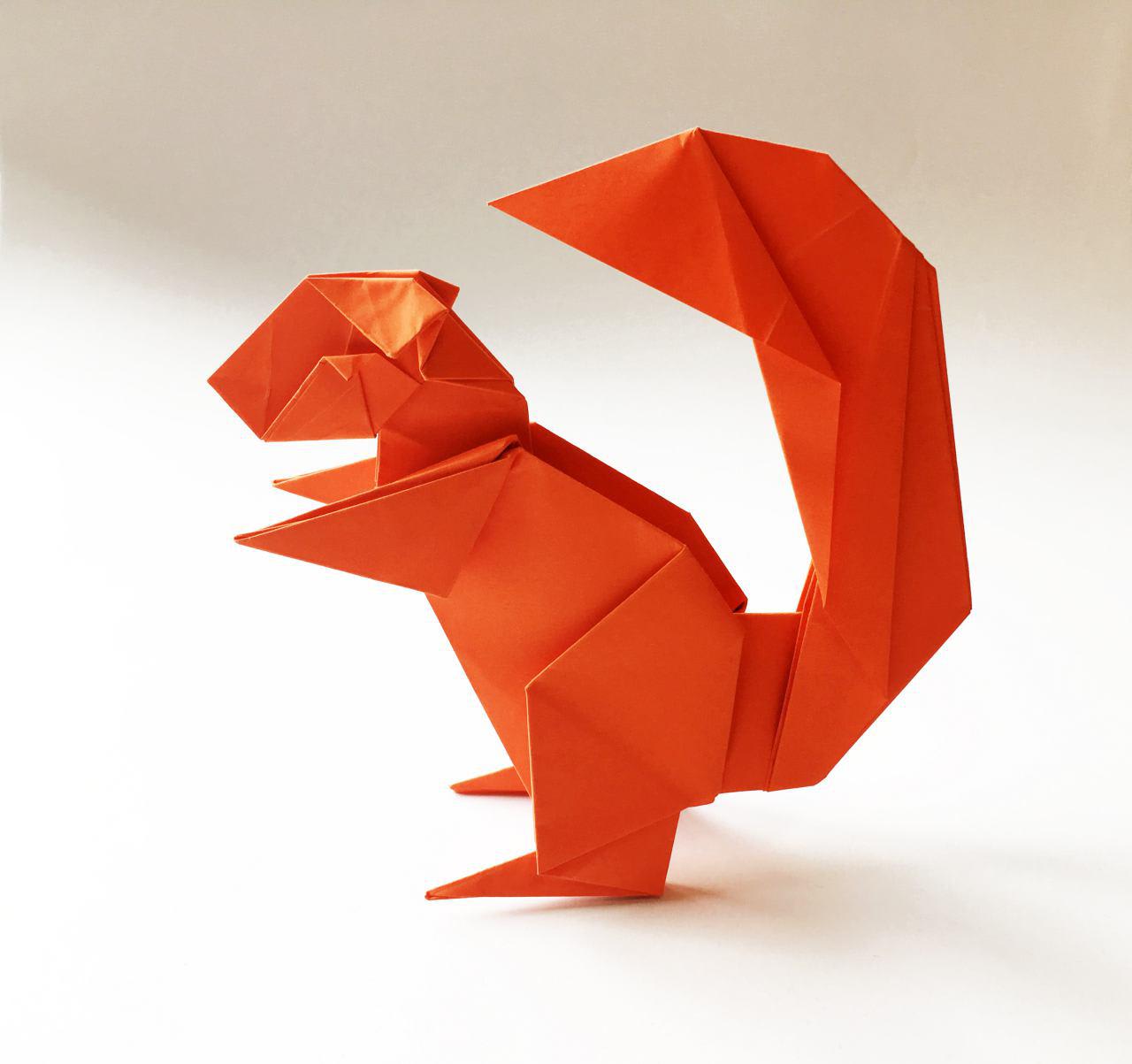
Step 1. Origami animal
Since every new Ubuntu release is named after animal, the Design Team wanted to bring this idea closer to the wallpaper and the Suru language. The folds are part of the origami animal and become the base of which we start our design process.

To make your own origami Xerus squirrel, you can find the instructions here.
Step.2 Searching for the shape
We started to look at different patterns by using various techniques with origami paper. We zoomed into particular folds of the paper, experimented with different light sources, photography, and used various effects to enhance the design.
The idea was to bring actual origami to the wallpaper as much as possible. We had to think about composition that would work across all screen sizes, especially desktop. As the wallpaper is a prominent feature in a desktop environment, we wanted to make sure that it was user friendly, allowing users to find documents and folders located on the computer screen easily. The main priority was to not let the design get in the way of everyday usage, but enhance it aesthetically and provide a great user experience.
After all the experiments with fold patterns and light sources, we started to look at colour. We wanted to integrate both the Ubuntu orange and Canonical aubergine to balance the brightness and played with gradient levels.
We balanced the contrast of the wallpaper color palette by using a long and subtle gradient that kept the bright and feel look. This made the wallpaper became brighter and more colorful.
Step.3 Final product
The result was successful. The new concept and usage of Suru language helped to create a brighter wallpaper that fitted into our overall visual aesthetic. We created a three-dimensional look and feel that gives the feeling of actual origami appearance. The wallpaper is still recognizable as Ubuntu, but at the same time looks fresh and different.
Ubuntu 16.04 Xenial Xerus

Ubuntu 16.04 Xenial Xerus ( light version)

What is next?
The Design Team is now looking at ways to bring the Suru language into animation and fold usage. The idea is to bring an overall seamless and consistent experience to the user, whilst reflecting our tone of voice and visual identity.
Talk to us today
Interested in running Ubuntu in your organisation?
Newsletter signup
Related posts
From inspiration to impact: design students from Regent’s University London explore open design for their dissertation projects
Last year, we had the opportunity to speak at Regent’s UX Conference (Regent’s University London’s conference to showcase UX work by staff, students, and...
Showcasing open design in action: Loughborough University design students explore open source projects
Last year, we collaborated with two design student teams from Loughborough University in the UK. These students were challenged to work on open source project...
Design and Documentation clinics at FOSDEM Fringe 2026
FOSDEM is one of the biggest and most exciting open source events of the year, held at the Solbosch campus of the Université Libre de Bruxelles (Brussels),...
