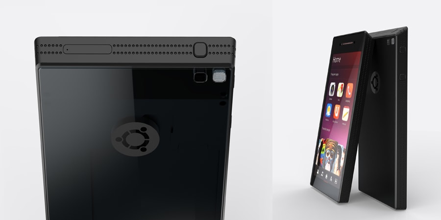
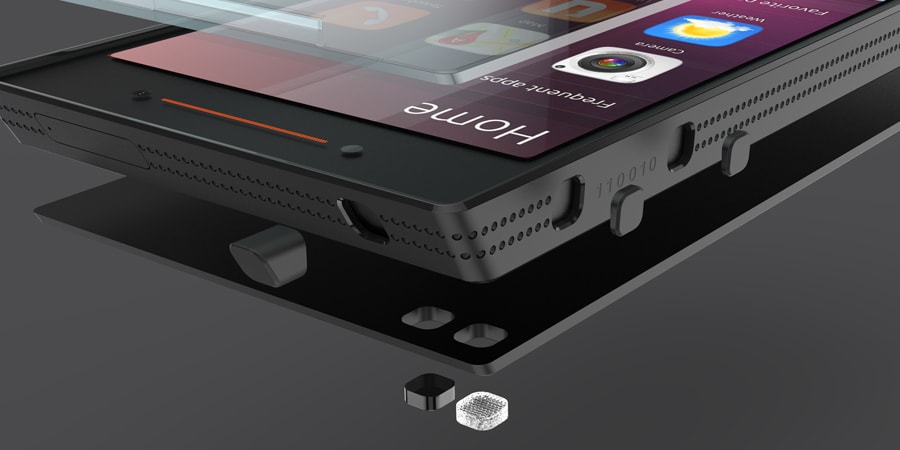
Ubuntu Edge: Design process
Canonical
on 26 July 2013
Tags: Design , Ubuntu Edge
Right… so where should we start? First post.
Hello, my name is Chee, and I am an industrial designer.
In this post I will share some materials, stories and process during the development of the Ubuntu Edge.
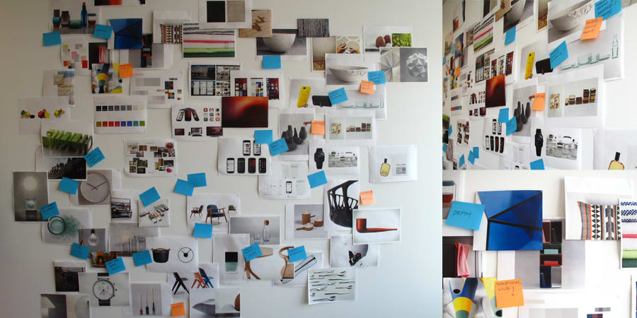
We started off by pulling the key elements of the Suru theme, and expanded on that, in order to explore the transition from a digital user experience, to a physical one.
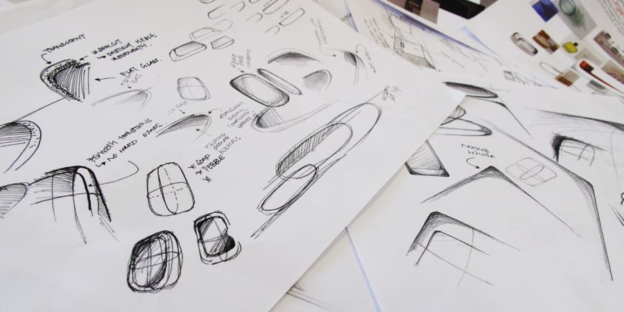
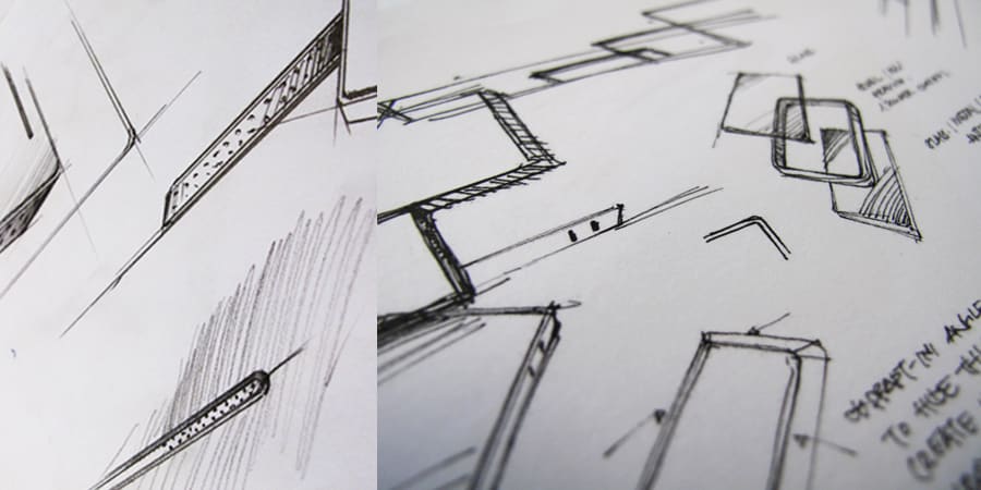
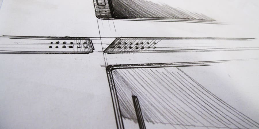
Once the rough ideas were formed, the fun part started, as we dived right into visualising the concepts; Pencils, sketching pads, markers, clippings, samples, colour chips and anything else interesting.
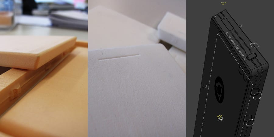 One of the best way to visualise, experiment and refine a design is to materialise it in any way possible. In the process of creating and fine tuning the Ubuntu Edge, we turned to methods known to be the most effective: Model making, 3D CAD, and 3D printing. In our case, we tried it all!
 It’s equally important how the Ubuntu Edge feels in the hand, how it visually presents itself and how certain textures give visual cues to the perceived expression. How each material works alongside each other without creating visual complexity is one of the key role to either make or break a design.
After several rounds of refinement and fine-tuning, we pressed forward with what we have now today as the Ubuntu Edge. From a rendering to visualize the Ubuntu Edge, to one that sit in front of us.
I hope you enjoy reading through the process, and lets make it a reality.
Talk to us today
Interested in running Ubuntu in your organisation?
Newsletter signup
Related posts
From inspiration to impact: design students from Regent’s University London explore open design for their dissertation projects
Last year, we had the opportunity to speak at Regent’s UX Conference (Regent’s University London’s conference to showcase UX work by staff, students, and...
Showcasing open design in action: Loughborough University design students explore open source projects
Last year, we collaborated with two design student teams from Loughborough University in the UK. These students were challenged to work on open source project...
Design and Documentation clinics at FOSDEM Fringe 2026
FOSDEM is one of the biggest and most exciting open source events of the year, held at the Solbosch campus of the Université Libre de Bruxelles (Brussels),...

