System status menu refinements in Ubuntu 12.10
Matthew Paul Thomas
on 13 April 2012
Over the past two years, Ubuntu has introduced a suite of status menus — known to Ubuntu geeks as “indicators” — in the top corner of the screen.
In Ubuntu 12.10, we plan to refine these menus to address several long-standing problems. If you’re a programmer, tester, or visual designer, there are plenty of opportunities for you to help out.
In updating the design, our general theme has been improving relevance — showing menus, and items in menus, only when they are relevant to you. For example, if you never use a VPN, it shouldn’t take up space in the network menu. If you never use Gwibber, it shouldn’t take up space in the messaging menu. If you never use a Bluetooth device, you shouldn’t need to see the Bluetooth menu. And so on.
System menu
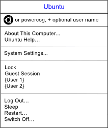 The biggest change to the structure, though, is a straightforward simplification. The two menus at the end of the menu bar, the user and system menus, will merge. As well as saving space, this will fix three main problems:
- “Switch User Account” and “Log Out” were in different menus, despite being closely related. Now, they’ll be in the same menu. (“Lock Screen” and “Switch User Account” will become one and the same command.)
- It’s been hard to find which version of Ubuntu you are using. This will now have a dedicated menu item.
- Finding the Ubuntu Help has also been difficult. That will now have an always-present menu item too.
One more detail. When Ubuntu used a home icon to represent the Nautilus file manager, usability testing found that people thought it was a launcher or starting point. (This isn’t surprising, given the strong connotations of Home in other applications.) The Unity Dash, meanwhile, is exactly that kind of starting point. So one possibility under discussion is changing the Dash launcher icon to a home icon — which the Dash already uses for internal navigation anyway.
How is that relevant to the status menus? It raises the possibility that we could use the Ubuntu logo, if it won’t be in the launcher, as the title of the system menu instead. We plan to test this against the powercog icon, and see which works better.
Clock menu
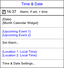 Many improvements can be made to the clock menu, but the design will remain much the same.
We’d like to add the ability to set a basic alarm, and if it’s set, this will be shown using an icon in the menu title.
If you’re a programmer and know your way around C and GObject, another simple enhancement would be populating the coming events section of the menu from a Web calendar, such as Google Calendar.
Sound menu
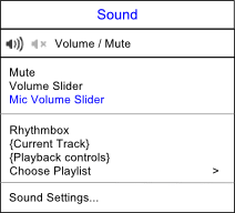 The sound menu design will remain unchanged in 12.10. As with the clock menu, though, there are plenty of minor improvements to work on.
Network menu
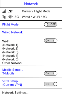 Ubuntu’s network menu is powered by Network Manager, and our design is a visual presentation of where we’d like to take it in future. It simplifies the current menu by using consistent on/off switches for connection types, removing needless separators, and showing less common functions — mobile broadband and VPNs — only if you have set them up in the Network settings.
Bluetooth menu
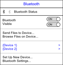 As with the network menu, we’d like to simplify the Bluetooth menu by using on/off switches and reducing separators.
Battery menu
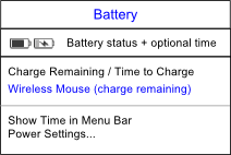 The battery menu design will stay the same.
Messaging menu
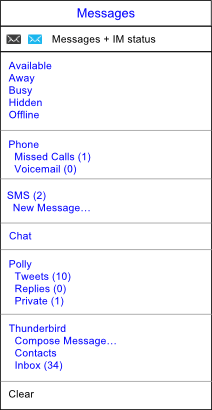 We plan to simplify the messaging menu by removing the default Chat, Mail, and Broadcast items. Instead, messaging programs will show up only if you have set them up, and will show up under their own names. As well as shortening the menu, this will solve the problem that nobody knows what “Broadcast” means.
In Ubuntu for Android, the messaging menu will naturally expand to show missed calls, voicemail, and SMS messages.
And finally, Ubuntu One will at long last be banished from the messaging menu, moving instead to the menu next door…
Sync menu
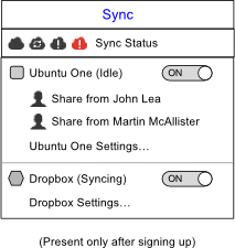 The new Sync menu will be present if you use any services such as Ubuntu One, SparkleShare, or Dropbox, that carry out non-urgent synchronization over the network. (Continuing the relevance theme, the menu won’t be present at all if you haven’t signed up for any of those services yet.)
From this menu, you’ll be able to turn each service off and on — turning them off if you’re trying to download something in a hurry, for example. You’ll also be able to access their settings, if they have any.
Keyboard menu
 We’d like to make two main improvements to the keyboard menu.
First, combining it with the input method menu. So that if you use input methods (such as for Chinese, Japanese, or Korean), you don’t have two separate menus for controlling your keyboard.
And second, making the menu title an icon that represents the current input method or keyboard layout, instead of a generic keyboard icon with added text. (Visual designers could help us here, in finding an elegant way to generate an icon based on the letter code for each layout.)
So long, printing menu, we hardly knew you
 In Ubuntu 12.04, a printing status menu appears whenever any print jobs are in progress. Unfortunately, it’s not that noticeable.
So in 12.10, we plan to replace it with a temporary printing item in the launcher. This will correspond to a minimized window listing your recent print jobs. You can close it when done, or just ignore it, as you see fit.
What’s next
As these designs are fleshed out, the individual specifications will be updated in the ‘Unity Application and System Indicators’ section of The Toolkit.
This is a lot of work, and you’re welcome to help out if you can. Pop in to the #ubuntu-unity channel on IRC, or get in touch on the unity-dev@ mailing list.
Talk to us today
Interested in running Ubuntu in your organisation?
Newsletter signup
Related posts
Canonical announces it will distribute NVIDIA DOCA-OFED in Ubuntu
Today Canonical, the publishers of Ubuntu, announced that it will integrate and distribute the NVIDIA DOCA-OFED networking driver with Ubuntu.
Meet Canonical at NVIDIA GTC 2026
Previewing at the event: NVIDIA CUDA support in Ubuntu 26.04 LTS, NVIDIA Vera Rubin NVL72 architecture support in Ubuntu 26.04 LTS, Canonical’s official...
Supporting more identity providers on Ubuntu with the new Authd OIDC broker
Today we are announcing the general availability of the new generic OpenID Connect (OIDC) broker for Authd. With enterprises needing to centralise access...
