Solving multiple calendar views
Canonical
on 21 June 2013
Tags: app design , Apps , calendar , Design
One of the key challenges with designing calendar applications is the number of ways you can display your time, whether it’s by year, month, week or day. After a lot of good old fashioned hard work, we refactored navigation by making the tab header the key to switching between views. Although the direction I’ll take you through in this article is strong and clean, it’s still a work in progress, and as such, can still change. The images are small in this article, to get a closer look at all of them collected together, download the PDF here.
The latest designs in this article show you how we’ve aimed to solve:
- Navigation between different calendar views
- Gestures to help quick navigation
- Editing events
- Creating events
- How this will potentially look and feel
Different views
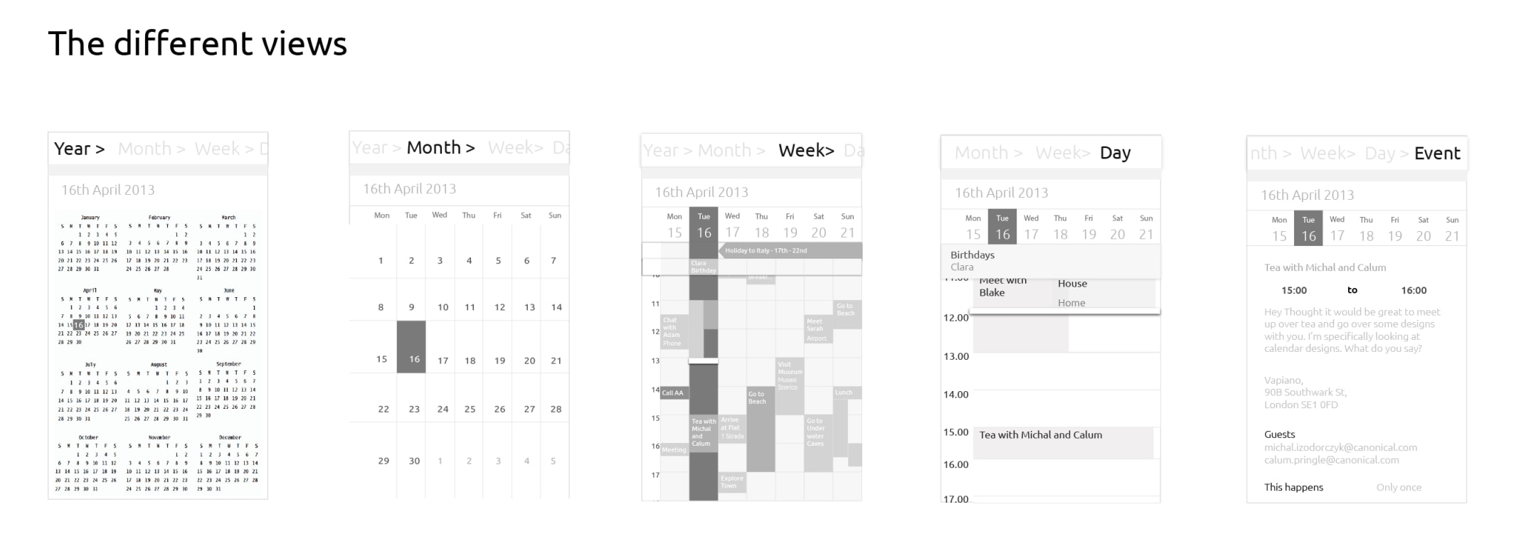
There are 5 different view templates inside the calendar app we are focusing on. They are:
- Year
- Month
- Week
- Day
- Event
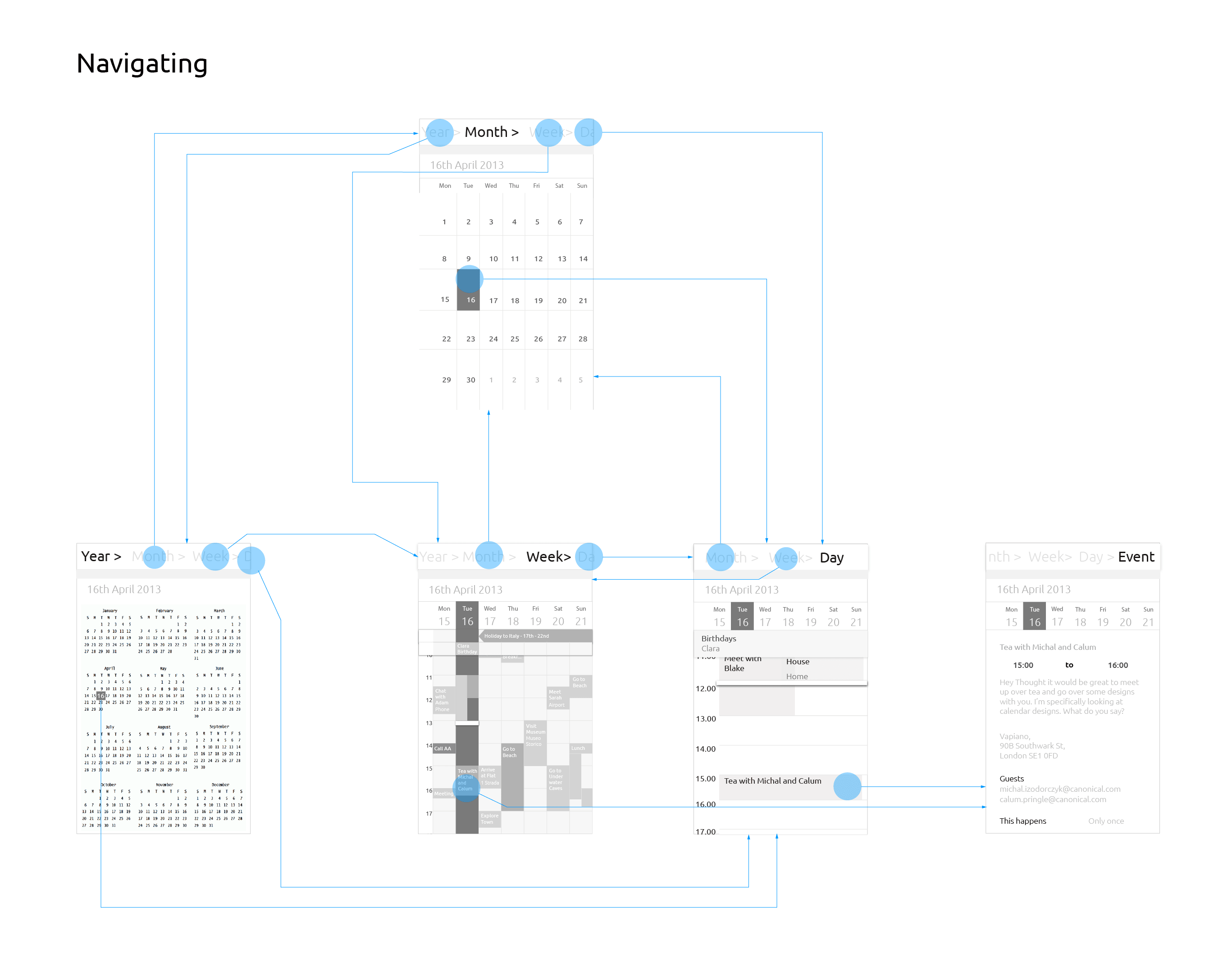
Navigating between different views using title header bar
You can move through the different views by tapping on the title header bar to toggle the view mode options. Just like our patterns, this title is scrollable – so that you can scroll through the view modes which don’t fit the width of the screen. Also like our pattern, swiping to the left or right moves along to the next or previous unit (year/month/week/day/event) in its category. For reference, take a look at Calum’s excellent post on this.
To get a better idea, click here to see a video of the prototype which formed the base of this navigation model and allowed us to test it out, comparing and contrasting it against other design directions. It was enough to give us a feel for the potential final build.
Navigating between views using spread and pinch gestures
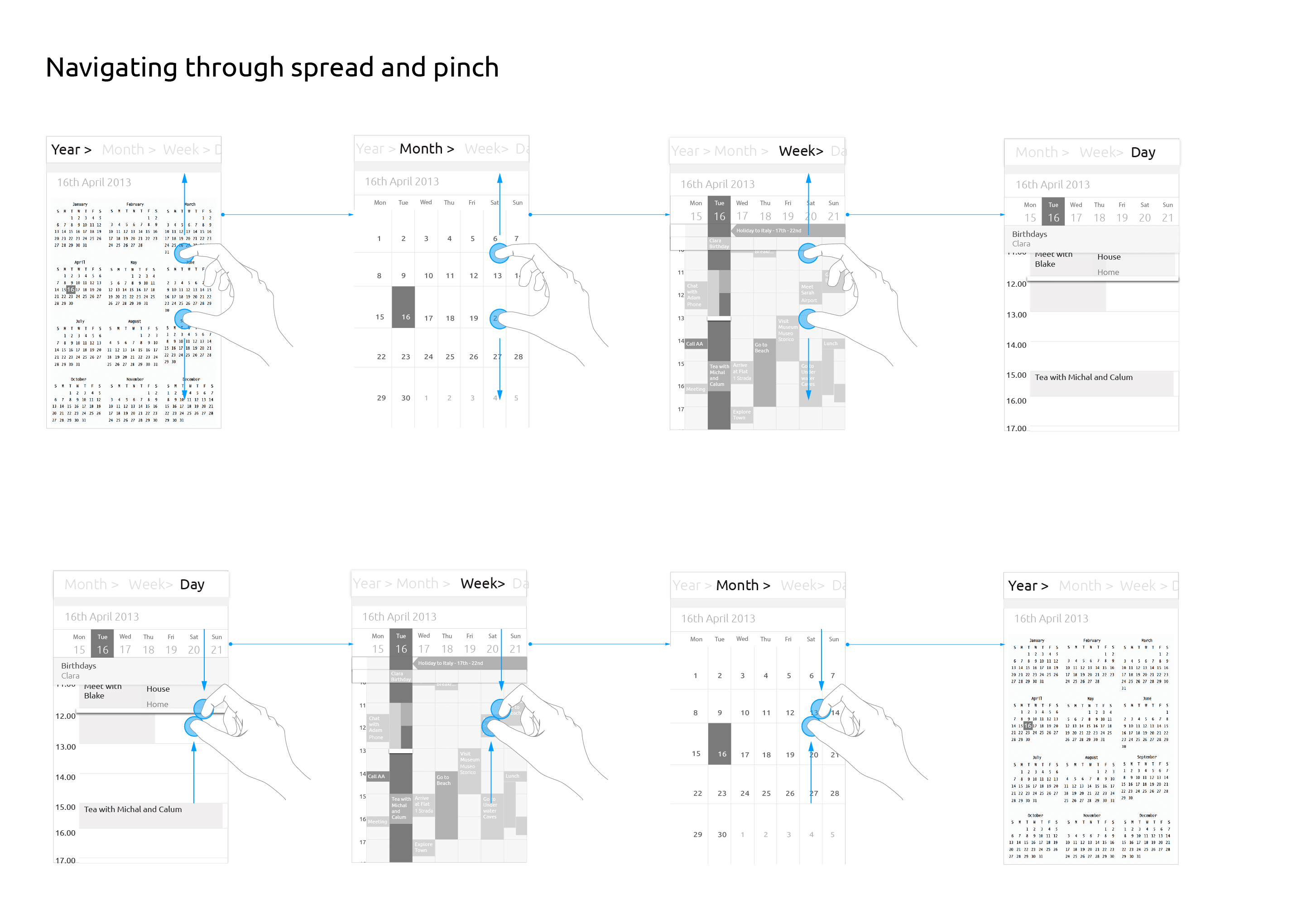
To aid fast navigation for pro users and to also add an element of fun, we’ve decided to enable zooming in and out between views using finger spreading and pinch gestures similar to zooming in and out in a map app.
Spreading fingers gesture: This zooms in to the next view; the next view offering more detail, close up.
E.g. A user spreads when on the year view. This opens up the month view. Spreading on the month view opens up the week view, and so on.
Pinching fingers gesture: This zooms out, to a less detailed view – the previous view in the view hierarchy.
E.g. A user pinches on month view, the system responds by taking the user to the year view.
An event
An event has several detail fields. In order of appearance they are:
- Event name
- Time
- Description
- Location
- Guests
- This happens (how many times does this event happen in the series? Or is it a one time event?)
- Remind me
- Timezone
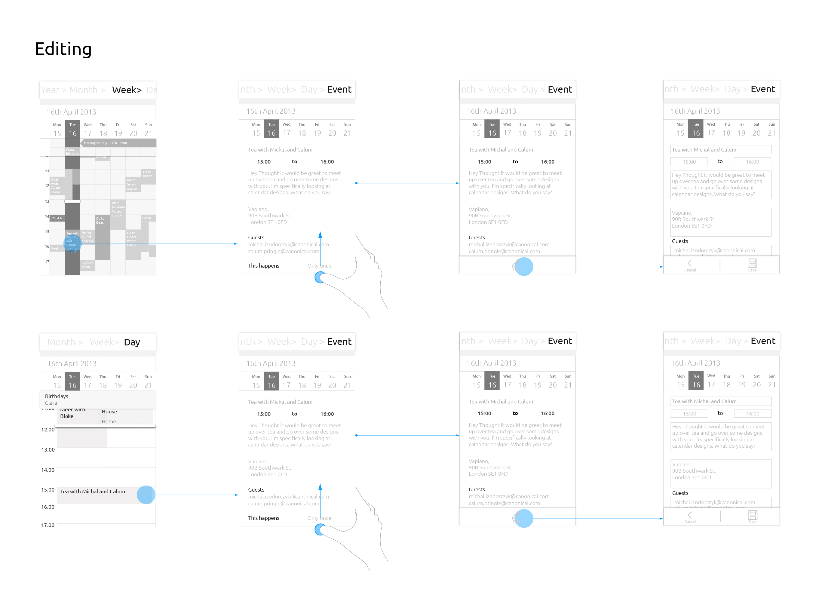
Editing an event
A bottom edge swipe on an event page brings up the toolbar with the edit button.
[NOTE: toolbar menu options within the calendar and across the whole system have not been finalised, this image of the toolbar is a placeholder to give an idea of how to edit]
The edit mode shows the boxes around the fields allowing the user to type and change the event details. The toolbar in edit mode is always present. It shows cancel and save options.
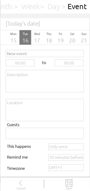
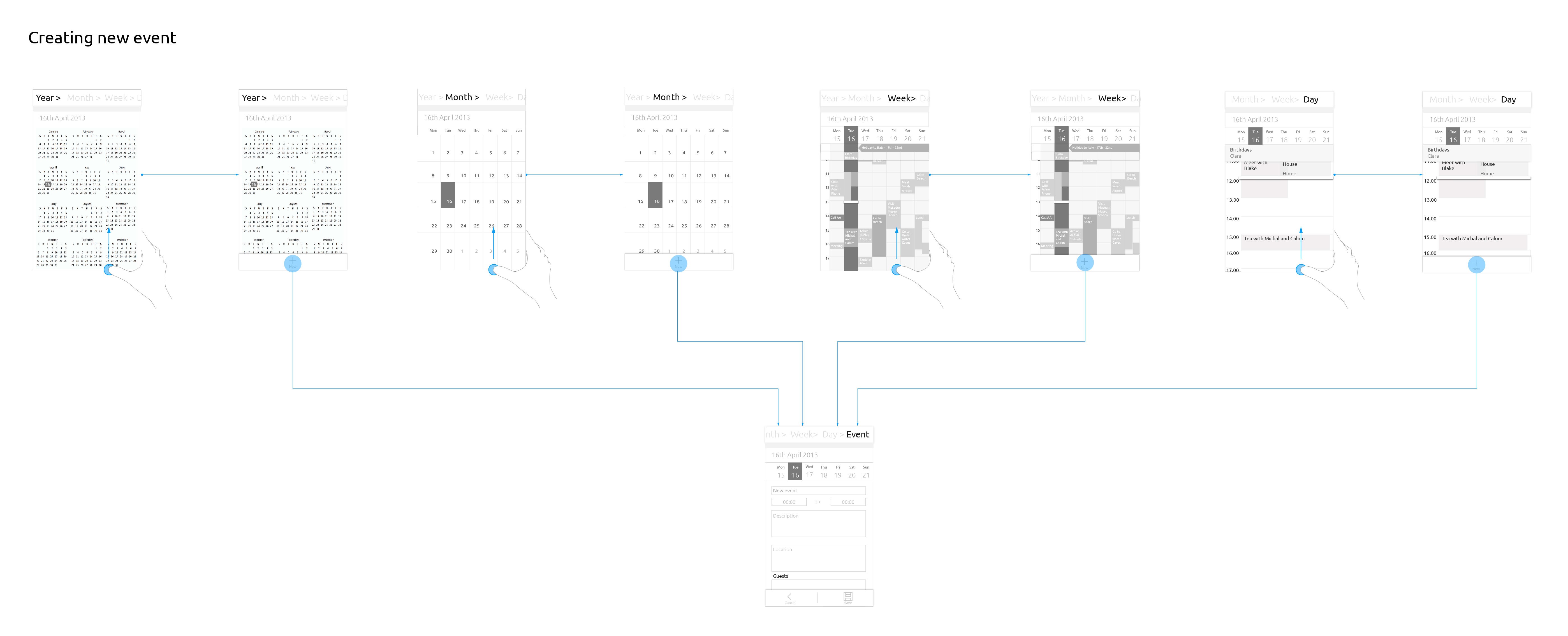
Creating an event
A bottom edge swipe on year, month, week and day views brings up the toolbar with the option ‘New’ to create a new event. Pressing this brings up a similar template to the ‘Edit’ mode, the only difference being the blank forms.
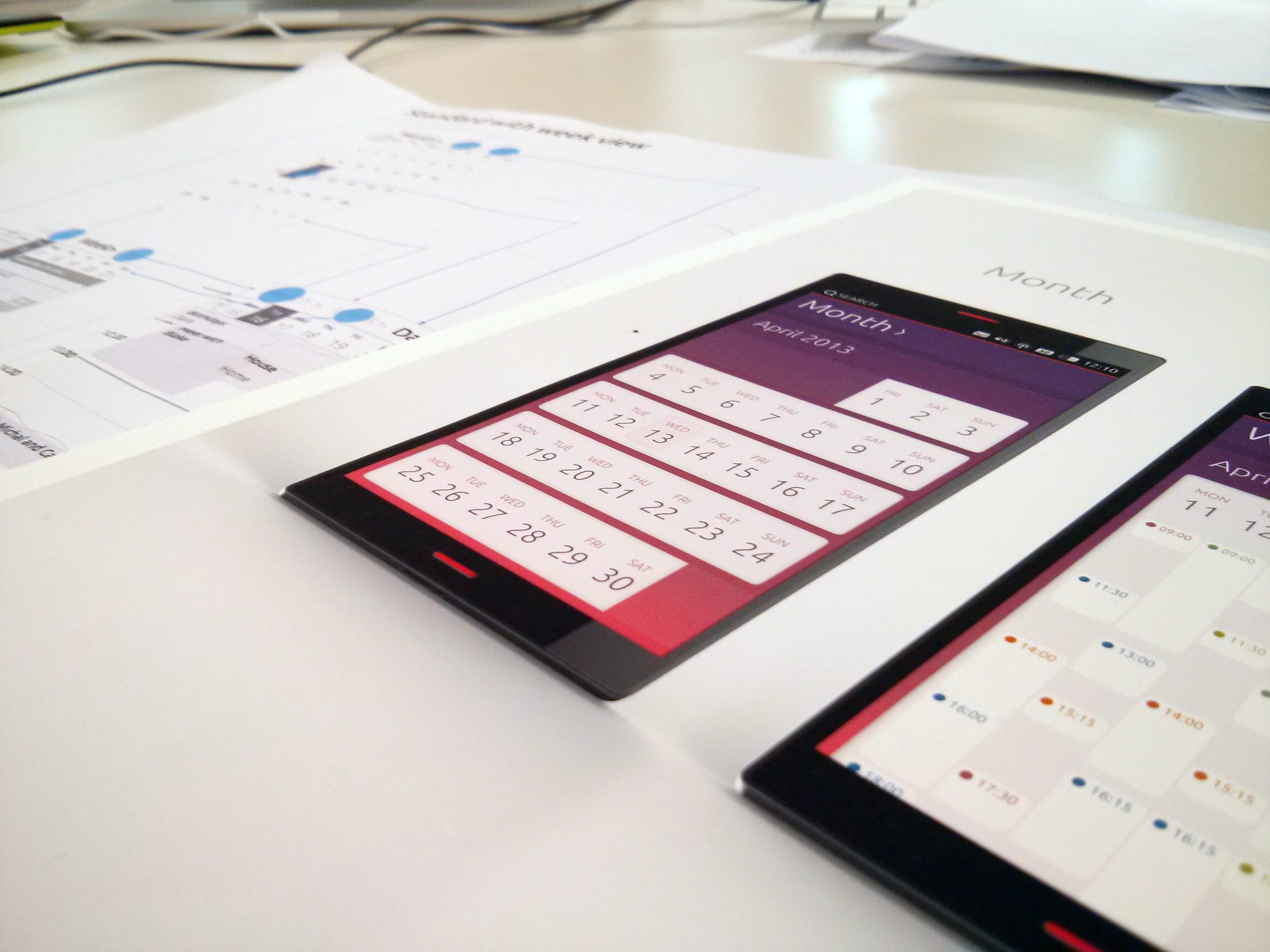
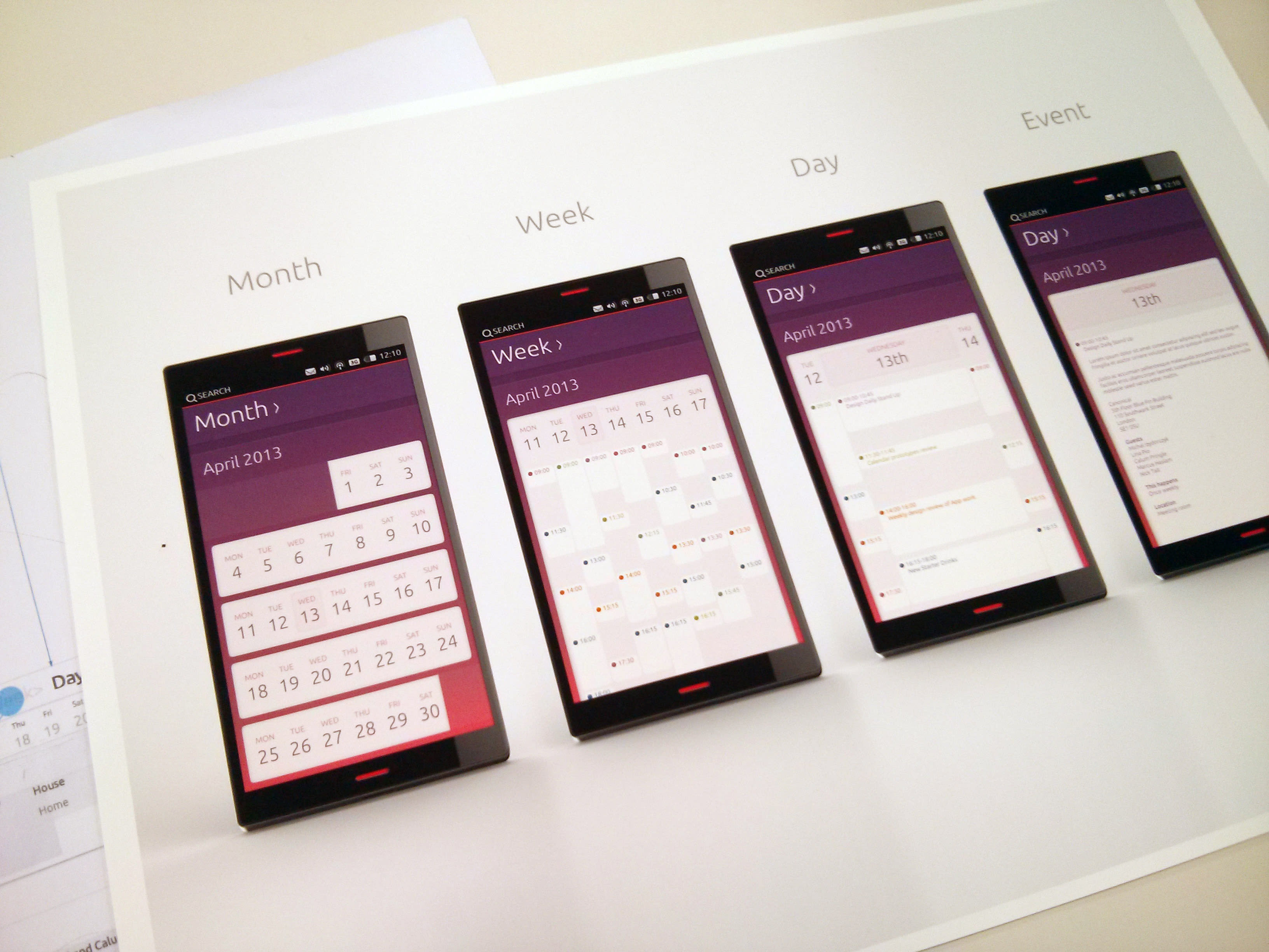
Visuals
The visuals in the image below are an exploration of how this can potentially look and feel. This is still very much still in progress, but gives a strong hint of what’s to come.
I hope you like our thoughts and directions on this, and that this article gives a stronger idea of what the final app will look and behave like.
Watch this space for my upcoming articles focusing on: an in depth look at events – (including guest contacts, location views, time and date pickers etc) calendar synching with external accounts, calendar settings, and calendar mode inside the indicators.
Talk to us today
Interested in running Ubuntu in your organisation?
Newsletter signup
Related posts
From inspiration to impact: design students from Regent’s University London explore open design for their dissertation projects
Last year, we had the opportunity to speak at Regent’s UX Conference (Regent’s University London’s conference to showcase UX work by staff, students, and...
Showcasing open design in action: Loughborough University design students explore open source projects
Last year, we collaborated with two design student teams from Loughborough University in the UK. These students were challenged to work on open source project...
Design and Documentation clinics at FOSDEM Fringe 2026
FOSDEM is one of the biggest and most exciting open source events of the year, held at the Solbosch campus of the Université Libre de Bruxelles (Brussels),...

