Design and Web team summary – 9th June 2020
Anthony Dillon
on 9 June 2020
Tags: Design
The web team here at Canonical run two-week iterations. Here are some of the highlights of our completed work from this iteration.
Meet the team
👋 My name is Sam, and I am a project manager on the web team.
I help run a few of our squads in the web team. The web squad, vanilla squad and the brand squad. This means I get to see how different disciplines work and help them form plans to achieve their objectives. I really enjoy seeing squad members work well together to get stuff done!
Before I came to Canonical, I worked in a small branding studio, working on a range of different projects, from digital brand hierarchies to cold-brew labels!
When I am not being a project manager I like to unwind by cooking something a bit bougie or by playing games on my PS4.
Web squad
Our Web Squad develops and maintains most of Canonical’s promotional sites like ubuntu.com, canonical.com and more.
A new “What is Kubernetes” page
Following the success of our other popular “What is” pages, we created one for Kubernetes. It explains a bit of the history of the project, who the main contributors are and the key concepts and terms around the Kubernetes project.
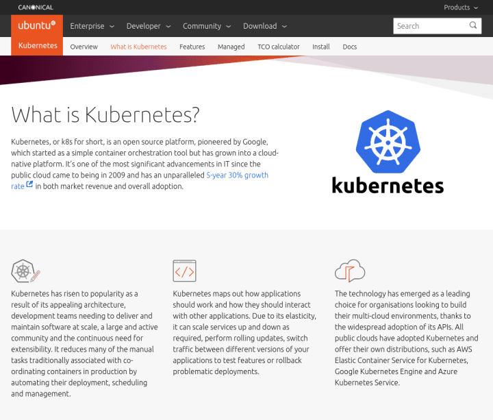
Visit the “What is Kubernetes” page >
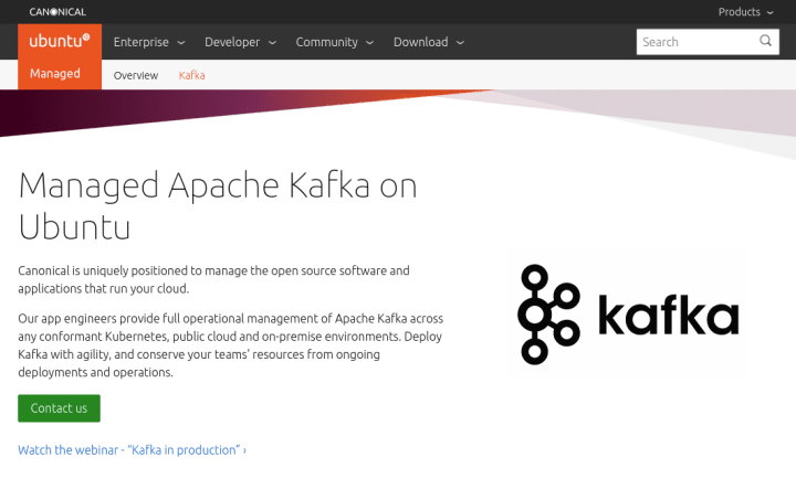
New managed app – Kafka
We published a new page for our managed application – Kafka. And we created a takeover for an associated webinar.

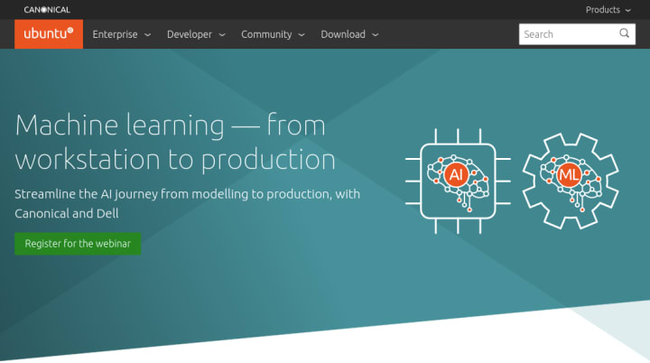
Azure and cloud-init webinar
Microk8s website updates
We updated the microk8s.io website for the announcement that MicroK8s now native on Windows and macOS. We completely updated the homepage and made the install instructions a lot easier to follow.

We have also updated the microk8s documentation to be pulled in from the official Kubernetes Discourse site. This is interesting as it is the first time our documentation is being maintained in a non-Canonical hosted Discourse.
Visit the new microk8s website >
Testing sprint
A few of us spent some time this week focusing on the testing across 100+ projects to work on standardisation and improvements.
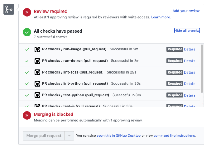
Standardise automated checks (CI)
We have been gradually migrating our projects to use GitHub Actions, as they are better integrated into GitHub where we do most of our work. This week, we migrated many of our projects from CircleCI and Travis to GitHub Actions, and we will be continuing to hopefully move everything in the coming weeks.
We also updated the recommended checks in our automated checks standard and we added these standard checks to many more projects.
JavaScript pipeline and test coverage
We’ve started to standardise our JavaScript build pipeline across all (non-React) projects, around webpack. This pipeline includes a framework for testing and reporting coverage with codecov.io.
We added structure to many of our website projects.
Linkchecker
We have been using linkchecker for a while to check both internal and external links on ubuntu.com.
This week, we considered how to expand this to other websites. We decided we should automatically collect information about broken links in a spreadsheet. To help with this, we wrote our first GitHub Action – Google Spreadsheet CSV importer.
Ubuntu advantage renewals
Renewals functionality released
We released the ability to renew existing enterprise subscriptions via the advantage dashboard. When a subscription is soon to expire, customers will receive an email notification directing them to the dashboard, where they’ll be able to process a payment directly.
This project represents a huge amount of work and collaboration from teams across the company, and is the first step towards a larger ecommerce experience on the Ubuntu Advantage dashboard.
Future design vision for renewals
The idea is to visually build up your fleet subscription in a simple UI and purchase support easily.
Brand
The Brand team develop our design strategy and create the look and feel for the company across many touch-points, from web, documents, exhibitions, logos and video.
Document Hierarchy
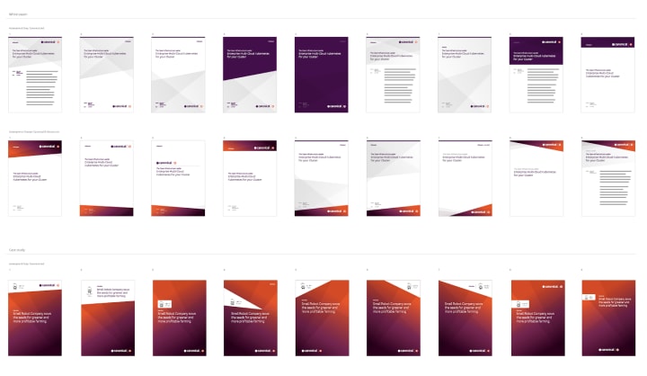
We progressed our document hierarchy work by applying our initial investigations into design prototypes, experimenting with the amount of branding applied to different documents.
WSL logo
The WSL logo ideas were narrowed down and worked up during this iteration, finalising the positioning and colours.

Robotics illustrations
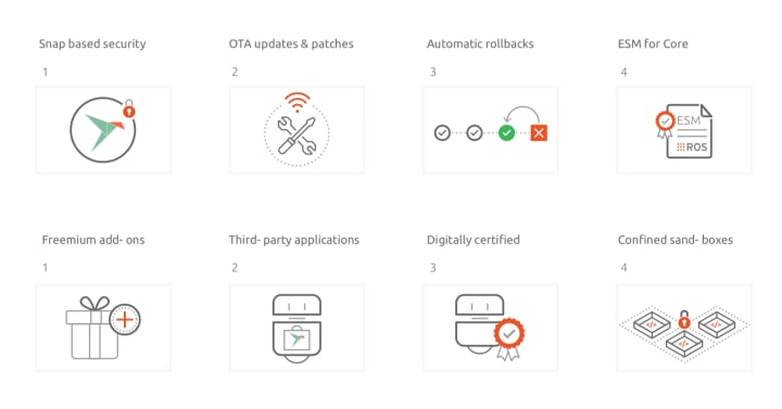
Working with the robotics project managers we progressed the initial ideas into finished illustrations for use in upcoming promotions.
Partner Portal
We have been working with the Marketing team and external suppliers to provide design support for the new Canonical Partner Portal, keeping it inline with the recently updated canonical.com to make the user journey as seamless as possible.

MAAS
The MAAS squad develops the UI for the MAAS project.
Focus on 2.8 release
The final RC has been released so we are QA’ing all aspects of the UI to check it works well for the upcoming release.
MAAS documentation improvements
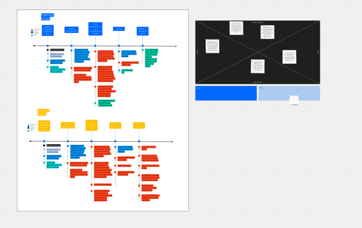
The journey to discover how to improve MAAS.io is still ongoing! Last week after trying to determine the current user journey for our Technical Writers, this week we are exploring the behavior of our Documentation readers. We have currently just identified two search behavior patterns such as transactional search behavior and contextual search behavior. The difference between the 2 is that transactional searches are on point searches, for people who are familiar with the concept and only needed examples. The latter one describes the behavior of users whose goal is to understand the big picture concept.
The question is how does this search behavior impact our current design and how might we help our users search and navigate to the content that they are looking for easily.
UX exploration into mini graphs
The team are aiming to tackle a refresh of the KVM section of MAAS and part of that is the in table mini graphs to give a summary of usage across the machines.
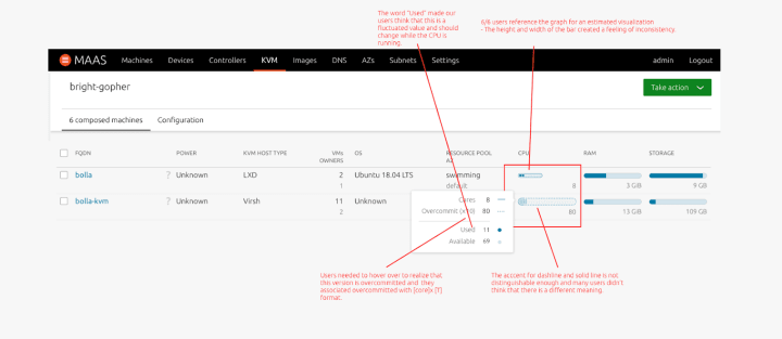
After reviewing a number of users across the company the findings show that many people thought the mini graphs were just an estimated summary and not an absolute representation of the allocation of resources.
The main question was did people understand the representation of overcommitted values. Many needed to view the tooltip on hover to understand what the different borders represented.
This research has led us to three options which will be iterated on.
JAAS
The JAAS squad develops the UI for the JAAS store and Juju dashboard projects.
Juju 2.8 release including the new dashboard
Juju 2.8 has been released which includes a new command `juju dashboard` which will open the brand new GUI. A shift in direction from the preceding Juju GUI which had a focus on the deployment of models. The new Dashboard is focused on the operations and observability of your Juju models across one or more controllers.
Explorations on layout, model detail page with apps/units/machines views
Model list page

Exploration on a layout to align our web applications and the modular table pattern to be used across products.
Considering the use-case of large models with hundreds or thousands units and machines, we explored a couple of options on how the model view could scale up to these numbers.
Model detail page, Option A
The default view of the model detail page would display only apps and relations, adding three views “apps | units | machines” on top:
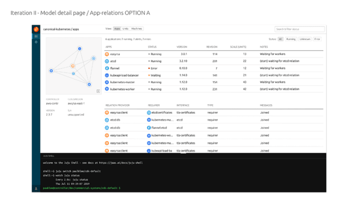
Click on an app, reveals a panel with relevant information:
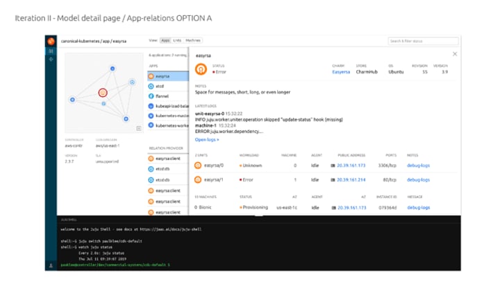
Additional information about the store/charm, latest logs, units and machines related to the app
Model detail page, Option B – Model status:
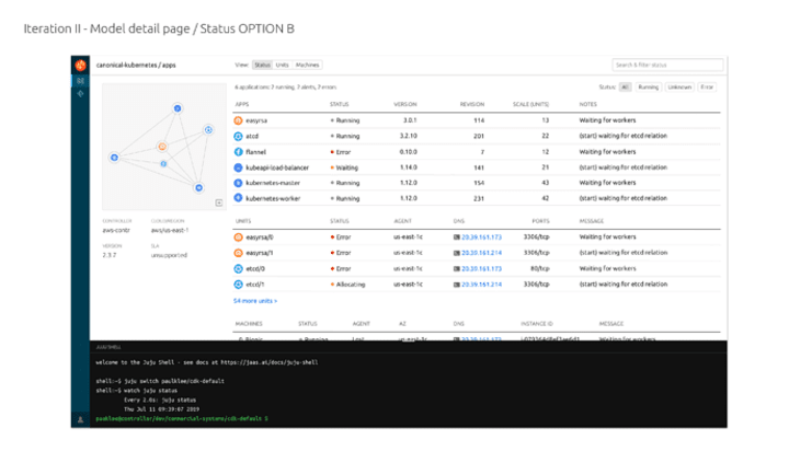
The option B is with the current model status displays apps, units, machines and relations, but the number of displayed units and machines is limited: “54 more units” in the example would open the units view (that can be accessed from the “status | units | machines” on top, too)
Panel on selection:
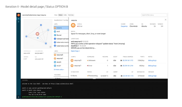
The other tabs, Units and Machines, would display a consistent approach from units and machines point of view.
Machines view
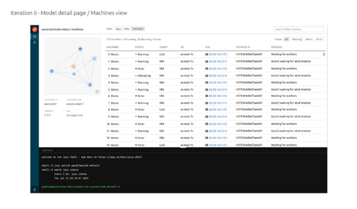
Clicking on a specific machine would reveal the panel:
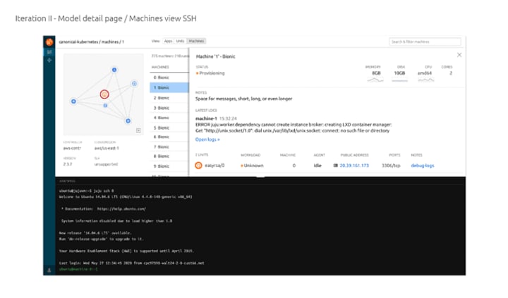
With more information on the constraints / performance of the machine, the units running on it and the latest logs.
Units view
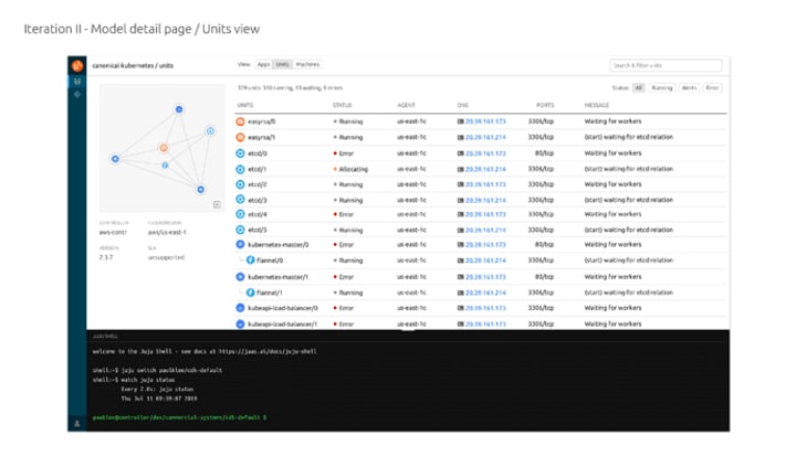
And the panel:

With more information on the logs, and the machine the unit is running on.
Post on Discourse, feedback welcome!
Finalising the search and filtering UX
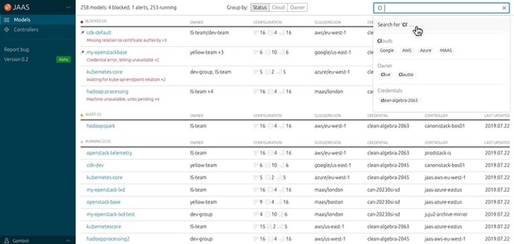
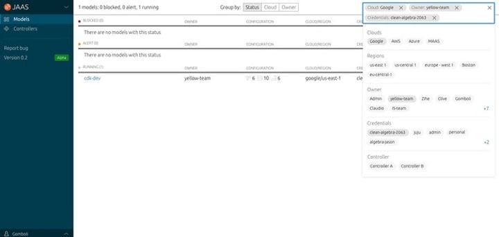
In this cycle, our team is implementing the Combo Search and filter pattern on the Juju Dashboard, where both search and filtering functions could be performed on one bar. The user can pick the filter chips from a menu, or type and submit direct keywords to query the table data.
Filtering result as a chip added
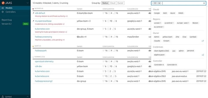
Clicking on the search bar will activate the pattern, a menu with categories and available filter chips will show. The user can select and de-select chips from the menu, selected ones will be applied as filters and shown in the search bar. The table will be filtered as soon as a filter is applied, no extra submission needed.
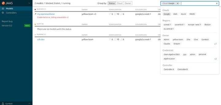
Keywords submitted as a chip
When the user starts typing and hit ‘enter’ to submit a keyword chip (e.g. ‘cl’ in the example), the table will be filtered to models containing data with matched characters ‘cl’ from the beginning of the word (e.g. ‘claudio’, ‘clive’ but not ‘accli’).
The filtered table will highlight the matched characters in bold.

Chips Overflow
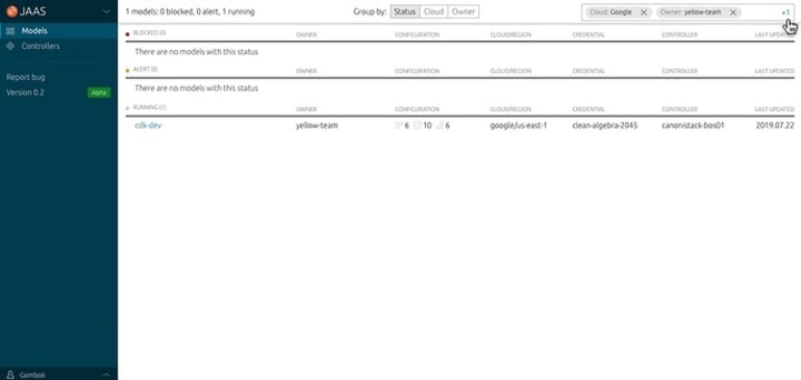
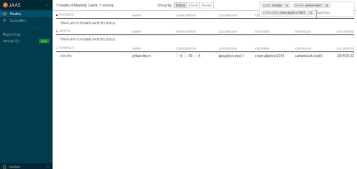
There will be situations where multiple chips are selected and couldn’t fit into one row in the search box. We designed an ‘expandable indicator’ formatted as ‘+2’, when on click the search box will expand and show all chips applied. This is how its look and feel on JAAS dashboard:
Post on Discourse, feedback welcome!
Discourse category
New UX & Design category is a place to collect explorations, ideas, suggestions and feature requests for our Juju-related products, focusing on the user experience and on the interface. If you are interested in future improvements to the UX of Juju feel free to join in and subscribe.
Vanilla
The Vanilla squad designs and maintains the design system and Vanilla framework library. They ensure a consistent style throughout web assets.
Vanilla 2.12 releases
Two weeks ago we released Vanilla 2.12 (which included updates from previous iteration, like muted text and updated icons). After another week we also released a patch version 2.12.1 which includes several bug fixes and improvements.
Research into a React table
We spent some time reviewing existing React table components to get inspiration for the interfaces and examples of documentation.
Are there many features we would like the new table component to support such as, multi-select, sorting, expanding table rows, etc.
Search and filtering
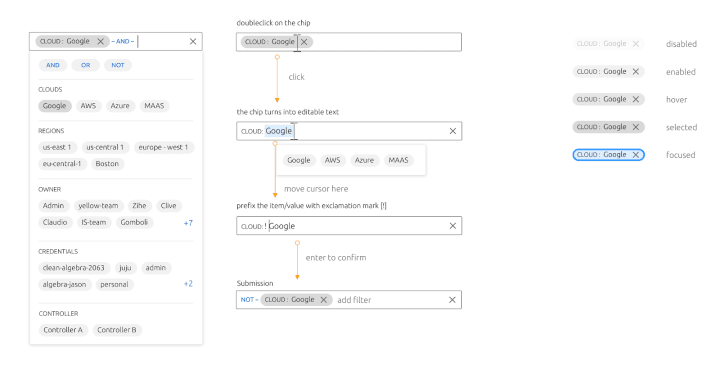
We completed the visual design of the search and filter pattern and the chip pattern.
Snapcraft
The Snapcraft team works closely with the Store team to develop and maintain the Snap Store site.
Certification of charms
We did some research on the concept of doing quality control for charms and bundles, to indicate to the Charm Store users that a charm meets some standards. We conducted interviews with in-house engineers to find out about their understanding of certain terminology, such as certification and verification, in order to come up with a label that makes sense to our users.
Iterative improvements to snapcraft.io
We began working on improving the homepage experience of snapcraft.io. Based on the large amount of analytics we collect we identified three distinct A/B tests that are going to be implemented over the next few months.
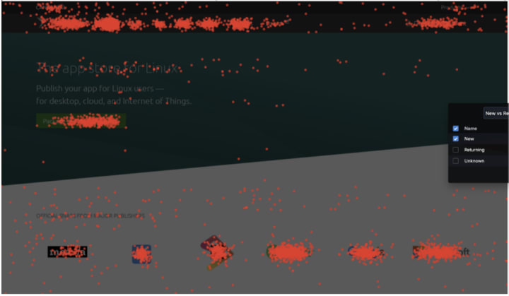
We will be measuring the engagement of users and the effectiveness of the changes in order to define the long term strategy we will undertake.
CLI output alignment
After the amazing work our team did on aligning the CLI commands for some of our products, this time we are tackling the output of those commands and will be working on ensuring all of it is useful for its context. This is a very long-term piece of work so it will be quite constant in our updates from now on!
Autopublish Konf Snap from GitHub Actions
We are working on a snap that we will use in our deploy process. The snap is in charge of generating the Kubernetes configuration that we are going to apply in production from small configuration files. We have included a GitHub action that will automatically publish the Snap to stable whenever the repository is updated.
Team blog posts:
- Building a cross-framework UI with single-spa in MAAS 2.8
- New feature in Juju 2.8: Juju Dashboard
- [Dashboard] Explorations on layout, model detail page with apps/units/machines views
- [Dashboard] Machines View and SSH to machine
- JAAS Dashboard, the new Juju GUI
We wish good health for you and your families during these uncertain times.
With ♥ from Canonical web team.
Talk to us today
Interested in running Ubuntu in your organisation?
Newsletter signup
Related posts
Showcasing open design in action: Loughborough University design students explore open source projects
Last year, we collaborated with two design student teams from Loughborough University in the UK. These students were challenged to work on open source project...
Design and Documentation clinics at FOSDEM Fringe 2026
FOSDEM is one of the biggest and most exciting open source events of the year, held at the Solbosch campus of the Université Libre de Bruxelles (Brussels),...
Open design: the opportunity design students didn’t know they were missing
What if you could work on real-world projects, shape cutting-edge technology, collaborate with developers across the world, make a meaningful impact with your...
