Design and Web team summary – 8th July 2020
Anthony Dillon
on 8 July 2020
Tags: Design
The web team here at Canonical run two-week iterations. Here are some of the highlights of our completed work from this iteration.
Web squad
Our Web Squad develops and maintains most of Canonical’s promotional sites like ubuntu.com, canonical.com and more.
USNs on ubuntu.com
Ubuntu security notices can now be found under https://ubuntu.com/security/notices, bringing a much needed visual refresh. Some pages (LSNs) are still living under https://usn.ubuntu.com but most of the content should now be accessible via the new pages.

Social media banner generator
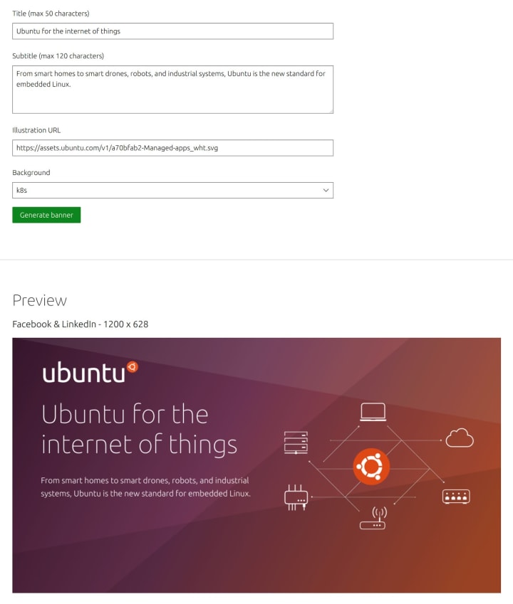
All artwork produced and available via the websites were hand created by the designers on the web team. We would like to reduce the time spent here by creating a new tool to generate social media images for marketing purposes for use in social media posts, meta images etc.

Brand
The Brand team develop our design strategy and create the look and feel for the company across many touch-points, from web, documents, exhibitions, logos and video.
Document Hierarchy
We shortlisted designs and applied rules to the chosen designs to make a cohesive set of documents to move forward with.


Automotive illustrations
We created a number of illustrations for the upcoming automotive page refresh in collaboration with the IoT PM’s.


Social media banner generator
Working in collaboration with the web developers we defined a number of scenarios for the social media banners in order for them to build in the variables for the tool.

Snapstore video
In this iteration, we sketched up the ideas for the main animation frames of the Snapstore explanation video.

Charm Hub
We helped the Charm Hub team with some illustration work and experimentation around the Charm Store cards that are currently being updated.


Design team icon
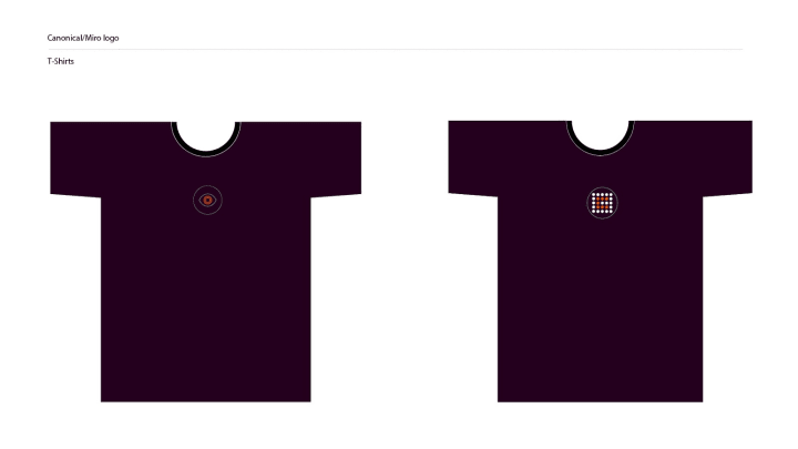
We were asked to produce an icon for the design team to use across applications we all collaborate on and for wider use, in this iteration we developed the chosen designs for final selection.


MAAS
The MAAS squad develops the UI for the MAAS project.
Deploy with custom cloud-init UI
Our cloud-init designs have been finalised and are currently in development, stay tuned for MAAS 2.9. The goal of this feature is to create parity with our API. You will be able to customise your cloud configuration with cloud-init user data.
The current feature includes:
- Allowing code paste and reading from uploaded file
- Users are able to edit the user data from the snippet area
- At this stage, we only allow one file/snippet upload

KVM Charts
Our second phase of React migration project is merely focussed on KVM; KVM listing and KVM details. In our earlier design work, we have been exploring different ways to represent KVM resources data in order to reflect the truth and minimise confusion.

One of the things that we discovered from our user interviews is that the word “used” vs “available” created confusion for our users. Because our users interpreted these resources as actually used. Whereas in reality, the data represented here is the amount of resources that our users assigned to their KVMs.
The concept of overcommit still remains as a big design challenge for our team. The current solution that we choose is to make the information expander clearer and add visual cues to help highlight the important aspects of KVM resources. The bigger question we want to answer is how might we show these graphs in ways that are useful and accurate?
In-app release notification on the way
Our data has shown that about less than 10% of our users updated MAAS to the newest version of MAAS in the past releases. So our goal is to expand the announcement channel to MAAS-app to help promote our new release. For MAAS 2.9 our goal is to create the simplest version of the notification component for new release announcements and from here we will try to see this as a starting point to scale our notifications forward.
JAAS
The JAAS squad develops the UI for the JAAS store and Juju dashboard projects.
Analysis of the user interview for the Dashboard
In this iteration, we analysed the user testings for JAAS model detail pages and summarised the findings into a report. The team had an initial discussion to prioritise actions into ‘Quick wins’ to fix and ‘Long term’ for feature exploration. The rest of the issues will be discussed in the next iteration.

Building the search and filter pattern
The team is building the ‘Search and Filter’ pattern on the Dashboard, in order to provide to the users the possibility of complex search queries. You can read more about this on Discourse.

Web CLI – an exploration
The team is investigating what we’re calling the Juju wCLI. It is a simulated Juju CLI in the browser that performs the necessary API calls under the hood to perform the same actions the Juju CLI does in your local shell. This gives us the ability to enhance the CLI commands and responses while iterating quickly to find the best interactions.

Vanilla
The Vanilla squad designs and maintains the design system and Vanilla framework library. They ensure a consistent style throughout web assets.
Update the display property
We updated our web-font loading strategy, so now our Ubuntu web-font is optional on the first load. This improves page loading performance by not making the browser wait for the font files to be downloaded before it can render the text. The first load of the page (if the web-font is not yet cached) will render with fallback font, but any later visit will use Ubuntu web-font downloaded in the background.

New inline-list stretched
We implemented a new variant for our list component that allows to layout the list items across the whole width of the list container using CSS flexbox. This will allow creating some simple horizontal split layouts that previously required custom styles or utilities.

Application layout
Work continues on the new application layout, which aims to make products like MAAS, JAAS and RBAC feel like a product family. This iteration we focused on:
- Responsiveness on the extreme ends of the spectrum – small phones and ultra-wide curved displays


- Interactions in panels – from small panels wrapping content to medium panels that enforce height limits, to large panels that attach to the top and bottom edge of the screen, making the full height of the window available to the panel’s contents.

More consistent active navigation
We’re exploring alternatives to the current navigation “active” state as part of a wider effort to make states across components follow the same design language.

Ubuntu
Documentation enhancements
Our UX and Design team have begun a design process aimed at improving the documentation experience across all our docs resources. As well as a content restructure, it’s likely this will result in enhanced tools for docs writers, and richer ways to present troubleshooting and code snippets.
We wish good health for you and your families during these uncertain times.
With ♥ from Canonical web team.
Talk to us today
Interested in running Ubuntu in your organisation?
Newsletter signup
Related posts
Showcasing open design in action: Loughborough University design students explore open source projects
Last year, we collaborated with two design student teams from Loughborough University in the UK. These students were challenged to work on open source project...
Design and Documentation clinics at FOSDEM Fringe 2026
FOSDEM is one of the biggest and most exciting open source events of the year, held at the Solbosch campus of the Université Libre de Bruxelles (Brussels),...
Open design: the opportunity design students didn’t know they were missing
What if you could work on real-world projects, shape cutting-edge technology, collaborate with developers across the world, make a meaningful impact with your...
