Design and Web team summary – 8 September 2021
Anthony Dillon
on 8 September 2021
Tags: Design
The Web & design team at Canonical run two-week iterations building and maintaining all of the Canonical websites and product web interfaces. Here are some of the highlights of our completed work from this iteration.
Meet the team

Hi there! I’m MariaPaula and I’m a Web Engineer. I recently joined the Web Squad where I help maintain Canonical’s websites such as ubuntu.com. Even though I’ve only been with the team for a couple of weeks now, everyone has been very helpful, welcoming and supportive which has made me feel right at home.
I have a B.A in International Relations from Florida International University and completed Lambda School’s full stack web development curriculum in 2020. Before Canonical I was an ESL teacher with a clientele mostly based in China, South Korea and Japan.
Outside of work I like to cook, travel, dance, and take care of my house plants. I’m based in a small town in Germany near the Dutch border where I live with my husband and our two cats.
Web
The Web team develops and maintains most of Canonical’s sites like ubuntu.com, canonical.com and more.
New Cube FAQ page
This iteration we created an FAQ page for Certified Ubuntu Engineer (CUBE) – Canonical’s professional certification program to help you find answers to all your questions.
CPU compatibility matrix
We also created a CPU compatibility matrix for Ubuntu and related products to help users get better performance and support with their CPU.

Learn more about CPU compatibility matrix
Major updates to the Managed Apps page
We rebuilt the managed page. The old managed page had only the information about Managed Apps. With this update, you will be able to get the information about managed IT services Canonical provides – Openstack, Kubernetes, and Application. The old managed page can be found in the Application page of Managed IT services.


Visit the updated managed page
Apps
The Apps team develops the UI for the MAAS project and the Juju dashboard for the Juju project.
Improving our documentation process in MAAS
For the past 6-12 months, MAAS has been trying to improve the documentation such as introducing the RAD (reader adaptive documentation) functionality in our documentation, as well as improving the experience for the Developer’s Advocate in terms of writing docs. In this iteration, we were wrapping a lot of our final design and UI behaviour doc in our spec. To improve the process and keep the source of truth in one place, we also introduced the User Documentation section. This format follows the Diataxis framework in order to provide the right content in the right place and make it easier for anyone to find content and digest that content in an efficient manner.
TypeScript conversion complete
We started migrating the React client to TypeScript just over a year ago and we’ve now finished that work! The React client is 100% TypeScript and not only that but it passes strict mode. This gives us a much greater confidence in the quality of the codebase and also allows us to make changes and know we’re not breaking things.
Machine cloning
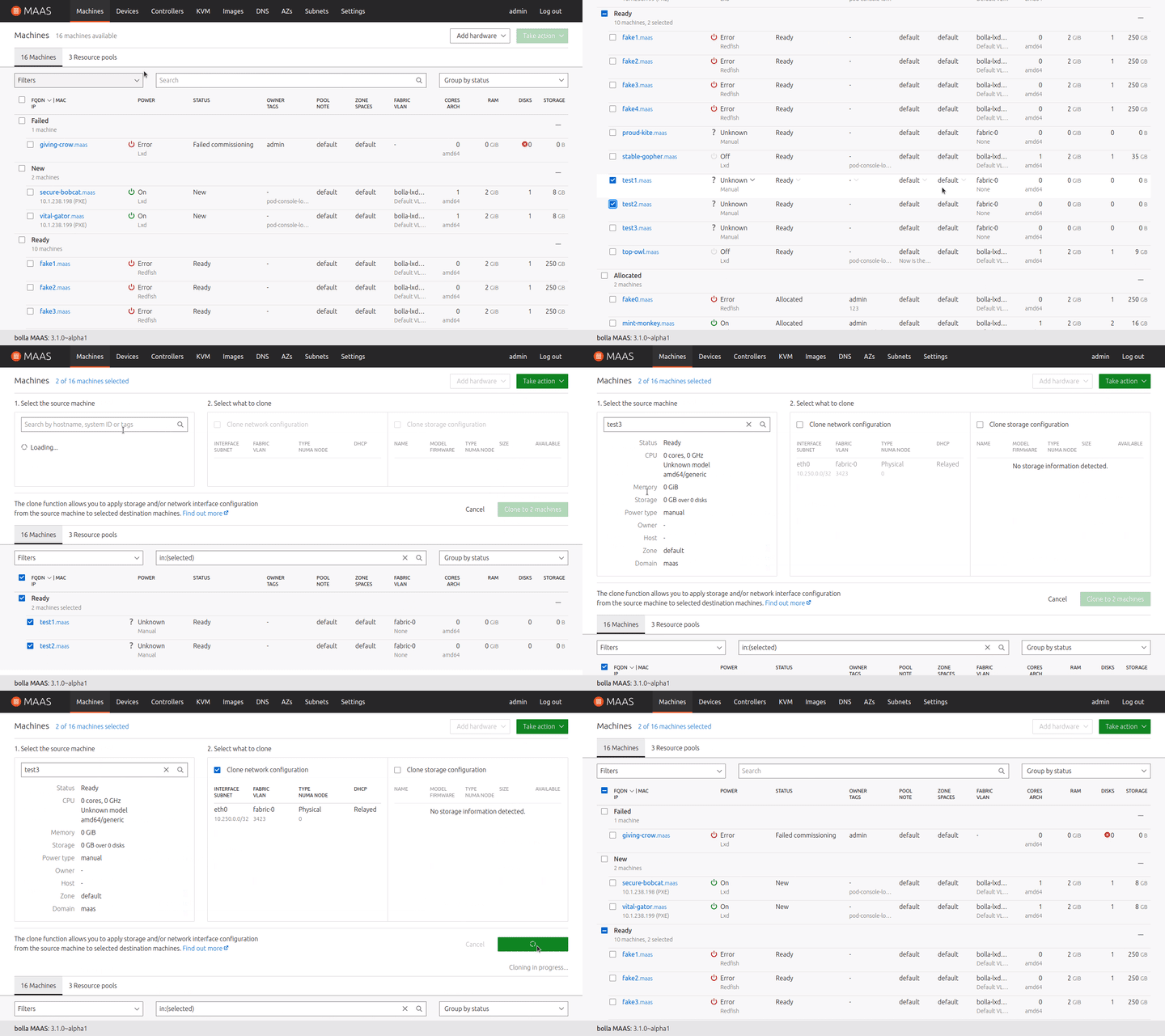
The machine cloning feature is near completion. This feature allows a user to “clone” one machine’s networking or storage configuration to one or more other machines, saving a lot of otherwise manual effort. The success flow now works as intended – just need to do a bit more work on error handling.

Vanilla
The Vanilla team designs and maintains the design system and Vanilla framework library. They ensure a consistent style throughout web assets.
Updates to form validation
Together with Beth who joined our squad as quest developer for this iteration we worked on updating the style of required fields and validation in Vanilla.

Removing deprecated code for Vanilla 3.0
We started working on removing any deprecated code from our Vanilla 3.0 branch. This allows us to clean and simplify the codebase for the upcoming release.
Nearly 20 components or their parts have been deprecated in Vanilla and removing them allowed us to reduce the codebase by over 1500 lines of code so far.
More organised way to document Vanilla design system
Our team reviewed the current components and patterns in Vanilla, and came up with a taxonomy to better organise variances of each one of them.
Each pattern will be broken down into variants, features, kinds, themes and other styling options as below. This will help to build deeper categories of our library to accommodate more differences, and identify where more detailed usage documentation is needed.

This will also be reflected in the new component/pattern page design. Customisations will be allowed by dropdown menus and toggles within the demo box, for designers to pick the right style for their purpose of design, and for developers to compose the right style and copy the code straightaway.

Marketplace
The Marketplace team works closely with the Store team to develop and maintain the Snap Store site and the upcoming Charmhub site.
Onboarding
We are pleased to onboard a new member of our team: Ana Sereijo.
She will support AnnSo and Dani as a UX Designer and make the whole team happy!
Brand store viewer pages

The work for Snapcraft brand store pages continues with the first iteration of building the viewer role pages. This involves removing actions only available to admins as well as access to members, invites and settings pages. There are also UI updates such as adding a filter and icons to the side navigation, as well as changing how the snaps are represented in the main table.
Brand store admin Pages
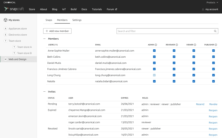
We have been working on the last UX pieces of improvements for the brand store admin pages, looking at the member page and the subnavigation. Some visual review still has to go before finishing the implementation.

Charmhub

We have improved the way we show multiple platforms in a charm page.
Up to 2 platforms can be shown in this layout variation. Any more than this the layout should switch to the 3-5 option below.

Mouse-over an OS icon will display the series below and should change into an active state (coloured).
Clicking the icon will fix the layout to the chosen OS and display the number of series associated with it.
Workplace engineering
The Workplace Engineering team works with the Human Resources department. The team builds internal tools to make life easier for every employee at Canonical.
360 Historical views
Every six months we run a tool called 360 for every employee. It allows us to review the people that we work with and get feedback on how we stand in the company. This tool was built internally.
Timeline
The tool has been running for a few years. In order for users to jump in time to see their previous reviews we integrated a clickable timeline within the result section of the tool. This timeline reloads the content of the page to show the relevant content of the selected iteration of 360.

Colors accessibility
To make sure the graphics shown in the tool are accessible for everyone, we also revisited the set of colors displayed.

Team posts:
With ♥ from Canonical web team.
Talk to us today
Interested in running Ubuntu in your organisation?
Newsletter signup
Related posts
From inspiration to impact: design students from Regent’s University London explore open design for their dissertation projects
Last year, we had the opportunity to speak at Regent’s UX Conference (Regent’s University London’s conference to showcase UX work by staff, students, and...
Showcasing open design in action: Loughborough University design students explore open source projects
Last year, we collaborated with two design student teams from Loughborough University in the UK. These students were challenged to work on open source project...
Design and Documentation clinics at FOSDEM Fringe 2026
FOSDEM is one of the biggest and most exciting open source events of the year, held at the Solbosch campus of the Université Libre de Bruxelles (Brussels),...
