Design and Web team summary – 5 March 2020
Anthony Dillon
on 5 March 2020
Tags: Design
This is the final week before the team is all off the Frankfurt for co-located sprinting on some features and products. So, watch this space. This was a fairly busy two weeks for the Web & Design team at Canonical. Here are some of the highlights of our completed work.
Web squad
Our Web Squad develops and maintains most of Canonical’s promotional sites.
Migrate usn.ubuntu.com to ubuntu.com/security/notices
The team has been collaborating closely with the security team to rebuild the old usn (Ubuntu security notice) website with a new modern infrastructure which provides feeds for us to render the listing and details of a in ubuntu.com itself. This section has been completely redesigned from the information architecture to the visual look and feel.

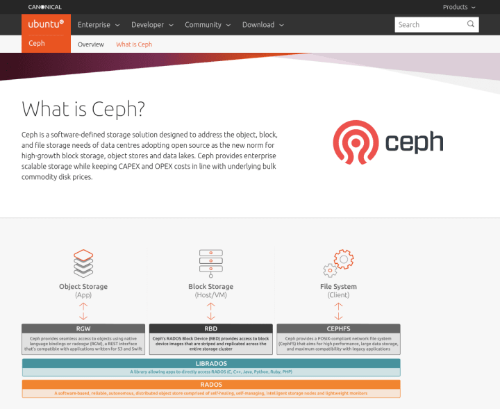
New ‘What is Ceph?’ page
To support the new upcoming release of Ceph the Ceph section of the ubuntu.com website is in the process of a revamp and as part of this work a new page has been written, designed, built and deployed. Find out all you need to know about what Ceph is including diagrams on the new page.
Cypress testing of ubuntu.com forms
For the most part ubuntu.com is a static content site but there are some functional parts which is important that we are confident have no issues or breaking changes introduced. Cypress is an open source, front-end testing tool framework which runs the site on headlessly and tests scripted interactions and responses.
Now, we receive a daily report on all interactive tests across the website which for now includes the forms and form submissions on the site.
Image performance improvements of ubuntu.com
The largest assets across our websites are images. To tackle this we need to lazyload and provide `srcset` to conditionally deliver the optimal size image for the device its rendered on. This increases the markup needed to include an image on the site significantly.
To improve the developer experience we create a image-template module which is included in all of our websites. We have replaced all hardcoded images with image-templated images to lazy load images outside of the viewport to improve page load times.
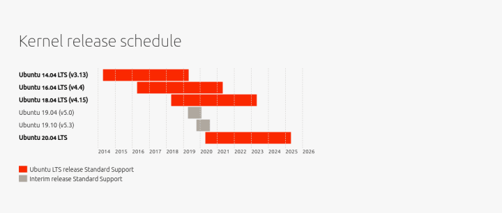
Added a kernel lifecycle page
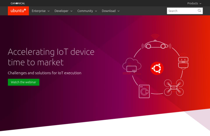
New takeovers

Design support for events
Supporting the Marketing Team for a number of upcoming events.

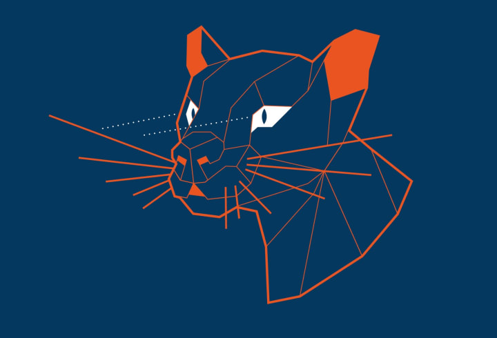
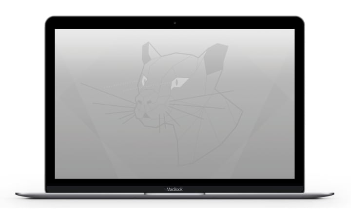
Focal mascot creation
The new mascot and desktops have been created for the Focal Fossa 20.04 LTS release.

MAAS
The MAAS squad develops the UI for the MAAS project.
Machine list – continued
We are continuing with moving to React and improving the machine listing of MAAS. This iteration we completed the first steps of the Global take action menu, completed the work on in-table actions and errors, warnings, and notifications.
There are a couple of things to complete, however we are still ahead of schedule.
LXD driven VMs – KVM pages wireframes

With the introduction of LXD as a KVM host in MAAS, we are expanding the Enhanced Platform Awareness (EPA) of the application. Users will be able to view detailed resource breakdowns on cores, RAM, and virtual NICs (powered by SR-IOV) per NUMA node of the machine. This will be the first step to allowing users to pin virtual machines on creation to specific NUMA nodes in the UI, utilising the reduced latency when all resources are in close proximity on the host hardware.
Machine details – user testing
Next week our team will be meeting all the engineering teams for a sprint week in Frankfurt. As this is a rare opportunity to meet face-to-face we will use it to user test one of the most used parts of the application – machine details. We are very lucky to have many internal users of MAAS, making the sprint week an excellent chance to get their feedback.
JAAS
The JAAS squad develops the UI for the JAAS store and Juju GUI projects.
This iteration landed quite a few changes around the filtering of models in the JAAS Dashboard that is planned to replace the Juju GUI later this year. Users can now filter models based on Clouds, Regions and Owners.

In the model details view, users can toggle the display of the different tables. The values of the filter drop-down panel are fetched from the information of the models, and users can now easily filter out the table with pre-composed tags/pills. These tags work as a toggle selection that users can compose.

Filters are now active also in the model details view. Users can compose their toggle selections to see, for instance, just the ‘app + units’ list of the model. This interaction is especially useful for long and complex models and deployments.
Please take pre-alpha build of the JAAS dashboard for a test drive and provide feedback on the repo.
Vanilla
The Vanilla squad designs and maintains the design system and Vanilla framework library. They ensure a consistent style throughout web assets.
Improve the current release process
We are using release drafter which builds a changelog from the pull requests closed, grouping them by the labels used. Once the GitHub release has been done, a GitHub actions workflow is automatically kicked off to build, test and publish the latest version of Vanilla framework to NPM and the asset server.

Design sidebar navigation pattern
We previously had a side navigation pattern a while ago which was removed as it was overly complicated and we didn’t see much usage. We now have a number of use-cases such as documentation layout and applications.
This pattern has been designed to accommodate a divider between navigation sets. Icons on the right and indicators to the right of the navigation item. We will now have a consistent style for highlighting the selected item and item hovering.

Vanilla React Patterns
Modular table component

This iteration we compared how the different ways in which we perform grouping in our web applications. We identified the strengths and weaknesses of each and made a draft proposal for a consistent, unified approach to grouping that serves all our existing products equally well.
Search and filtering benchmarking
The team is continuing working on an advanced search/filter component that can be used across our portfolio of applications, services and websites. The current JAAS dashboard filtering includes part of this work and can be considered as a first iteration. The goal is to include MAAS and other platforms as well.
Snapcraft
The Snapcraft team works closely with the Snap Store team to develop and maintain the Snap Store site.
Build snap improvements
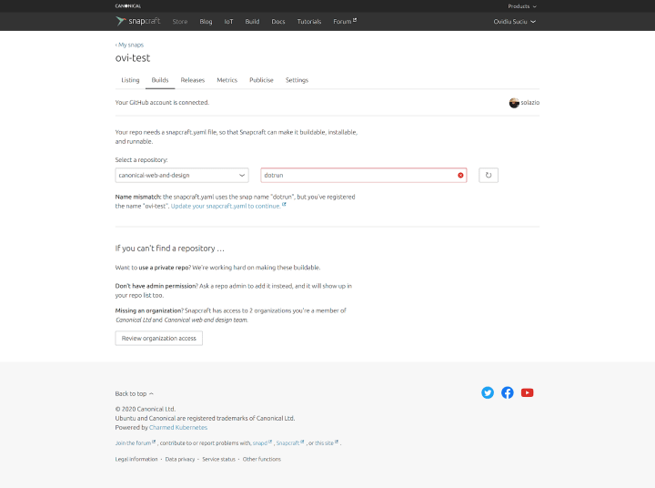
Part of moving build.snapcraftt.io to snapcraft.io/[snap_name]/builds, we implemented a better, more intuitive “build” flow. With the new flow, if your snap is already connected to a GitHub repository you will see a build table which contains all the builds of the snap so far.

In case you have no GitHub repository connected to your snap, you have the possibility of connecting to a repository (from any organization you have access to) and then make use of the automatic builds when the repository is changed.
Updates to first snap flow
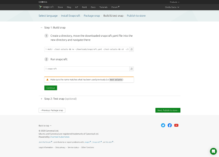
The “First Snap Flow” was improved by merging “Build” and “Test” (only available for MacOS) into one section “Build & test” with the test part being optional for both Linux and MacOS.
Travis snap flow feature exploration

We worked this week on a user flow that would allow users to build their snaps using Travis CI. Up until now they have been able to use this as an experimental flow using the CLI, and this flow would allow them to set it up using the UI.
The main stages of the flow are:
- Connect a GitHub repo to Snapcraft and make sure it includes a snapcraft.yaml and a .travis.yml files.
- Log in to Travis CI and add the repo.
- Authorise Travis CI to be able to release the snap to the latest/edge channel on Snapcraft.
Talk to us today
Interested in running Ubuntu in your organisation?
Newsletter signup
Related posts
Showcasing open design in action: Loughborough University design students explore open source projects
Last year, we collaborated with two design student teams from Loughborough University in the UK. These students were challenged to work on open source project...
Design and Documentation clinics at FOSDEM Fringe 2026
FOSDEM is one of the biggest and most exciting open source events of the year, held at the Solbosch campus of the Université Libre de Bruxelles (Brussels),...
Open design: the opportunity design students didn’t know they were missing
What if you could work on real-world projects, shape cutting-edge technology, collaborate with developers across the world, make a meaningful impact with your...
