Design and Web team summary – 30 July 2021
Peter Mahnke
on 5 August 2021
Tags: Design
The Web & design team at Canonical run two-week iterations building and maintaining all of the Canonical websites and product web interfaces. Here are some of the highlights of our completed work from this iteration.
Meet the team
My name is Scott Mason-Nash, and I’m a web engineer. I joined Canonical’s web and design team in May 2019; initially I worked in the web squad for a year, where I had the opportunity to work on a handful of big, interesting projects, one of them being the Ubuntu Advantage store.
I have since joined the Vanilla squad, where I get to work on the team’s CSS framework. It’s been very satisfying to get to grips with the framework, and understand how a well maintained system like this can really help achieve a consistent look across a ton of different websites and apps.
I’m very passionate about accessibility; it’s important to me that the work we do can be readily experienced by people from all walks of life, and though there continue to be – and will always be – ways we can learn and improve, it’s been great to be able to help push accessibility forward on the Vanilla squad.
Outside of my work, I recently moved to Cardiff from London, where I am still getting used to the incredible scenery. I am also a proud dad who loves baking, climbing, movies, and video games.

Web
The Web team develops and maintains most of Canonical’s sites like ubuntu.com, canonical.com and more.
New page for Blender support

This iteration we created a more permanent location to help users learn about Canonical’s support for blender.
Learn more about blender support
Hardware certification filter and search result updates
This iteration, the web team has been working on some UX improvements to the Hardware certification section of ubuntu.com. We’ve improved the design of the cards, added the ability to select how many results per page, and added expandable sections to view more, or view less filters. You can also choose to open or close each filter section depending on what you are looking to filter by.
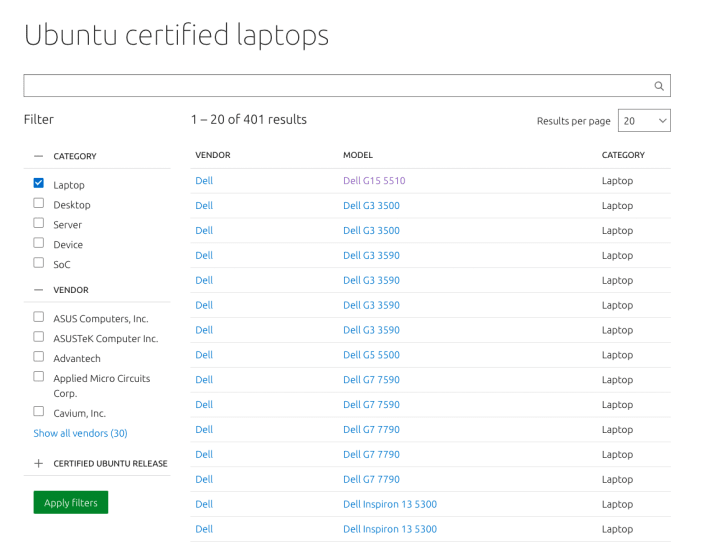

Visit the hardware certification pages
Brand
The Brand team develop our design strategy and create the look and feel for the company across many touch-points, from web, documents, exhibitions, logos and video.
Marketing support
We worked closely with the Marketing team this iteration to produce a number of documents from Whitepapers to Case studies.

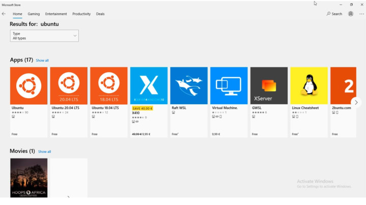
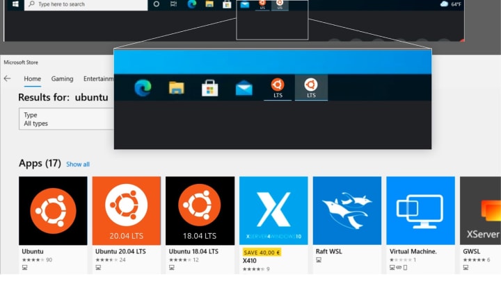
WSL logo presence
Working with the WSL team we are looking at ways to improve the presence of Ubuntu on Microsoft and how we can differentiate between different versions of Ubuntu in the UI.
Event branding
Our Product management team is hosting an event with three partners to promote the use of open source within a business environment. We were tasked with creating a logo and branding for the event that encompassed all four companies in some way, as well as creating some social ads in our Canonical style to promote the event.


Apps
The Apps team develops the UI for the MAAS project and the JAAS dashboard for the Juju project.
MAAS LXD authentication enhancements
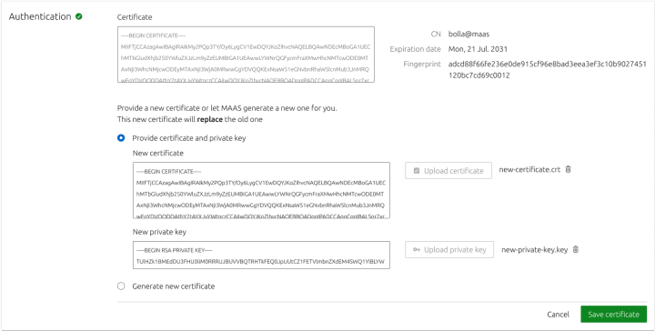
This iteration, we want to make authentication with LXD more secure in MAAS. Originally, when authenticating with LXD, MAAS only requires the LXD host address and optional trust password. However, we want to establish a more secure connection between MAAS and LXD using a certificate to authenticate. With that in mind, we drafted out a prospective authentication flow for the purpose of security and error tolerance as our main focus, while making the experience easy to use.

The current problem with our authentication is that when establishing a connection between LXD and MAAS, MAAS will generate a different certificate for each authentication even though it is with the same server. So we tried to fix this problem and use the same key for the same LXD server. When generating a certificate with MAAS,
MAAS will generate a secret key and certificate pair to use with a LXD server. Whereas the MAAS name is used as a CN.
If a user also already has a certificate generated from their LXD server they can `curl` their certificate from LXD and add it to MAAS as an alternative way to authenticate.
The key points were the following:
- Users should be able to provide an external certificate with its private key.
- They could also generate a certificate in MAAS.
- Certificates have to be trusted in LXD through a CLI command.
- Authentication details and the ability to renew the certificate should be included in the Settings section of KVM.
With that in mind, we took the current flow and added some functionality in a prototype.

From the KVM section, clicking on Add KVM a form will show up. Instead of the authentication password, now we have two authentication options:

Users can either provide a certificate or generate it in MAAS. After that, the certificate has to be trusted in LXD.

As soon as it is successfully trusted, MAAS will fetch the LXD projects, users will select one or create a new one, and the process will finish there.
The new KVM will be connected to the LXD server as long as the certificate is valid. In order to manage the authentication details, a new section called “Authentication” has been created inside the Settings tab. This section contains the certificate with its CN, expiration date and fingerprint.

A button allows users to manually Update the certificate. The process is exactly the same as for the first certificate: provide it or generate it, and trust it in LXD.


Finalising the cloning UI design
We completed the high-fidelity visual designs of the Cloning UI feature:
Searching for, and selecting a machine to clone from:
Selecting what to clone from the chosen machine:
Reporting any errors that occurred during the process
In a slight departure from the original plan, we group the errors by type of error (there are 5 possible error types), rather than reporting them per machine, as there could be hundreds of machines and a list wouldn’t be useful.
One of the problems that we tried to solve in this iteration was how to show the failed cloning machines in a scalable way. For instance, if someone decides to clone 100 or perhaps, 1000 machines, how might we show these errors in a way that is efficient?
We’ve learned from our cloning API that there are 6 criteria for cloning to be successful, meaning they will clone successfully in a homogeneous hardware environment. For instance, the source and destination machines need to be in the same boot method, have the same physical interface, same block device, and the destination disk must not be smaller than the source machine. On top of that, destination machines need to be in a valid state for cloning such as ready, failed testing, or allocated. With this in mind, we realised that there will be 5 types of error when the machines fail cloning. So we solve this problem by grouping the failed machines with the same error message in one bucket. As shown in the image below.
Instead, clicking on the error type filters the machine list to display all the machines that encountered the respective error. This will create a persistent url that can be navigated back to in case you move away from the page.

The blue link shows the error message and once clicked, it will filter the machine list to show only those machines. A failed cloning machine can have multiple error messages, however, when you filter them, you will be able to see the failed cloning machine in multiple error categories.
Vanilla
The Vanilla team designs and maintains the design system and Vanilla framework library. They ensure a consistent style throughout web assets.
Component/Pattern page User Testing Report
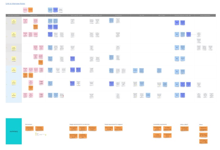
With the goal to bring live examples with documentation, and to assist designers and developers better to find information on components and patterns, we designed 2 versions of the page – A split by discipline (design, implementation and accessibility), B split by variants.
Seven user testing were conducted to align the usage for each role to the designs and spot unaddressed problems. Thematic analysis is done as below, highlighting the occurring problems and requirements of each theme.
Overall, our team prefers to view component and pattern details by discipline, which helps them to overview all variants quicker and read relevant information efficiently. But the general structure of our patterns need more depth and classification. We will address these issues in the next iteration’s “Documenting Design system” epic.
Documentation updates
We also spent some time bringing Vanilla’s documentation up to date, in particular how to build Vanilla with dart-sass, how to customise icons, and making import instructions clearer.
Converting our component library from Sketch to Figma
We’re making progress on the new Vanilla Figma library. So far we’ve created Inputs, Buttons, Checkboxes/radio buttons and a Contextual menu:
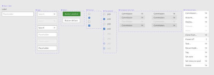
We’re carefully recreating each component, ensuring the vertical rhythm and baseline grid that is so important in the live Vanilla framework is accurately matched in the figma version of the components:

Marketplace
The Marketplace team works closely with the Store team to develop and maintain the Snap Store site and the upcoming Charmhub site.
Survey results page improvements
A few weeks ago we released a new page with the results of a large survey that the company did on Kubernetes and cloud native operations. This week we have been looking at the metrics on this page and thinking of ways in which we can improve it. Main takeaways are to focus on insights more than the raw data, and to improve navigation and hierarchy so it’s easier to absorb as much information as possible at a glance.

Brand store admin pages improvements
This iteration we have been focusing on making some incremental improvements to the admin page specifically around removing Snaps from a Store list.
Previously we had a bin icon on each row which wasn’t reflective of the action performed. When you click the icon, the Snap is removed from your store list rather than deleted.
We introduced checkboxes so you can multi select Snaps from your list and batch remove as well as retain the ability to remove Snaps individually by hovering over a row and clicking the Remove button.

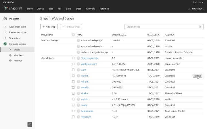
Also we added a layer of visual confirmation for removing or adding Snaps by incorporating a toast notification with the ability to undo your action.

Workplace engineering
The Workplace Engineering team works with the Human resources department. The team builds internal tools to make life easier for every employee at Canonical.
Dashboard to help improve our hiring process
Canonical is growing. The company currently has more than 100 open jobs. It can be overwhelming for hiring managers to track all the great applications that we receive every day. To manage those applications we use the service Greenhouse. It is a very complete hiring tool that offers a lot of control, but it can be difficult to read and use for hiring managers.
The team is building a dashboard that would consume Greenhouse API and a database to help the hiring managers, the recruiters, and the people that pass interviews. This dashboard will show very simple and actionable information. We currently bootstrapped the application with a react application and a flask backend. More to come in the future!

The information on this screenshot was blurred for privacy reasons.
With ♥ from Canonical web team.
Talk to us today
Interested in running Ubuntu in your organisation?
Newsletter signup
Related posts
From inspiration to impact: design students from Regent’s University London explore open design for their dissertation projects
Last year, we had the opportunity to speak at Regent’s UX Conference (Regent’s University London’s conference to showcase UX work by staff, students, and...
Showcasing open design in action: Loughborough University design students explore open source projects
Last year, we collaborated with two design student teams from Loughborough University in the UK. These students were challenged to work on open source project...
Design and Documentation clinics at FOSDEM Fringe 2026
FOSDEM is one of the biggest and most exciting open source events of the year, held at the Solbosch campus of the Université Libre de Bruxelles (Brussels),...
