Design and Web team summary – 27 May 2020
Anthony Dillon
on 27 May 2020
Tags: Design
The web team here at Canonical run two-week iterations. Here are some of the highlights of our completed work from this iteration.
Meet the team

My name is Bartek (also known as bartaz around the interwebz). I live in Poznań in Poland and I’m a web developer. I’ve been a software developer for over 10 years now, working in front-end related technologies for most of this time. IE6 was still a thing when I started trying to make browsers display what I want them to, jQuery was not a thing yet, and nobody even dreamed of React.
I joined Canonical four years ago as a front-end developer to work on snap store dashboard and after about a year I moved to the Web and Design Team, where I continued working on snap related projects such as snapcraft.io and build.snapcraft.io. A couple of months ago I moved to Vanilla squad where I develop and enhance our Vanilla framework.
In my free time (at least as much as my kids allow) I like to play board games of all shapes and sizes or spend long evenings and nights painting miniatures for these games.
Web squad
Our Web Squad develops and maintains most of Canonical’s promotional sites like ubuntu.com, canonical.com and more.
Takeovers and engage pages
We had quite a lot of marketing activity this week; a webinar detailing how open source can be leveraged with Ubuntu Pro on Azure, a Pre-kubecon event registration page. We also released two new whitepapers on IoT Device Management and Core and snaps – embedded updates.
Latest news Javascript module
A new npm package latest-news was developed and distributed this iteration. The package acts to consolidate the client-side blog-feed which is used throughout a number of our websites.

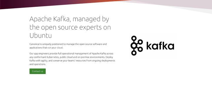
New Apache Kafka page
Canonical is uniquely positioned to manage the open-source software and applications that run your cloud. Which includes management of Apache Kafka across any conformant Kubernetes, public cloud and on-premise environments.
The web team have worked closely with our product manager to create a new Kafka offering page.
Brand
The Brand team develops our design strategy and creates the look and feel for the company across many touch-points, from web, documents, exhibitions, logos and video.
Brand hierarchy
We conducted some analysis of the strategy and positioning which Apple adopts to its products and logos as part of our ongoing hierarchy project.

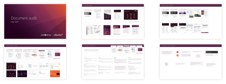
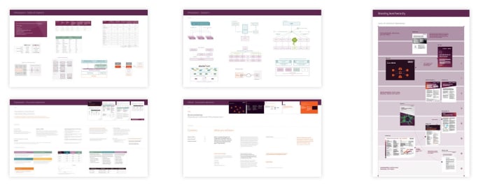
Document hierarchy
Our suite of documents and templates are in need of aligning with our updated brand style. In this iteration, we did an audit of the current documents and the type styles, graphics and tables used currently.
Social creative
We worked with the Marketing Team to produce some assets to promote the adoption of Ubuntu Pro and Snaps by Bosch-Rexroth.

MAAS
The MAAS squad develops the UI for the MAAS project.
Single SPA
The MAAS UI project is now in its second phase of migrating into ReactJS. Due to some legacy code from our angular 1.X app, we migrated both apps into single SPA. Our templating issues in CSS are now fixed, but some static assets in twister needs to work properly. The team is working on finalizing the work for the 2.8 release.
Documentation Research
In this cycle, we want to take a step back and look into our MAAS documentation. There are many areas of improvements in our documentation from understanding how our users are using it and from the technical writer’s perspective. In this iteration, we started working on the initial research for maas.io and understanding how we can help our users look for contexts that they need either personalised or generic. We hope to create better engagement in the documentation and increase discoverability for topics that our audiences are looking for. Stay tuned for more information and if you would like to add your view please leave us a comment on MAAS Docs Feedback. Your feedback is a gift.
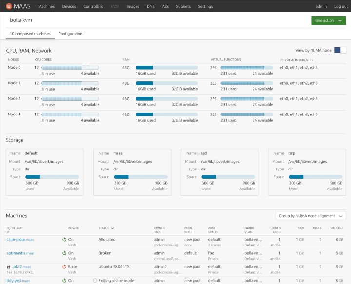
NUMA aware VMs
NUMA aware VMs have been our focus since the previous cycle and in this cycle, we are going to build them as part of our React migration work. This is the 6th iteration of our design for NUMA node storage labels to show NUMA details of the KVMs. Thanks to our Visual Designer, Lyubo, we now have a more robust design that helps us utilize the white spaces better.
The Future of Logs
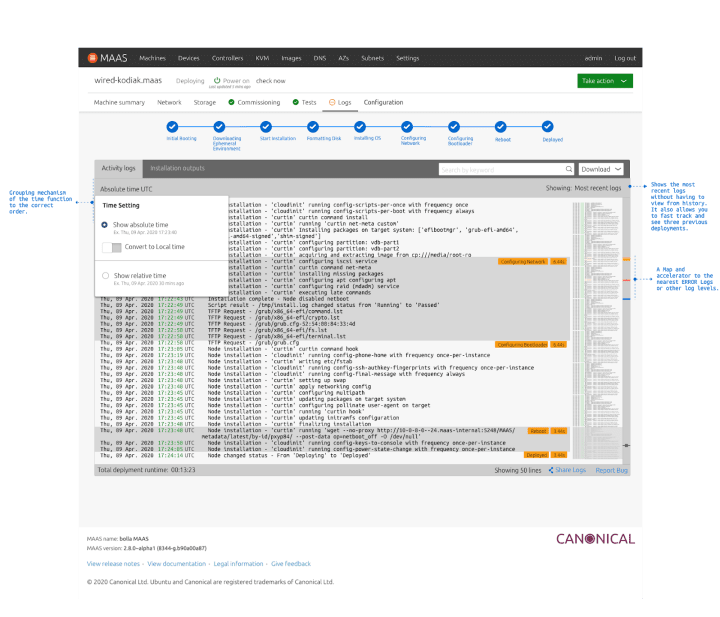
Here is a little preview of the future of our logs in MAAS. After discovering some flaws in the previous design, we have revisited a few places that our users struggled with during our testing session. We have added an accelerator for the logs using the map and colour indication on the scrollbar to show a preview of where the closest error/warning is at. We have also regrouped a few components such as the time functionality and the search functionality to closer proximity to our target area (terminal) in order to reduce delay in the interaction. We are still working on the final version of this log and waiting for feedback from the team going forward.
JAAS
The JAAS squad develops the UI for the JAAS store and Juju GUI projects. This sprint was largely a maintenance sprint as we cleared off many small bugs. This was in preparation for a huge milestone where we are now shipping our dashboard product directly with Juju from 2.8 onwards.

Dashboard in Juju 2.8
From the Juju 2.8 release users will be able to launch the JAAS dashboard from the Juju controller directly by running the new dashboard command: juju dashboard.

Search and filter
The team worked on the definition of the first implementation for the JAAS Dashboard from the recently outlined ‘Search and filter’ wider and modular UX/UI pattern. Defining a set of initial features and interactions helps to implement an MVP functionality that we can continue to iterate.
Vanilla
The Vanilla squad designs and maintains the design system and Vanilla framework library. They ensure a consistent style throughout web assets.
Accessibility updates

We’ve updated the :link, :visited and :focus colors used across Vanilla. The updated blue has a higher contrast against light colours, which makes it accessible on a wider range of backgrounds. We’ve also fixed some accessibility issues with focus states.
Updated documentation layout rolled out for Snapcraft

We updated the Vanilla side navigation pattern, so it works well with our documentation sites generated from Discourse. Together with the Snapcraft team, we worked on updating snapcraft.io docs to new layout and side navigation.
Updated icons

We updated Vanilla icons to the latest set provided by our brand team. We have only updated the icons that already existed in Vanilla, but we plan on making the whole set of new icons available via Vanilla package for our product teams to use.
Snapcraft and CharmHub
The Snapcraft team works closely with the Store team to develop and maintain the Snap Store site and the upcoming CharmHub site.
Snap GitHub build fixes
Since launching the build tab for publishers we’ve seen an increase in the volume of the service. With this increase we’ve been picking up on bugs through issues and error logging, as such we’ve spent some time making the UI more robust, here are a few of the issues we’ve worked on:
- Inputs disappear when an unknown error occurs on /builds tab
- Shouldn’t have distro pages for snaps unavailable on that distro’s arch
- build-snapcraft-io seems to require an extreme amount of permissions to my Github account
- Show some information about launchpad builder status on builds tab
- Create new Trigger new build component
CharmHub
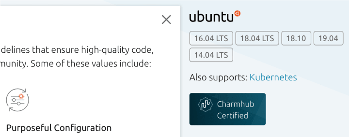
While we push forward with CharmHub, we’ve put the website behind SSO for Canonical employees only. This way we can gather feedback internally as we implement changes and updates without presenting a broken website to the world. We’re currently working on the treatment of Verified Publishers and certified charms and how they fit in the CharmHub world. We’ve also been fixing bugs in the store UI and implementing more informative pages to describe what CharmHub is.
Maintenance
- Release UI: Upgrade to using the new /channel-map endpoint
- Branch expiration dates are hardcoded to the creation-date + 30 days
- Setup renovate
- Search auto-focus and/or hotkey
Ubuntu Advantage
Our Ubuntu Advantage page currently tracks UA subscriptions for people running Ubuntu 14.04 ESM. We are looking to expand its scope, and this week we held a design workshop to explore how that might look and work. Designers, front-end and back-end engineers, sales staff, and the Ubuntu Advantage product manager collaborated online using Google Meet and the Miro whiteboard app.

Team blog posts:
We wish good health for you and your families during these uncertain times.
With ♥ from Canonical web team.
Talk to us today
Interested in running Ubuntu in your organisation?
Newsletter signup
Related posts
Showcasing open design in action: Loughborough University design students explore open source projects
Last year, we collaborated with two design student teams from Loughborough University in the UK. These students were challenged to work on open source project...
Design and Documentation clinics at FOSDEM Fringe 2026
FOSDEM is one of the biggest and most exciting open source events of the year, held at the Solbosch campus of the Université Libre de Bruxelles (Brussels),...
Open design: the opportunity design students didn’t know they were missing
What if you could work on real-world projects, shape cutting-edge technology, collaborate with developers across the world, make a meaningful impact with your...
