Design and Web team summary – 22 October 2021
Peter Mahnke
on 28 October 2021
Tags: Design
The Web and design team at Canonical run two-week iterations building and maintaining all of the Canonical websites and product web interfaces. Here are some of the highlights of our completed work from this iteration.
Meet the team

My name is Albert, I’ve been working at Canonical for little longer than a year. As a developer I am very proud to be working here, because I’ve alway used a Linux based operating system while developing, and Ubuntu is my favourite distribution.
It’s the first place I got to work in an Open-Source environment. It’s a very different mentality. Everyone can see what you are coding and many times my Git commits feel like a contribution to the community rather than just another bug fix, and it’s very rewarding.
We have a lot of projects that use all kinds of technologies, and there is always the option to contribute to whichever your heart desires to explore. You feel like a child in a toy store.
Outside of work hours, I like to practice martial arts, play chess and eat the best food I can find in London. The rest of my time is usually spent on the internet like a true millennial.
Web
The Web team develops and maintains most of Canonical’s sites like ubuntu.com, canonical.com and more.
In this iteration we finished up most of our work on our inclusive naming initiative and finished deploying a github action to catch any more inclusive language before it is merged. There is still some work to be done but this relies on upstream changes that are out of our direct control.
Anbox updates
Anbox lets you stream mobile apps securely to any device by running Android in system containers, not emulators, on AWS, OCI, Azure, GCP or your private cloud. The web team maintains the management front-end for Anbox and we did some enhancements this iteration.
Empty states message
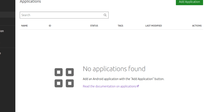
When there is no application or session added to the Anbox instance, we show a message that guides the user on how to use the Anbox application.
In-stream controls
Show a togglable controls bar on top of the stream where we can add multiple buttons that affect the streamed Android application. This menu is designed to scale as we add more functions in future.

Controls bar in desktop
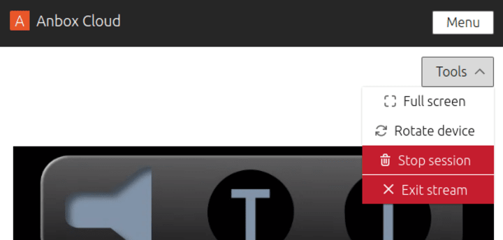
Controls bar in mobile as a dropdown menu
Improve applications list for mobile
Instead of showing all the details of each application in the list, show only the stats, name and creation date of the application and add a button to show more details for the selected application with only one action button: “New session” to make it simpler to create a new session in mobile.
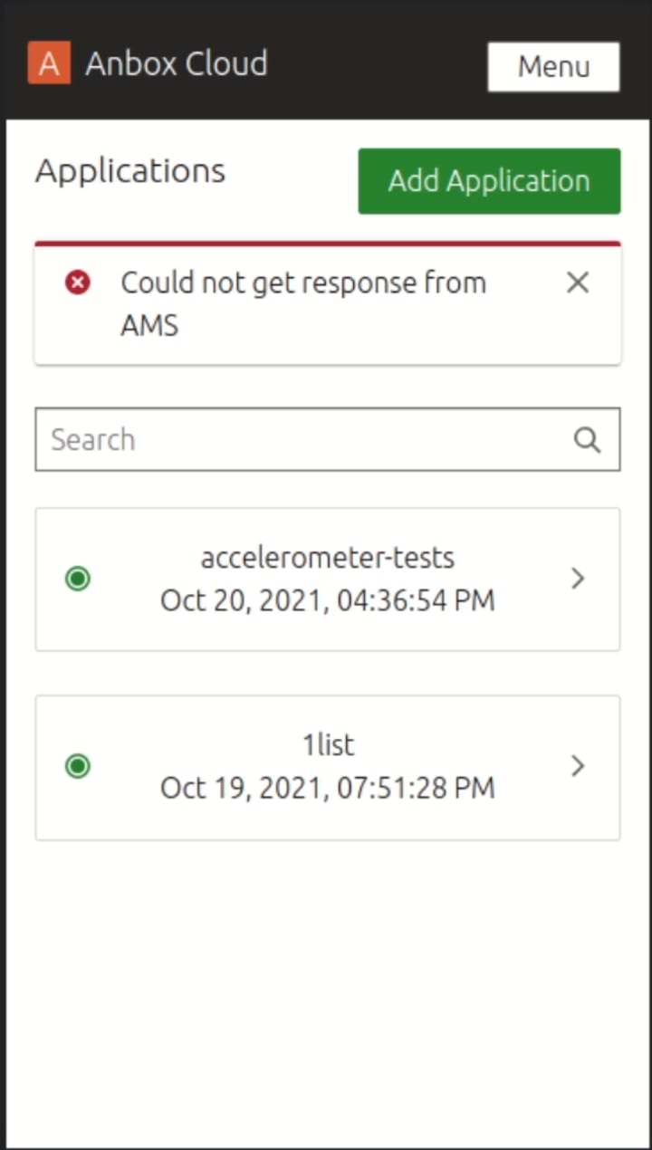
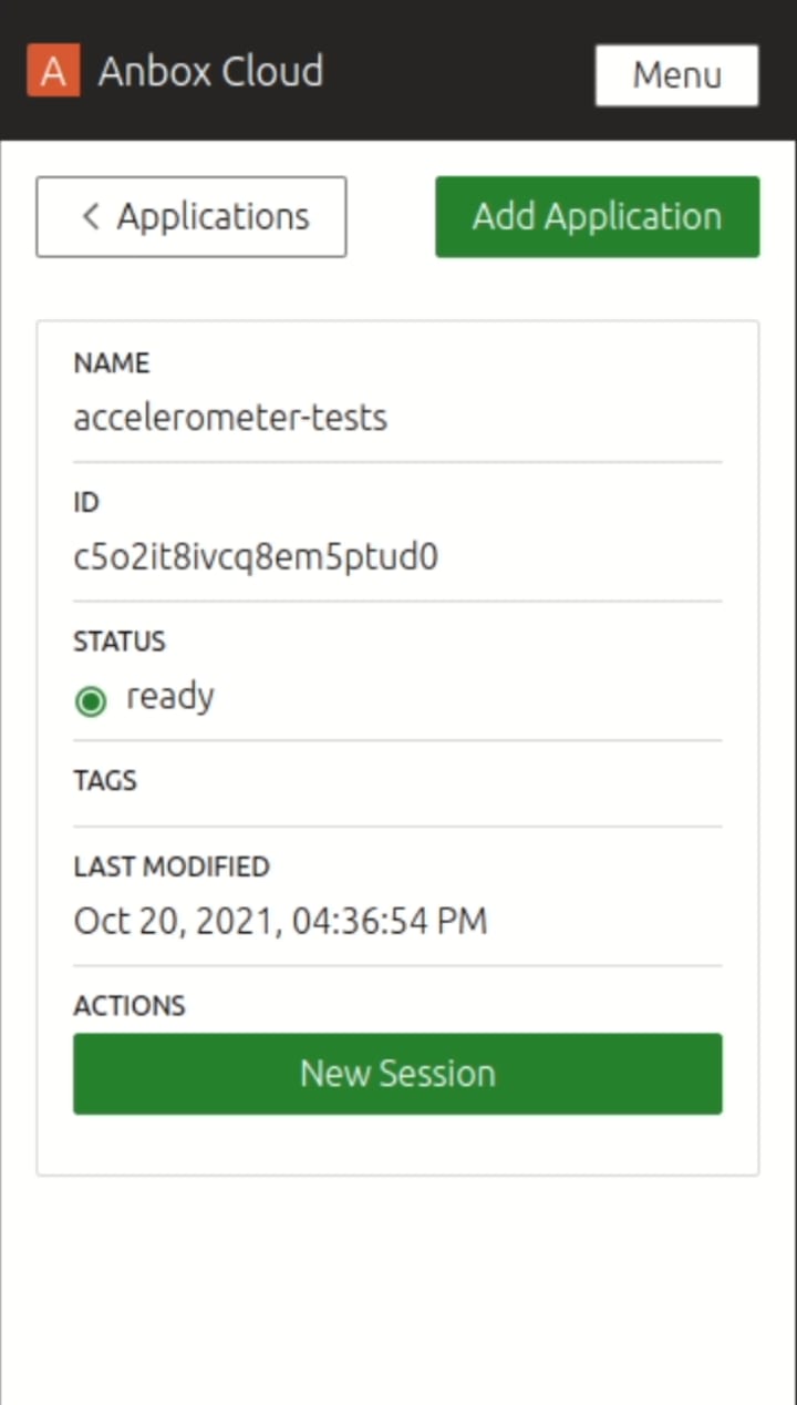
Applications list Application’s details
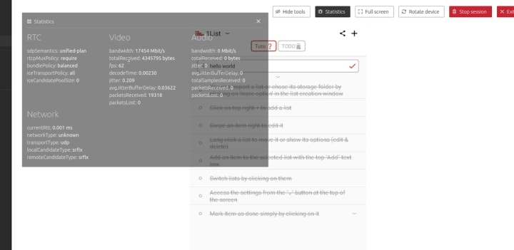
Improve stream stats overlay
Make the stats window a draggable window and more transparent to be able to use the application while showing the stats overlay.
Brand
The Brand team develop our design strategy and create the look and feel for the company across many touch-points, from web, documents, exhibitions, logos and video.
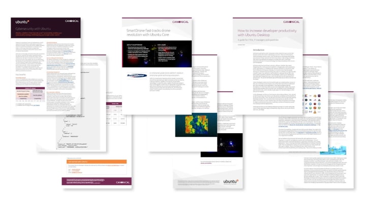
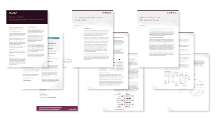
Marketing documents
Working closely with the Marketing team and Project Managers we created a number of documents in this iteration, ranging from case studies to white papers.
Diagrams
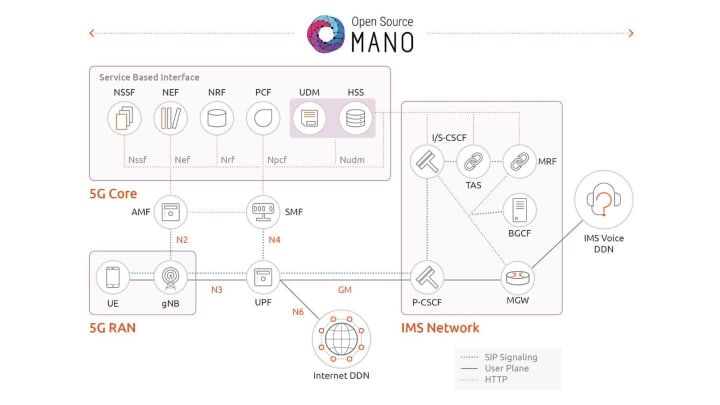
We created a number of diagrams to help explain our work in the Telco space.

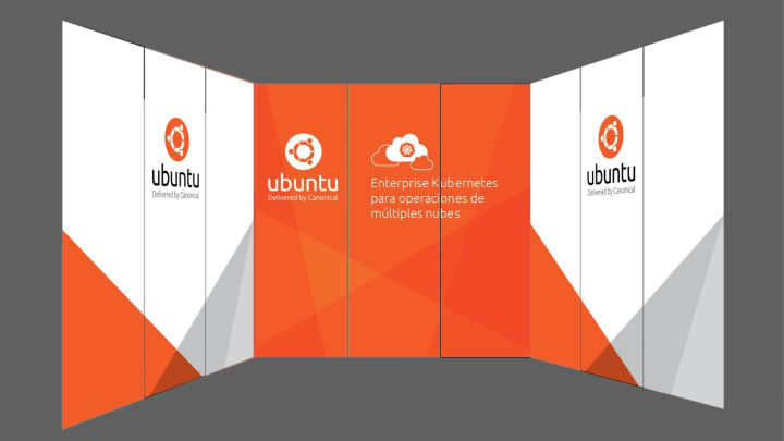
Exhibitions
Back wall graphics and posters were produced for exhibitions we will be attending in Spain and Taiwan in the coming months.


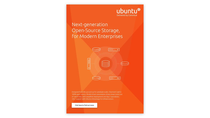
Digital Ad
We produced a digital Ad targeted at the Enterprise to promote our Ceph offering.
IndyCar
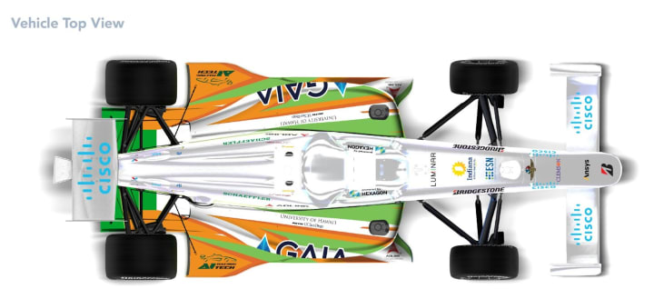
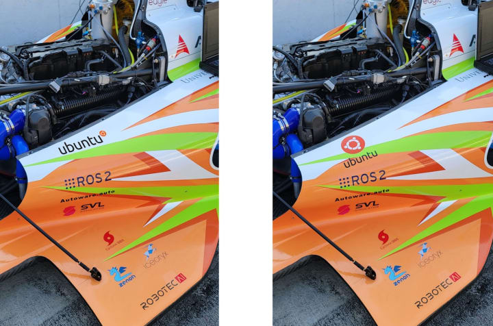
We worked on finalising the size and positioning of our logo with the decal team in the US for our sponsorship in the IndyCar series.
Commercial
The Commercial team maintains and develops all commercial service UI’s provided by Canonical. Including the Ubuntu Advantage store.
User accounts
Up until now, Ubuntu Advantage accounts didn’t expose their multi-user features on the web. It’s been possible to build organisations, but it’s not been very clear or accessible for users.
The new “Account users” view in Ubuntu Advantage is available now and lets our customers add, edit and remove colleagues inside their Ubuntu Advantage accounts. We have added permission levels like “Technical” and “Billing” so you can be sure your teammates see the right information without exposing access to sensitive information.
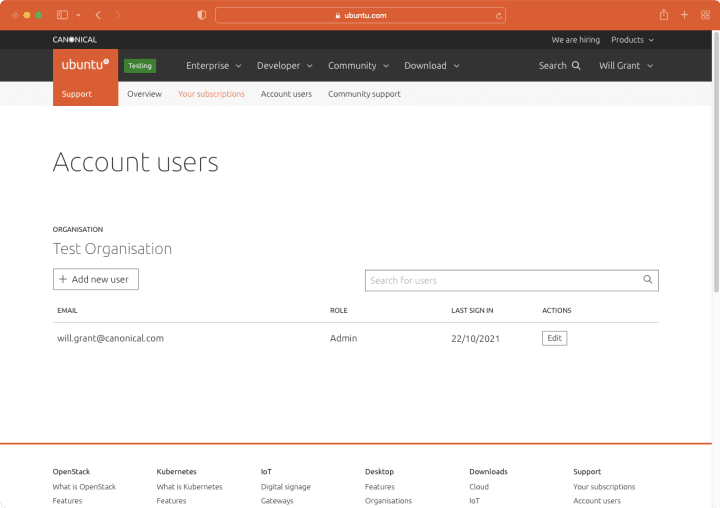
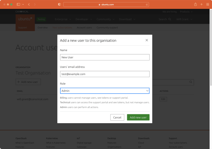
We made sure that people using screen readers can navigate through the list of users effectively by taking advantage of accessible table markup. All success and error messages are announced for assistive technologies so that nobody misses important messages at any step of the process of managing accounts.
Vanilla
The Vanilla team designs and maintains the design system and Vanilla framework library. They ensure a consistent style throughout web assets.
Vanilla 3.0 preparations
Dropping IE support
As part of the Vanilla 3.0 updates we removed support for Internet Explorer. This allows us to remove IE-specific fallbacks and hacks such as custom implementation of the grid.
New navigation search
Together with Min and Fran who joined our squad as quest devs we worked on upstreaming the expanding search box from ubuntu.com to Vanilla. Because of quite significant changes and refactoring of navigation planned for 3.0 release we decided to make this search functionality part of 3.0 release to avoid porting it back to older implementation in current version.

Breakpoints exploration
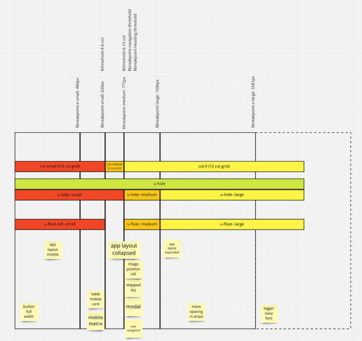
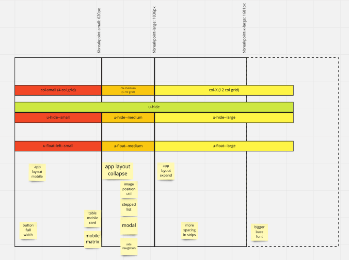
While working on fixes to some responsive utilities we noticed inconsistencies in how different elements of Vanilla handle media query breakpoints.
We noticed that different components and utilities change responsively in different ranges of screen sizes. This causes some confusion and is a source of bugs.
We reviewed our current use of breakpoints across different elements in Vanilla and decided to work on improving the consistency for Vanilla 3.0.
Current (Vanilla 2.x):
Proposal (Vanilla 3.0):
Figma library updates
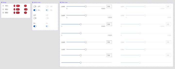
We’re continuing to add new components to our figma library. This iteration we added badges, and redesigned sliders and switches:
New design system site Information Architecture
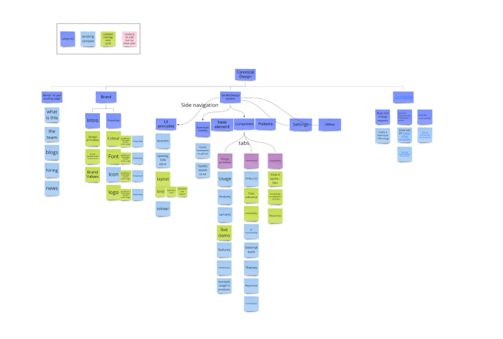
This iteration we did a content audition on our vision of sitemap planned this cycle. By separating the content into ‘existing’, ‘coming this cycle’ and ‘to-add-later’, the Information Architecture of the site coming next cycle becomes clearer.
Marketplace
The Marketplace team works closely with the Store team to develop and maintain the Snap Store site and the upcoming Charmhub site.
Configure bundles
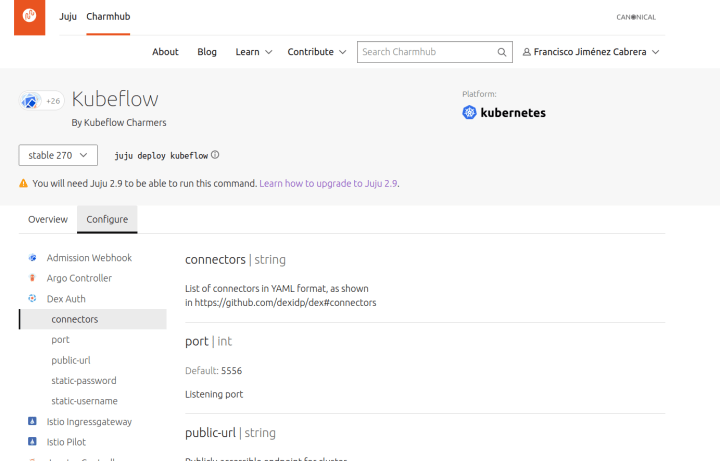
We implemented a new functionality on charmhub to see Bundles configurations for each Charm. You can see this new section by looking at any Bundle page under the Configure tab.
Publishers login
We included a new section in the navigation for authentication, publishers can now modify some information about their packages and register new packages names.

Team posts:
With ♥ from Canonical web team.
Talk to us today
Interested in running Ubuntu in your organisation?
Newsletter signup
Related posts
From inspiration to impact: design students from Regent’s University London explore open design for their dissertation projects
Last year, we had the opportunity to speak at Regent’s UX Conference (Regent’s University London’s conference to showcase UX work by staff, students, and...
Showcasing open design in action: Loughborough University design students explore open source projects
Last year, we collaborated with two design student teams from Loughborough University in the UK. These students were challenged to work on open source project...
Design and Documentation clinics at FOSDEM Fringe 2026
FOSDEM is one of the biggest and most exciting open source events of the year, held at the Solbosch campus of the Université Libre de Bruxelles (Brussels),...
