Design and Web team summary – 20 December 2019
Anthony Dillon
on 20 December 2019
Tags: Design
This is the final iteration of the year. The team has worked exceptionally hard to produce a number of new projects and initiatives. Here is a shortlist of highlights from the team in 2019:
- JAAS dashboard, proof of concept – a new view of Juju for people that have a lot of Juju to list and inspect models and controllers.
- MAAS-UI, migrating to a stand-alone React based frontend codebase. Including a newly designed machine listing with in-table actions, grouping and many more improvements.
- Snapcraft’s team have developed a set of distro pages which have been incredibly popular
- Discourse to docs has been developed and deployed across a suite of sites which rendered an HTML version of documentation authored in discourse.
- Vanilla 2.0 release took 6 months of development refactoring and updating large parts of the framework such as switching the grid system from floats to grid
Web, Ubuntu and Brand squad
Web is the squad that develop and maintain most of the brochure websites across Canonical and is the team that underpins our toolsets and architecture of our projects. They maintain the CI and deployment of all websites we maintain. The Brand Squad are tasked with updating and managing the overall style of Canonical, Ubuntu and the many fantastic products we create both on and off-line.
UI icons
The style has been set and the development of a new set of UI icons is well underway, once complete they will be pushed out across all our products.

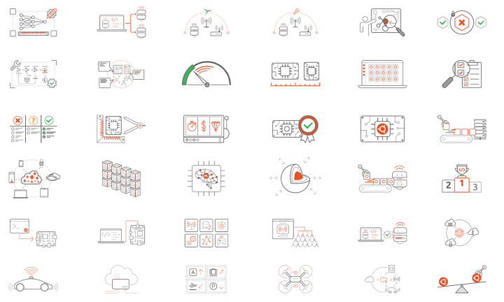
Illustrations
The new illustration style is in place and we have been busy getting existing ones redrawn and new concepts produced.

BlueFin reception
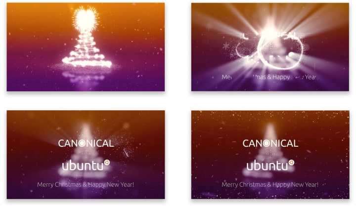
To bring a bit of Christmas spirit to the London office we created a short animation for the reception screen.
Tutorials
The designs for the listing and the tutorial template have been completed and we are in the final stages to the implementation to release ubuntu.com/tutorials.
New internet of things networking page
We designed, built and launched a new page detailing our networking products.
Multipass.run Discourse docs
We updated multipass.run to include documentation originally written on Discourse.
Takeovers and engage pages
This iteration we built two new takeovers and engage pages, updated a third takeover and engage page to include a new whitepaper:
An intro to MicroK8s
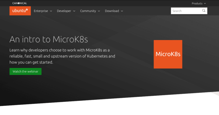
Ubuntu Desktop for the enterprise

From VMware to Charmed OpenStack

MAAS
The MAAS squad develops the UI for the maas project.
Release 2.7
The MAAS UI team performed a full QA of the UI and tightened up many small UI inconsistencies. The team have been supporting the release of 2.7 which is the first release with the maas UI as a dependency on the core product.
JAAS
The JAAS squad develops the UI for the JAAS store and Juju GUI projects.
Grouping of models
As the team take early holidays and wind down before the break. The table grouping of the owners or statuses has landed.
Vanilla
The Vanilla squad design and maintain the design system and Vanilla framework library. They ensure a consistent style throughout web assets.
Ubuntu SSO on Vanilla
We’ve been working on redesigning Ubuntu One SSO service (login.ubuntu.com) with Vanilla patterns. The site has been given a refreshed look and is in the final reviews and QA on staging. With the target to be released to production early next year.

Pastebin on Vanilla
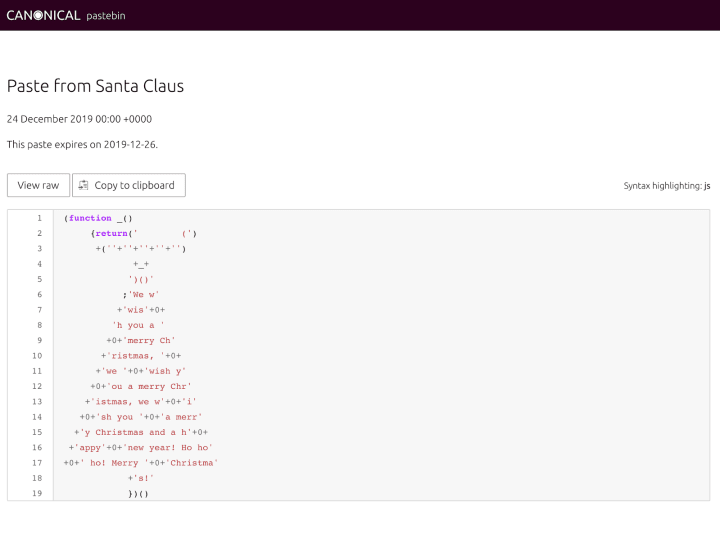
Our internal Canonical Pastebin site was migrated to the latest version of Vanilla and got a refreshed design consistent with Canonical branding.
CodePen examples
We have switched from embedded examples in the Vanilla documentation to using CodePen to display the code and visual of the component. This will hopefully help developers who want to interactively play with a component before using it.
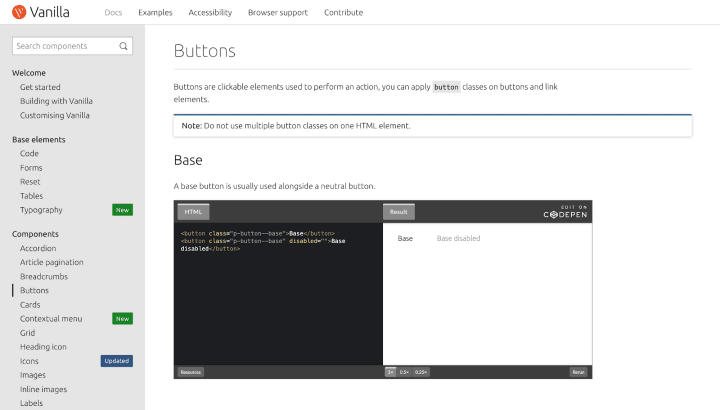
You can now see all the examples embedded in the docs as pens and edit them easily with CodePen.
Snapcraft
The Snapcraft team work closely with the snap store team to develop and maintain the snap store website.
Modularisation of Store API
As snapcraft.io grows and its functionality becomes more complex it makes sense to separate code into modules. This iteration we’ve moved the API request logic of snapcraft.io into its own module. This will allow us to test and update the module independently of the main snapcraft.io codebase while maintaining a consistent public API. It also allows us to experiment with other projects that use the snap store, without needing to reimplement (copy and paste) our previous work.
Code review
Off the back of the Store API modularisation, we took the opportunity to review snapcraft.io’s code more generally. The site is a couple of years old now, and while we make every effort to keep the code clean and well maintained, sometimes it’s good to do a manual review to identify places that can be simplified, abstracted, or generally improved. We identified a number of areas that could do with some attention that we’ll spend some time addressing in the New Year.
Maintenance
- Fixed padding for docs images
- Fixed pixelated banner images on /store
- Fixed an issue with the Save and Revert buttons on the publisher listing page
- Tidied up SCSS units
- Improved navigability of first snap flow
A final note from the team
We hope you enjoy the UI improvements we have brought to the suite of sites and applications over the last year. With many more to come in 2020! We are bursting with ideas and excited to jump into the new year. But, first, we will take a break to relax and be with family. We hope you all do the same and see you in the new year.
See you all in the new year,
The web and design team.
Talk to us today
Interested in running Ubuntu in your organisation?
Newsletter signup
Related posts
Showcasing open design in action: Loughborough University design students explore open source projects
Last year, we collaborated with two design student teams from Loughborough University in the UK. These students were challenged to work on open source project...
Design and Documentation clinics at FOSDEM Fringe 2026
FOSDEM is one of the biggest and most exciting open source events of the year, held at the Solbosch campus of the Université Libre de Bruxelles (Brussels),...
Open design: the opportunity design students didn’t know they were missing
What if you could work on real-world projects, shape cutting-edge technology, collaborate with developers across the world, make a meaningful impact with your...
