Design and Web team summary – 17 June 2022
Anthony Dillon
on 1 July 2022
Tags: Design
The Web and design team at Canonical run two-week iterations building and maintaining all of the Canonical websites and product web interfaces. Here are some of the highlights of our completed work from this iteration.
Web
The Web team develops and maintains most of Canonical’s sites like ubuntu.com, canonical.com and more.
Major update to the ubuntu core page
In this iteration we rolled out a major refresh of the ubuntu core page. Check out the advantages and the key features of Ubuntu Core.

New Kafka page
We’ve also built a page for Apache Kafka® operations. This includes what solutions and managed services Canonical offers for Apache Kafka.
Visit the Kafka page for more information.
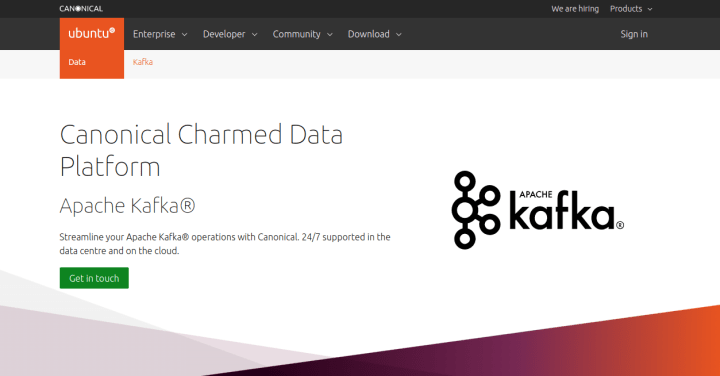
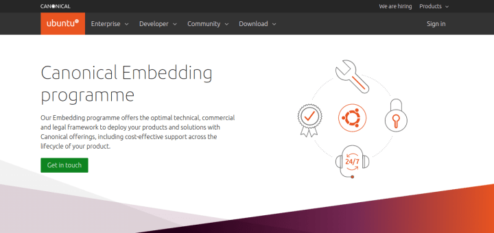
New page for Canonical Embedding Programme
We’ve also added a new page for the Canonical Embedding Programme.
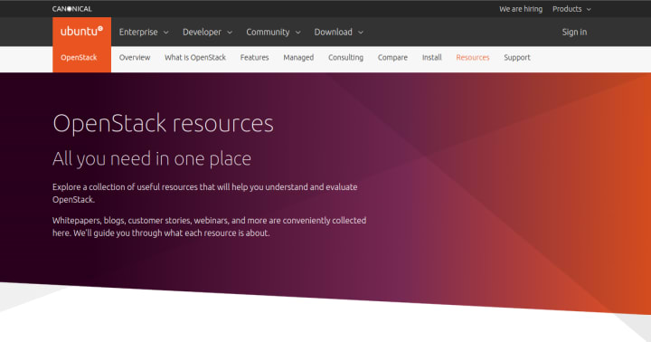
New OpenStack Resources page
Lastly, we’ve added an OpenStack resources page where you can find all things OpenStack – from whitepapers to webinars and more.
Brand
The Brand team develop our design strategy and create the look and feel for the company across many touch-points, from web, documents, exhibitions, logos and video.
Marketing support
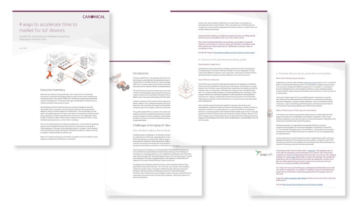
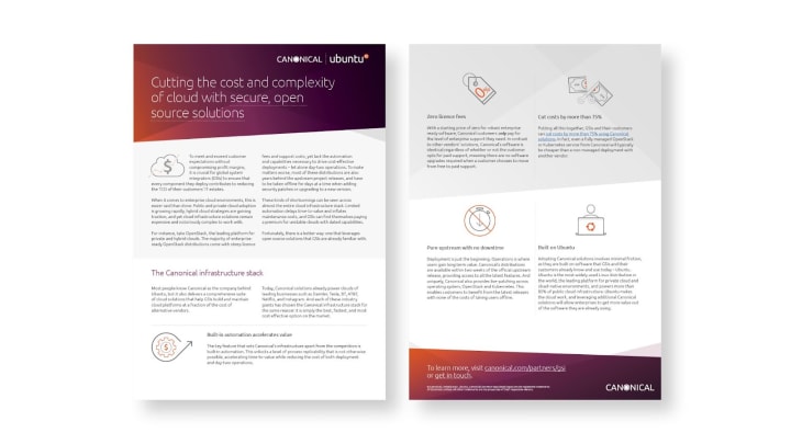
We designed and delivered a number of documents for the Marketing team in this iteration, ranging from white papers to tactical documents.

Robotics illustrations

We finished our sixth illustration in a series for the robotics Project Management team, this high-level illustration outlines our involvement in home robotics.
Commercial
The Commercial team maintains and develops all commercial services provided by Canonical. Including the Ubuntu Advantage store.
We’re working on some changes to the Ubuntu Advantage product selector, and before we release those changes we want to see how users react to the new user interface.

Modern design tools let UX designers mock-up screen designs and then link them together to make an interactive prototype. This prototype runs in a web browser and the link can be sent to test participants – helping us check our designs with real users before they go into production. We’re always looking for customers to help us out with research studies, please sign up using this form if you’re interested.
Internal tooling
UA-QA tool
Have you had to do dull, slow and repetitive actions at work? Sometimes it’s unavoidable, but sometimes it can also be an opportunity for a developer to rediscover what it means to be a developer and solve these situations with code.
The UA-QA tool originated from such a situation. It will help us test our Ubuntu Advantage subscription system on ubuntu.com. This also aims to improve the quality of our test scenarios: we can prepare test accounts to hold a wide variety of subscriptions just as users would have in real-world scenarios.

It’s a simple interactive CLI tool created with the help of Cobra CLI and PromtUI. It was also a great opportunity to play with GoLang. Really good fun!
Apps
The Apps team develops the UI for the MAAS project and the JAAS dashboard for the Juju project.
Finishing up react migration work
We have finally arrived at the end of our react migration work, our biggest milestone to celebrate. From now on, our entire MAAS UI is in React! That means, no more lagging interaction between different pages or different parts of the UI.
MAAS site identity
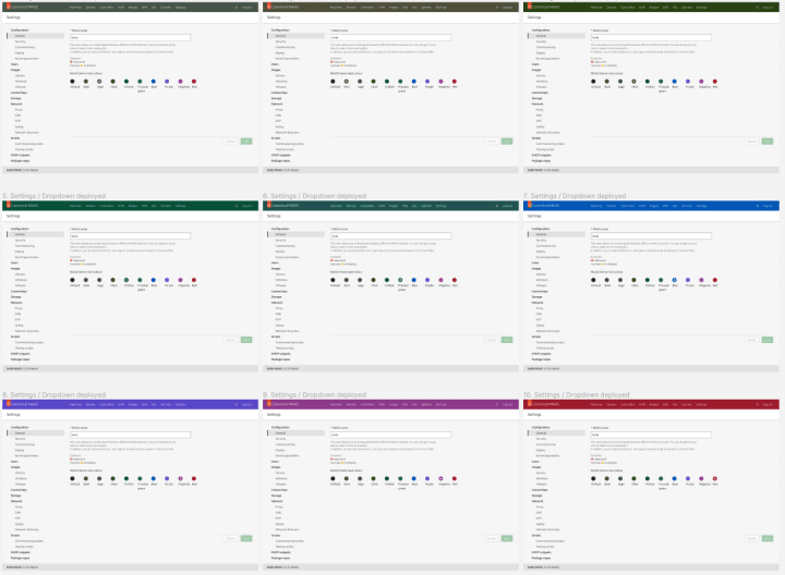
One feedback that we received from our clients was that in some organisations, there are 3 MAAS instances that are connected to 1 Data Center. These MAAS instances were for the purpose of testing, lab, and production. Because MAAS UI looks the same for all these different purposes, it is very easy to make a mistake and deploy the wrong machine on the wrong instance. So on top of the MAAS name in the status bar, that we use as the MAAS instance identifier, we are allowing people to also customise the theme for their MAAS instances.
In the settings page below, you can choose a MAAS name, add some emojis next to it, and also change the colour of the header to represent the MAAS instance that is different from the default one.

The colours are based on our Yaru brand colours and there are 10 options to choose from. Once you customise the theme, you can see a preview of the colouring style. If it is not the setting that you like, you can always revert back by cancelling your selection.
Vanilla
The Vanilla team designs and maintains the design system and Vanilla framework library. They ensure a consistent style throughout web assets.
Expandable side navigation for documentation pages
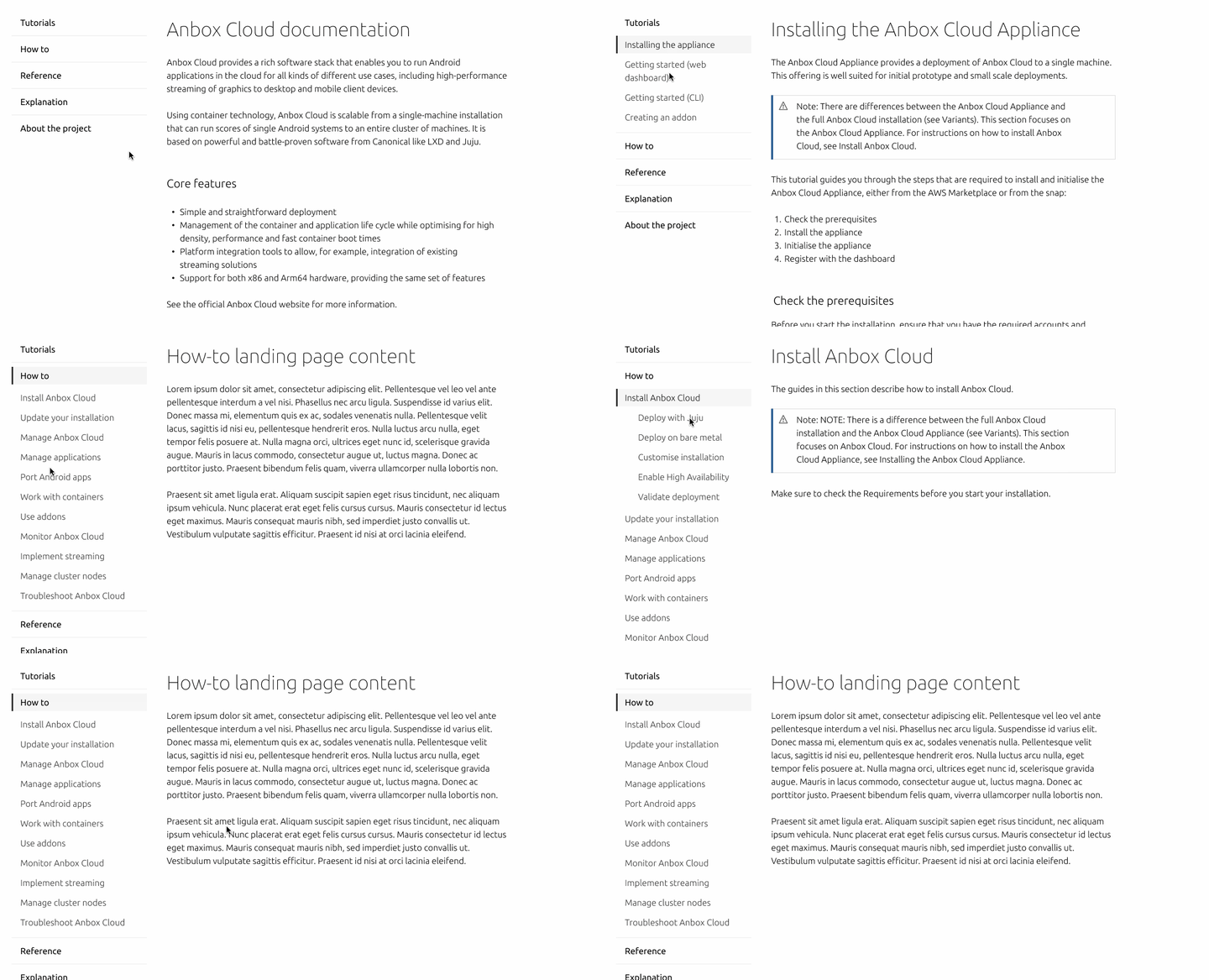
Documentation pages tend to have long side navigation with quite a few levels of hierarchy, which makes it complicated for the user to know on what level and topic they are currently. We have designed and developed a way for documentation writers to collapse the nested levels of navigation so that only children of an active item are visible at once. During this iteration, we have implemented a static version of this, and in the future iterations, we plan to include a version that uses accordions.
Spec template improvements for Vanilla documentation
As we write new documentation for our components which will live in a new design system website, we have found some friction and inconsistencies in the process and language. In this iteration we have improved the template that we use to write this documentation to be clearer in terms of what tone of voice and language should be used, how the document should be structured, and how to avoid repetition of content inside a single component or pattern page.
Marketplace
The Marketplace team works closely with the Store, Snapcraft, Snapd and Desktop teams to develop and maintain the Snap Store and Charmhub.
Snap details page metadata links

Currently snap developers are able to provide links for their websites and email addresses. An upcoming feature will be to also allow them to add a donation, source code and bug report links. As well as that, it will be possible to add multiple links for each category.
Notification for dropped architectures
Snap developers using the Snapcraft build integration with GitHub will get a notification when they had previous builds for the i386 architecture but now are using core20 or higher, alerting them about the dropped support for the i386 architecture.

Workplace engineering
The Workplace Engineering team works with the Human Resources department. The team builds internal tools to make life easier for every employee at Canonical.
Deploy the foundation of the new directory
We’ve been working on the new directory that helps navigate through the employee’s list in an organized way using an API (GraphQL) or a UI (not implemented yet).
The API is live now for internal usage (beta) and will be improved and available to all the employees at Canonical in the future.

We are hiring!
Come and join the team. If you would like to find out more about the team please read our blog and description of the team.
With ♥ from Canonical web team.
Talk to us today
Interested in running Ubuntu in your organisation?
Newsletter signup
Related posts
From inspiration to impact: design students from Regent’s University London explore open design for their dissertation projects
Last year, we had the opportunity to speak at Regent’s UX Conference (Regent’s University London’s conference to showcase UX work by staff, students, and...
Showcasing open design in action: Loughborough University design students explore open source projects
Last year, we collaborated with two design student teams from Loughborough University in the UK. These students were challenged to work on open source project...
Design and Documentation clinics at FOSDEM Fringe 2026
FOSDEM is one of the biggest and most exciting open source events of the year, held at the Solbosch campus of the Université Libre de Bruxelles (Brussels),...
