Design and Web team summary – 16th September 2020
Anthony Dillon
on 16 September 2020
Tags: Design
The web team here at Canonical run two-week iterations. Here are some of the highlights of our completed work from this iteration.
Web squad
Our Web Squad develops and maintains most of Canonical’s promotional sites like ubuntu.com, canonical.com and more.
CloudNative Days Tokyo 2020

This year will see a lot of physical events move to a virtual event format. However, most virtual booths bring low engagement with the audience, limit the abilities to do demos and showcase interactive content and have very low conversion rates.
Visit the CloudNative Days Tokyo 2020
New homepage for Ubuntu.com
We released a refreshed homepage for ubuntu.com. Providing a lot more outreach for different audiences.
EdgeX page on ubuntu.com
A new page with information about the exciting EdgeX ecosystem. Allowing you to sign up for our new EdgeX newsletter.

Brand
The Brand team develop our design strategy and create the look and feel for the company across many touch-points, from web, documents, exhibitions, logos and video.
Brand Hierarchy
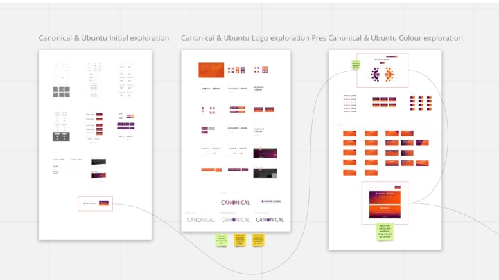
We collated all of the work we have done so far, analysed the content and decided on the outcomes and next steps to complete the system and roll it out across all areas of the company.

Charmed Kubeflow
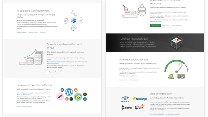
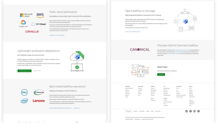
Illustrations and web design for the updated Kubeflow page.

Document Hierarchy testing
We took the templates developed in the last iteration and inserted real content to make sure that the styles and typography are robust enough to roll out.


Livechat branding
Initial colour and design work to brand the Eye catcher and Livechat instance on Ubuntu.com.

MAAS
The MAAS squad develops the UI for the MAAS project.
MAAS new CLI iteration 2
Last week, we have been testing out the CLI prototype with 6 MAAS CLI users to collect feedback on what we can do to improve our current CLI experience.
The first thing we tested out was the concept of the initial help or what our testers mostly referred to as “cheat sheet”.
When a user types “maas” or “maas –help”, you will see a cheat sheet as a guideline to help you do basic operations. In the first prototype, we introduced the concept of a primary object (machine), so by default, MAAS interprets an action against machines as an object when no object is indicated.

We received a lot of positive feedback for this concept and our testers wanted to see what other objects are available in the CLI. So to provide learnability, we added “Hints” to this page and indicate the current version of MAAS as well as other useful information.
One use case was frequently mentioned during the test regarding how to operate bulk actions for multiple MAASes or data centres.
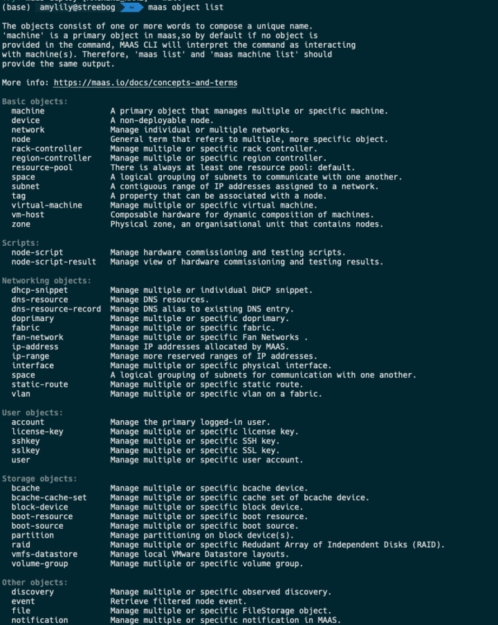
Breaking down MAAS objects. In the current CLI, we have both singular and plural forms of object as a way to indicate collection services VS individual services. In this version, we stripped down all plural objects and broke them down into different categories for readability. We’ve also added a link to the documentation page for further readings.
Highlight: 5 out of 6 users mentioned that they don’t like reading the documentation and would not bother to read them because when they are working with the CLI they feel like they have to start the search over again in the documentation page. It felt like they have to do a double search to get to the point where they get the answer. So to reduce that hassle, we attached the right documentation link to the relevant commands help page.
In this prototype, we also introduced the concept of the primary profile, which is reflected in the current prompt. A user may log in to multiple profiles and set one of the profiles as their primary profile. When a user wants to take actions on multiple profiles such as deploying 10 identical machines 3 MAAS profiles, they just need to apply a profile flag to their deployment action.

The user will always see their current profile when they take action. This is to help prevent our users from making mistakes and that they are aware of their current environment.
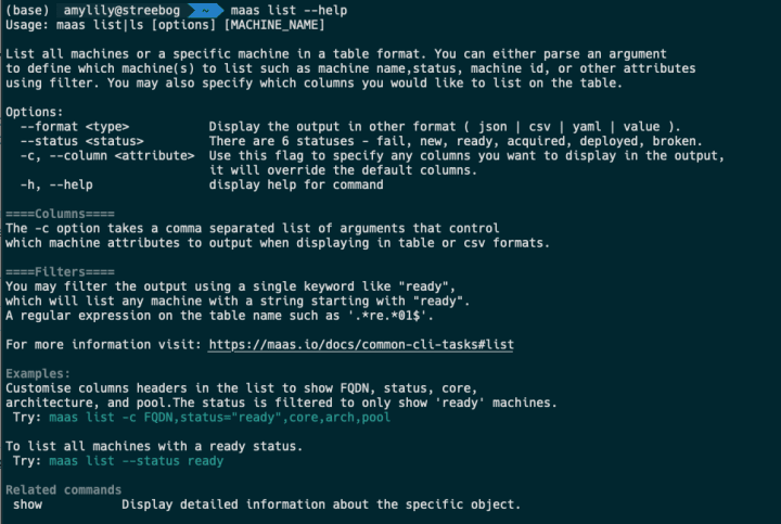
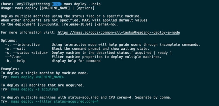
To enhance the experience for learnability, we also try to break down the help page to be more meaningful. This is an example of the new help page. It will show you a brief description of the action, options, different ways to customise the outputs, examples, and related commands. For instance, maas list will list multiple or individual node description in a compact format as an overview. Whereas a related command is “maas show”, where a user can drill down detailed information of a particular machine in an elaborate manner.
After going through this user test, our team has agreed to make the default experience in the CLI compatible with our scripting users because we have a separate MAAS UI that can achieve the same purpose. However, if a user prefers to do things in MAAS using the CLI and expecting a beginner’s experience, they can use the” –interactive “ flag or “ -i” to use the interactive prompt.

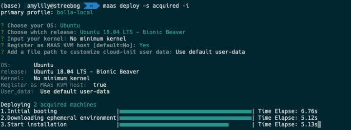
When a user indicates -i in the CLI, they will be presented with an interactive prompt where, it will ask for required information for the deployment such as OS, release, kernel, setting a machine is a KVM host, and customising cloud-init user-data.
By default, “maas deploy” will throw an error, because a user needs to supply information about the machine or a characteristic of a collection of machines they wish to deploy.

However, if an error occurs, the prompt will provide guidelines and suggestions including documentation to help our users perform an action correctly.
Since the default experience is tailored to scripting users, by default a user will get the prompt back when they perform an action. They will also be informed that the machine(s) they deployed are running in the background and they may use any of these suggestions to check up on the status of the deployment.

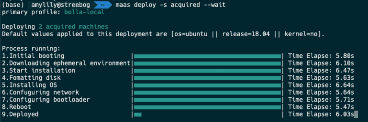
If a user wishes to have their prompt block when performing an action and want to see if it’s running, they can use the --wait flag to see the waiting state of the CLI. This will show a broken down version of the running task, a loading indication, and the time elapse. Time is quite important for MAAS users because for many users, if something is processing longer than usual, they would rather have that process aborted and reboot.
What’s next?
- We are still working to define a better way to help our users debug when an error occurs. So the error state is another important piece that we are focusing on. Our current goal is to enhance the learnability aspects of our CLI and help our users recover from their errors or mistakes.
- Another interesting feature is partial matching of the machine name. Currently, MAAS operates on machine IDs, which is not easy to fetch. We will allow our users to operate based on the machine names instead and they can either supply the full FQDN or just hostname. The current prototype provides suggestions for misspelt names and our next task is to allow partial string matching for this.
If you are reading about this and would like to add feedback, we are more than happy to find out how we can improve the CLI experience. Your feedback is a gift.
JAAS
The JAAS squad develops the UI for the JAAS store and Juju GUI projects.
Cross model relations
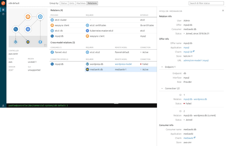
We posted our UX work about CRM on discourse last iteration, thanks for the positive feedback from the community. The final visuals for the MVP has been completed – the Cross-model relations information is displayed in the Relation view, Application panel and a dedicated Relation details panel.


Charm Actions UX Exploration
The team are exploring ways to provide actions which can be performed on a charm or units, with better visual affordance and representation. We started investigating the existing feature sets from Juju CLI, talking to charm writers and Juju users, organising feedback and comments from Discourse. A workshop with prepared design proposals and ideas will be held next week.
Vanilla
The Vanilla squad designs and maintains the design system and Vanilla framework library. They ensure a consistent style throughout web assets.
Notifications
Work continues on a unified notifications pattern for use across our websites and web apps. Our UX team has been working on defining problems, auditing our use of notifications and benchmarking against the best-in-class notification experiences.
We’re hoping to deliver a notification experience that’s useful, lightweight and doesn’t interrupt user flow as they accomplish their important tasks in our software.
Accessibility audit and fixes
We’ve completed a component-wide accessibility audit, and we’ve started applying enhancements to many components and example pages, including navigation, breadcrumbs, the switch component, buttons and others.
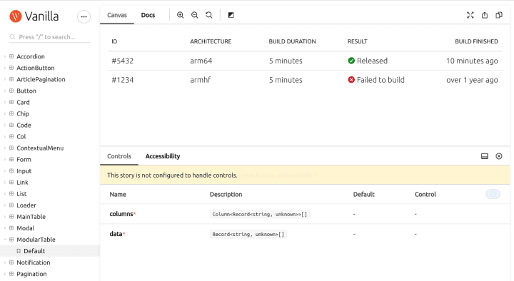
Modular table React component
We’ve been continuing the work on creating a new modular table React component. After initial proof of concept, we created a basic component in our React components library and will continue to extend it with features used by the tables in our products.
Snapcraft and Charm Hub
The Snapcraft team works closely with the Store team to develop and maintain the Snap Store site and the upcoming Charm Hub site.
Snapcraft
Forum
The snap team have published a forum category. You can come and join us by giving feedback or engaging in design conversations with us directly there.
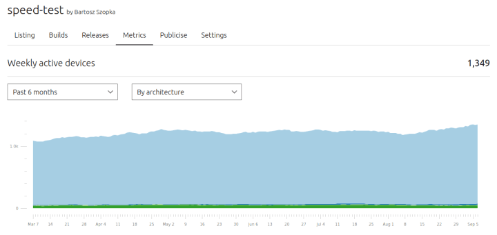
Weekly active device by architecture
Snapcraft publishers page can now get the weekly active device by architecture. A publisher can go to the snap metrics page and filter by architecture. Please, provide us feedback in the forum.
Your month in snaps email
The system that was providing the “Your month in snaps” emails has now been updated to run as a cron job in the Webteam’s Kubernetes. The repository for this cronjob can be found on GitHub.
Brand store admin
The brand store admin pages are in the process of being re-designed to become more useful, provide deeper insight into how the snaps published in them are used, and to become more easily manageable. With the redesign they will also be moved into snapcraft.io, from dashboard.snapcraft.io.
Charm Hub
Charm Hub Developer Experience
We have been iterating on the charm detail pages to be able to accommodate for content that helps charmers build their own new charms by reusing Python libraries from other charms, as well as help consumers, make integrations between charms in a more intuitive way. Along with the improvements of the developer experience, we have done visual improvements on the rest of the detail pages.
Store page
Responsive filters and sorting have been added to the store page for a better experience when browsing charms and bundles.
With ♥ from Canonical web team.
Talk to us today
Interested in running Ubuntu in your organisation?
Newsletter signup
Related posts
Showcasing open design in action: Loughborough University design students explore open source projects
Last year, we collaborated with two design student teams from Loughborough University in the UK. These students were challenged to work on open source project...
Design and Documentation clinics at FOSDEM Fringe 2026
FOSDEM is one of the biggest and most exciting open source events of the year, held at the Solbosch campus of the Université Libre de Bruxelles (Brussels),...
Open design: the opportunity design students didn’t know they were missing
What if you could work on real-world projects, shape cutting-edge technology, collaborate with developers across the world, make a meaningful impact with your...
