Design and Web team summary – 16 November 2021
Anthony Dillon
on 16 November 2021
Tags: Design
The Web and design team at Canonical run two-week iterations building and maintaining all of the Canonical websites and product web interfaces. Here are some of the highlights of our completed work from this iteration.
Meet the team

Hi! My name is Marina and I’m a senior UX Designer in the Workplace Engineering squad. We are on a mission to improve the lives of everyone at Canonical by building tools for things like recruitment and performance reviews.
I joined Canonical at the end of August but it feels like I was here for longer, everyone has welcomed me in an amazing way!
I studied Business and Economics at University before realising that Design was my passion. I am thrilled to see that my colleagues are as passionate about the craft. Everyone is really knowledgeable and willing to share with others, which makes it a great place to contribute but also grow as a designer. Also, I am very excited about the different accessibility initiatives going on, which I hope we can share in the near future.
I love travelling, hiking, climbing, skiing and doing anything creative, although nowadays my two young daughters occupy most of my free time.
Web
The Web team develops and maintains most of Canonical’s sites like ubuntu.com, canonical.com and more.
Download Ubuntu for Raspberry Pi Zero 2
This iteration marked the release of the new Raspberry Pi Zero 2, so we have refreshed our Raspberry Pi downloads page to show which versions of Ubuntu are compatible.

We also added information and download links to Ubuntu Core.
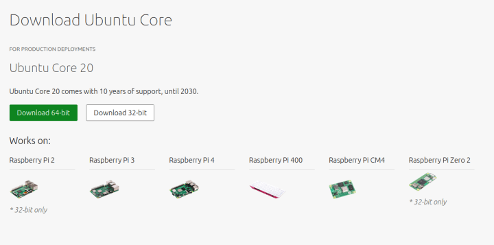
Visit our raspberry pi download page.
New page: What are containers?
We broke down our page ‘What is kubernetes’ into two pages by creating a new page ‘What are containers’. Splitting up the information this way makes it easier to find exactly what you are looking for.

New Ubuntu Frame page
A new page has been released for Ubuntu Frame – Canonical’s fullscreen shell for edge devices has been published on the https://mir-server.io website.

We have added a cool animation on this page to better show one of Ubuntu Frame’s key features that enables keyboard touch interaction.

Find out more details and how to get started with Ubuntu Frame
Brand
The Brand team develop our design strategy and create the look and feel for the company across many touch-points, from web, documents, exhibitions, logos and video.
Marketing documents
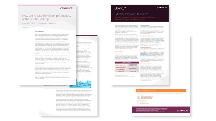
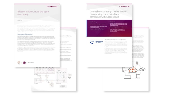
We created a host of documents in collaboration with the Marketing and Project management teams for use on the web. The white papers, datasheets and case studies will help to drive traffic and reach conversion targets.



Event support
With our participation at a number of upcoming events, we created stand graphics as well as tent cards for delegates to scan and be directed to specific website content as we are not giving out physical documents due to Covid.


New illustrations
Working with the engineering team we created a number of Observability illustrations. We created two sets, one more detailed and one simplified to be used at smaller sizes and in other larger illustrations.
Detailed set:
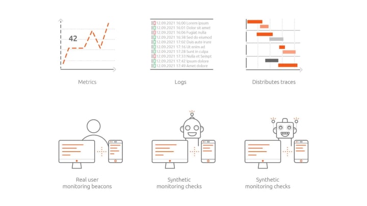

Simplified set:
Apps
The Apps team develops the UI for the MAAS project and the JAAS dashboard for the Juju project.
LXD cluster support
After several iterations of UX and design phases, our work on LXD cluster support for MAAS is finally in the QA phase of our development cycle.
The most evident changes are visible in the main KVM screen, where LXD and Virsh have been separated into different tabs. In the LXD tab, when the user adds an LXD host that is part of a cluster, a new kind of row will appear in the table:
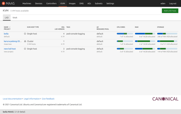
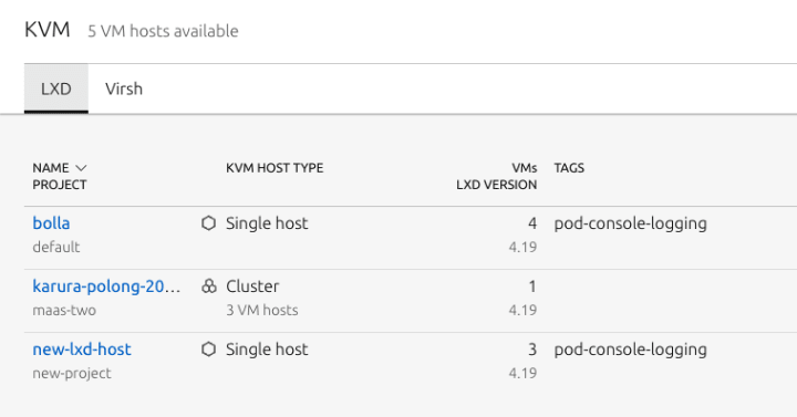
It will show the amount of VM hosts in the cluster.
The detail view has changed as well to properly cover the single-host and cluster cases.
Single host

The first tab replaces the previous “Project” view. It shows an aggregate of the resources, the virtual machines and new information in the redesigned project header, including a quick access to the “Add virtual machine” action and the toggle for the view by NUMA nodes.
The “Settings” tab has a new label to distinguish between the single-host case (VM host settings) and the cluster, where only the cluster-level settings will be accessible and each VM host has a specific settings section.
Cluster

There is a new tab for the clusters: VM hosts. It shows the hosts in the LXD cluster with some useful information,
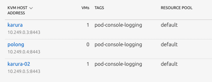
resources per host and two buttons: Add virtual machine and VM host settings:
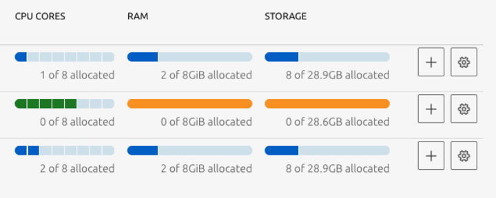
The Virtual machines tab does not have many differences with the single-host case. The most important one is that each VM in the table will include its host.
However, if the user clicks on a VM host in the first tab, they will be redirected to a filtered version of Virtual machines with a redesigned header:
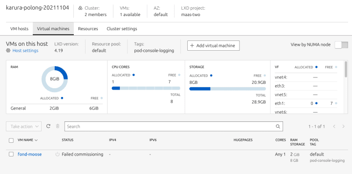
This new interaction allows the users to quickly move between the general cluster overview and the host-specific virtual machines view to easily manage large clusters.
CLI verbosity level
We have been working with the Starcraft team to create a guideline for Canonical CLI’s to standardise the verbosity level across Canonical products.
During our preliminary research phase we discovered a pattern in the CLI interactions that is common among different engineering roles such as Security engineers, SRE/DevOps, Network engineers, Software engineers, etc.
Our current standard verbosity levels consists of four levels: quiet, normal, verbose, and debug or trace.
These four common tasks consist of setting up and configuration, monitoring, troubleshooting, and package building or general operations.

People are more likely to use quiet mode when they are setting up or configuring the CLI application for the first time because these command groups surface simple shell scripts. It is likely to happen once and users won’t reuse it until there is a symptom that their regex or scripting file parses the wrong value.
For commands that belong to the monitoring and package building categories, people are more likely to use normal mode because it would show sufficient information for these tasks.
Whereas, when it comes to troubleshooting, people are likely to dig deeper and perform forensics on the produced logs looking for hints in verbose, debug, or higher, if applicable.
With that said, our CLI guideline aims to provide a generic mental model for users to help them select the correct method from the emitter to present the information on these different modes.
The first question that the CLI creator needs to answer is which command group you are designing? If it belongs to the setting up/configuration or monitoring category, verbose and debug mode can show very similar results. Whereas, when it comes to troubleshooting, if there are more useful information for people to do forensics on the logs you can either extend the verbosity level to more than 4 levels or make sure that the highest mode (`Debug` mode) will provide enough information to perform forensics on the logs.
As for the Starcraft team, the team has been creating a Python library using the CLI guideline to make developers’ lives easier when implementing a CLI. It includes 20 examples of how to show messages with different verbosity levels.

Vanilla
The Vanilla team designs and maintains the design system and Vanilla framework library. They ensure a consistent style throughout web assets.
Vanilla 3.0
The last few weeks have been focused on preparations for the upcoming major release of Vanilla. We are finalising the code changes, testing pre-release versions and preparing the upgrade guide.

Chip, slider and switch component updates
We’re working on improving our chip, slider and switch components. These are the new designs that will be implemented soon:

We are hiring!
With ♥ from Canonical web team.
Talk to us today
Interested in running Ubuntu in your organisation?
Newsletter signup
Related posts
From inspiration to impact: design students from Regent’s University London explore open design for their dissertation projects
Last year, we had the opportunity to speak at Regent’s UX Conference (Regent’s University London’s conference to showcase UX work by staff, students, and...
Showcasing open design in action: Loughborough University design students explore open source projects
Last year, we collaborated with two design student teams from Loughborough University in the UK. These students were challenged to work on open source project...
Design and Documentation clinics at FOSDEM Fringe 2026
FOSDEM is one of the biggest and most exciting open source events of the year, held at the Solbosch campus of the Université Libre de Bruxelles (Brussels),...
