Design and Web team summary – 15th April 2020
Anthony Dillon
on 15 April 2020
Tags: Design
Here are some of the highlights of our completed work over the previous iteration.
Meet the team
Heya, I’m Lilyana (Лиляна)!
I’m a senior UX designer and have been working primarily on MAAS since I joined Canonical two years ago. I love solving complex problems and learning more about the fascinating technology that drives the digital world.
Before Canonical, I worked in an education technology start-up, working towards making the lives of everyone working in schools in the UK easier. I, similarly to Zihe whose profile you might have read in our update two weeks ago, graduated with an MSc in Human-Computer Interactions with Ergonomics from UCL and have a BSc in Computer Science from the University of York.
Outside of work, I’m a devoted gym-goer and I love modern art and live music, thankfully all of those are within easy reach of our lovely London office! (And in this time of quarantine – even more easily available online haha!)
Web squad
Our Web Squad develops and maintains most of Canonical’s promotional sites.
Whitepapers, case studies and webinars
We launched a lot of homepage takeovers this iteration. A summary of these events, whitepapers and announcements can be found below.
Charmed OpenStack – OpenStack Adoption Guide

Ubuntu Core security audit with Rule 4

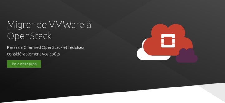
French VMWare to Openstack whitepaper

IBM Athena announcement

Learn about securing your cloud with IBM and Canonical
Ubuntu Masters virtual event

Managed Apps

New robotics web pages

We have been doing more and more with robots and the ROS (Robot Operating System). So we have been expanding the pages around Robotics on the site. So far we have updated the overview and created new What is ROS and Community pages.
Ubuntu Pro for Azure
While this has been available for a few weeks, we put up some pages about Ubuntu Pro for Azure.
Brand
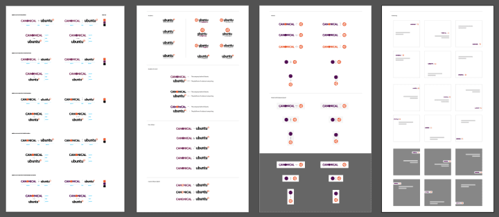
Brand Hierarchy – logo relationship
We progressed the brand hierarchy work investigating the relationship between Canonical and Ubuntu and how we represent this in the future.

Cube logo – Amend designs and create the presentation
The feedback from our initial designs was worked upon in this iteration and we developed the logos to the next level and began creating a presentation for final approval.

Animation style
Video is an important medium for us to deliver lots of in-depth content in an engaging way, we continued with the development of our animation style/framework and will look to finalise this in our next iteration.

Ceph diagrams
We developed a number of illustrations/diagrams to help describe the benefits of Ceph and software-defined storage.


MAAS
The MAAS squad develops the UI for the MAAS project.
NUMA-aligned VMs

Following up on the work from the last iteration, we further explored a few of the options for composing NUMA-aligned VMs. The designs are building on the already established design language for used, available, and requested resources, and expanding them to visually and interactively allow the users to make an informed decision on the placement of their virtual machines.
This work is part of our ongoing effort to improve the Enhanced Platform Awareness (EPA) of MAAS.
MAAS certificates

We are currently working on a MAAS certificate feature for administrators as many services MAAS interacts with requiring a signed certificate. In the current setup, there is only one certificate which will be automatically generated through MAAS and automatically renewed. However, users have the option to manage an external certificate through the API as well. For this iteration, Lily has come to the 3rd iteration of her visual design. If you’re excited too, let’s see what other fun stuff she will add for the upcoming version.
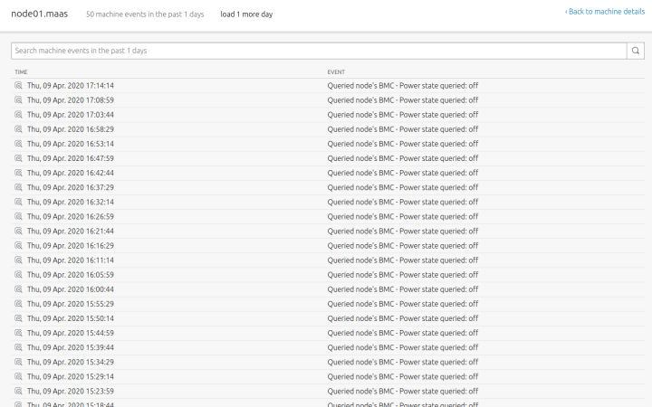
Machine Details: Logs and Events

One problem that we discovered from the user testing sessions in Frankfurt is that users struggled and are confused when interacting with the Logs and Events tabs to debug or understand what went wrong in failed machines. Along the journey of discovering how our current users are interacting with Logs and Events, we found a few places where our Events and Logs become overwhelming, distracting, and eventually, causing misinterpretation. Now that Amy has learned more about our users’ interactions, let’s see what’s coming in her up-coming prototype.
Sentry error-tracking
With Kit’s work on creating distinct development and production build environments for legacy application, we completed a roadmap item. Now we will be able to catch front-end errors quickly and hopefully before any of our users even notice them.
JAAS
The JAAS squad develops the UI for the JAAS store and Juju GUI projects.
The team is continuing to work on the implementation of new features in the JAAS dashboard. For this iteration, we completed the terminal resizing functionality. Now users can resize the Juju Shell in the model detail view of the JAAS Dashboard to use Juju commands and read the output more comfortably.
The team started planning for the next cycle, defining the next UX explorations based on user testing and customer feedback and requests.
Vanilla
The Vanilla squad designs and maintains the design system and Vanilla framework library. They ensure a consistent style throughout web assets.
Wireframing search and filtering
The team have been working on the definition of a modular search and filter pattern to be used across Canonical products. The pattern will cover use cases from a simple text search to a complex composition of a query to filter down a large number of items, and be flexible enough in order to align to different layouts.
Modular table design
We are nearing the end of our modular table spec documentation. During the iteration, we documented features like double rows, grouping, actionable icons, dynamic summaries, column resizing and reordering, pinned rows, dragging and dropping, row selection, responsive behaviours and others.
Snapcraft
The Snapcraft team works closely with the Snap Store team to develop and maintain the Snap Store site.
Poller script
The functionality of this script is to build snaps automatically if the GitHub snap’s parts have been updated for people who are using automatic builds in snapcraft.io.
The existence of this service is not new and it was already implemented in build.snapcraft.io. We have migrated the script from JavaScript to Python have made it stateless, like snapcraft.io itself, in addition to using Docker to make it work as a CronJob in Kubernetes.
Disconnect repo from snap
The “Builds” tab of a snap now includes a “Disconnect repo” link which offers the option of disconnecting the GitHub repository linked to your snap. Once disconnected, the following will occur:
- Previous builds for this snap will disappear from the Builds page
- You will be able to continue to release your previous revisions on the Releases tab

Continued development of Charmhub
In an effort to create a common pattern for search and filter across all websites, we developed a new filter for Charmhub that includes checkboxes for those categories that are predefined to the user, and a separate string-search bar with a sort by dropdown. We also worked on translating the desktop approach on mobile screens.


Maintenance
- General
- First snap – All example projects updated to work as part of the broken Java flow
- Prevent staging snap revisions that can’t be released (with information as to why)
- Internal server error with per-os metrics on certain snaps
- Better handling of webhook errors in build.snapcraft.io
- Added a 5 year option to the metrics dropdown
- Build tab
Team blog posts:
We wish good health for you and your families during these uncertain times.
With ♥ from Canonical web team.
Talk to us today
Interested in running Ubuntu in your organisation?
Newsletter signup
Related posts
Showcasing open design in action: Loughborough University design students explore open source projects
Last year, we collaborated with two design student teams from Loughborough University in the UK. These students were challenged to work on open source project...
Design and Documentation clinics at FOSDEM Fringe 2026
FOSDEM is one of the biggest and most exciting open source events of the year, held at the Solbosch campus of the Université Libre de Bruxelles (Brussels),...
Open design: the opportunity design students didn’t know they were missing
What if you could work on real-world projects, shape cutting-edge technology, collaborate with developers across the world, make a meaningful impact with your...
