Design and Web team summary – 15 February 2021
Anthony Dillon
on 15 February 2021
Tags: Design
The web team at Canonical run two-week iterations building and maintaining all of Canonical websites and product web interfaces. Here are some of the highlights of our completed work from this iteration.
Web squad
The Web Squad develops and maintains most of Canonical’s sites like ubuntu.com, canonical.com and more.
Ubuntu Core 20 release
The web squad launched many Ubuntu Core 20 updates. This included a rebuild of the Ubuntu Core home page, a new features section including brand new secure boot, full disk encryption, device recovery and over-the-air updates pages. We moved the SMART START guide to the Core section. Finally, a new page, highlighting the success stories of Ubuntu Core.
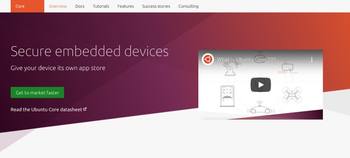
Learn all about Ubuntu Core 20 >
Ubuntu 20.04.2 release
In this iteration, we updated the site for the Ubuntu 20.04.2 point release. It combines all of the software updates, security patches and bug fixes as well as a new hardware enablement stack (HWE) which is both the newer 5.8 Linux kernel and updated graphics drivers
It also brought support for the new Raspberry Pi Compute Module 4, so we had to redesign the download page to fit all the devices.
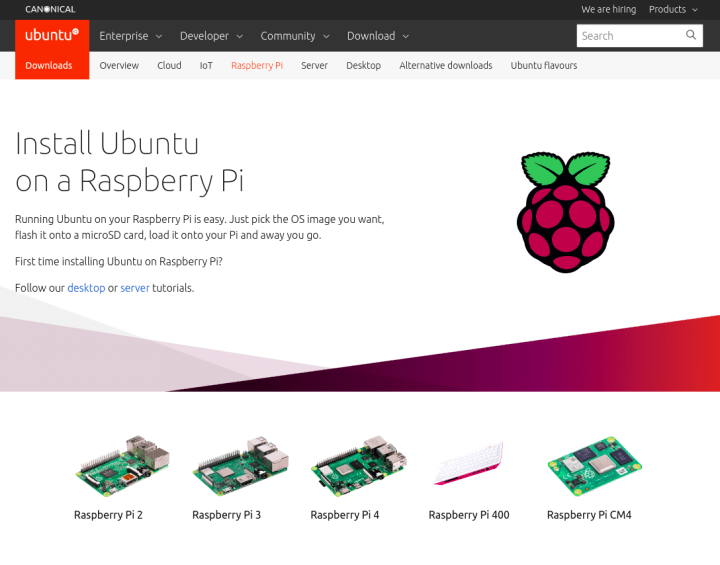
Download Ubuntu 20.04.2 today >
Brand
The Brand team develop our design strategy and create the look and feel for the company across many touch-points, from web, documents, exhibitions, logos and video.
Bratislava Office
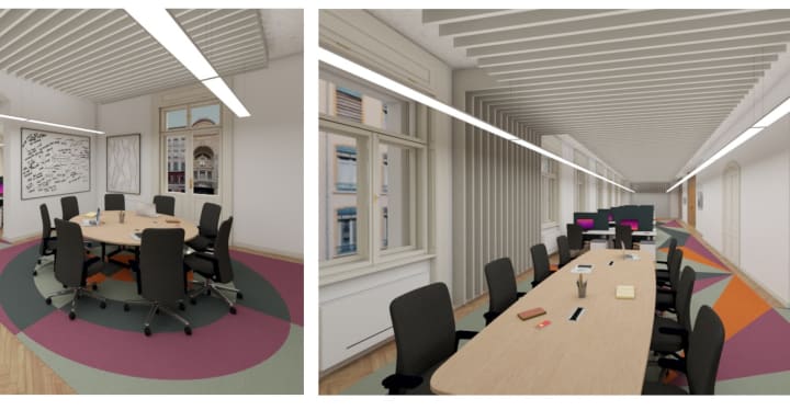
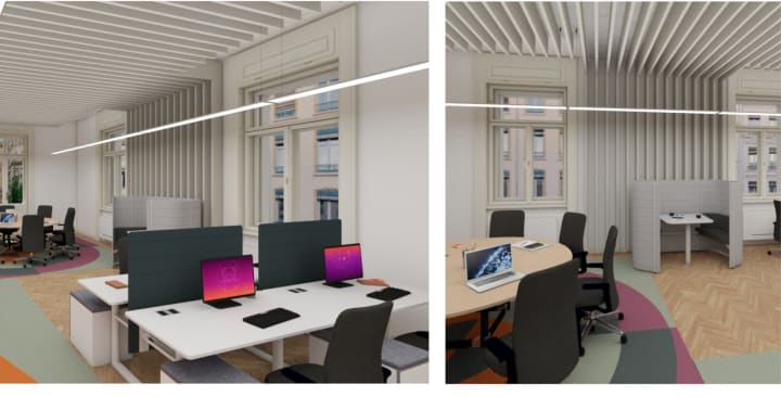
Working with our appointed architects we have been busy refining the visual language and layout to be used in our new Bratislava office.
Microsoft Azure social banners
We developed a number of social banners to be used by the Marketing team to promote Ubuntu Pro on Azure, creating a few different design styles to avoid visual fatigue.

DELL battlecards
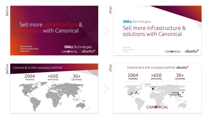
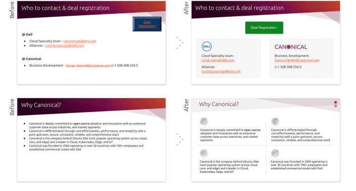
Supporting the Sales Team and leveraging the fantastic partnership we have with DELL, we polished some of the slides used by the sales team to be more consistent with our look and overall brand style.
Embedded World 2021 Digital
To support the Marketing Teams participation in the upcoming Embedded World digital exhibition, we designed a number of branded visuals for the team to use in our online presence during the exhibition.

Brand Hierarchy: Canonical and Ubuntu relationship
We continued the brand hierarchy project in this iteration, exploring the relationship between Canonical and Ubuntu, how they look visually together and how they work together from a strategic point of view.
MAAS
The MAAS squad develops the UI for the MAAS project.
React migration
The journey for our React migration is still going strong. This iteration, we have been wrapping the QA work for the test tab, storage tab, and machine workload annotations. In the next release, we will be introducing the status bar at the bottom of the page.
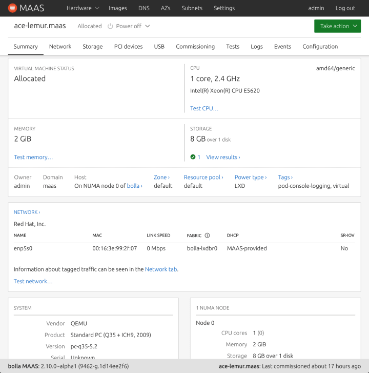
The purpose of this status bar is to inform our users when was the last time a machine was commissioned. The timestamp information can be helpful in several ways. For instance, if you plug in a new PCI device or USB device, you will need to recommission the machine to view this information. We use relative time to communicate this information because people usually associate time with duration. When an exact timestamp is provided, our users will try to estimate their calculations to define how far it has been from today. This will reduce this cognitive step for our users.
MAAS as LXD tenants
We are also working on another feature called MAAS as a LXD tenant. In this project, the purpose is to connect MAAS with a LXD server from a project level, where a user can create a new project, compose VMs, or delete VMs without interfering with the set up in LXD.

The new KVM page will separate the table into LXD and Virsh because down the road, we will be deprecating Virsh. The LXD table will be connected via LXD addresses that allow us to see a one-to-many relationship between the server and the connected projects
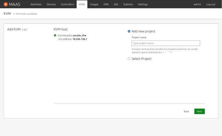
After authenticating with the LXD server, you have an option to create a new project or select the existing project.
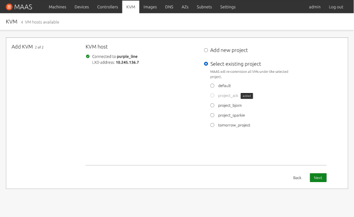
If a user selects an existing project, MAAS will recommission all VMs under that project.
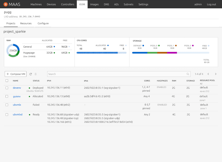
Once you have selected a project or created a new one, you will arrive at the project tab, where you can view all VMs and look at your resources graph as a reference. Based on our research, we found that the aggregate view of the storage graph was not useful because it is more important to know the breakdown of the storage pool. So in this example, we’ve broken down the information of the storage pool. We’ve moved all call to actions closer in proximity to the table so that the interaction point is more intuitive. In a case where you scale your projects to support several VMs, the search and pagination will help you navigate to the right VM in a quicker manner. The table would show both the IPv4 and IPv6, as well as whether the core is pinned or not.
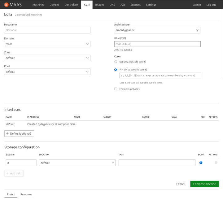
When composing a machine, you may also pin your cores in the UI, by providing the core numbers separated by a comma or providing a range of numbers. Our help text will also guide you to which cores are currently available out of all cores. If hugepages is set up as part of the LXD server configuration, you may also enable that in the project, when you compose a new VM.
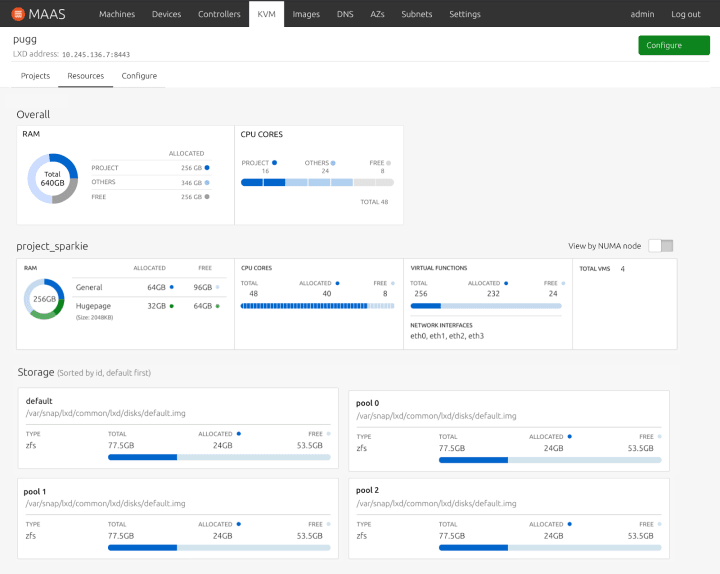
Finally, our resources page would break down overall information about how much RAM and Cores are allocated for the current project VS all other projects combined, as well as what is free. We hope this would provide a meaningful snapshot of the overall resources.
Instance tab
We are still exploring different use cases for the instance tab in the MAAS UI. If anyone views information from the instances tab (under machine summary), we would like to hear from you. Tell us about how you are currently using the instances tab:
- What information is useful and what do you use it for?
- Why is this tab important to you?
- What kind of actions are you trying to perform?
Tell us about your instance usage in the discourse post. Your feedback is a gift! Let’s improve MAAS together.
JAAS
The JAAS squad develops the JAAS dashboard for the Juju project.
JAAS Navigation Exploration
With new features coming on JAAS, we restructured the sitemap to make sure that the dashboard’s information architecture is clear. With a focus on actionable features being discoverable and users being able to navigate through different task flows.
We have refined the options to three styles of navigation:
Breadcrumbs up to three levels
Knowing where you are in the model structure with the use of a breadcrumb pattern, and only displaying the main navigation items on the top level.

Back button with the top navigation all the time
It remains a fixed set of the top level navigation items for the model will allow users to more easily between the main areas of a model. Below it we are Introducing a back button allowing a user to navigate up a level.

Back button without the top navigation
Displaying the back button to the parent level, and only displaying the main navigation at the top-level model’s page. Could help to reduce visual complexity.

We are in the process of gathering feedback from the community, which we will summarise the result next iteration.
Vanilla
The Vanilla squad designs and maintains the design system and Vanilla framework library. They ensure a consistent style throughout web assets.
Fluid breakout layout
We added an IE11 fallback for the new Fluid Breakout Layout:
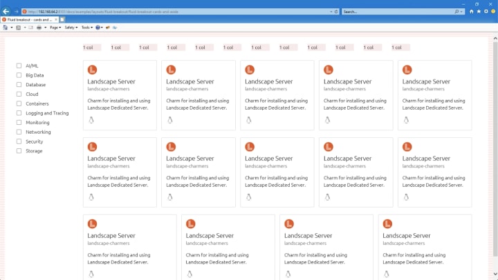
Code snippet dropdowns
In this iteration, we’ve been finalising the work on the new code snippet component. In the next release of Vanilla, code snippets will be able to accommodate multiple select elements.
Providing the ability to change the layout of code snippet header blocks to accommodate long titles or multiple selects which otherwise look crowded. Using the `.is-stacked` utility class on the header block will shift the selects below the header:

Investigating CodePen replacement
Due to some performance issues we’ve encountered in Vanilla docs with examples embedded via CodePen, we are investigating a replacement that doesn’t rely on a third-party service but directly uses the examples from our codebase. The newly implemented code snippet component will be used to display the code of the examples

Snapcraft and Charmhub
The Snapcraft team works closely with the Store team to develop and maintain the Snap Store site and the upcoming Charmhub site.
Snapcraft
New discourse navigation for snapcraft forum
The team continues to roll out the new designs for discourses. This iteration we adapted the theme to match snapcraft branding. Come to the forum to see the upgrade soon!

Brand store admin pages
Continuing the development of the brand store admin pages. This iteration added some more data such as collaborators and latest releases to snap tables, some improvements on mobile, adding a manage snaps view, adding a filter to the members view and began working on the member invites section.
Charmhub
Libraries pages
Charms have the ability to share libraries. The team is including a view to share the libraries that a charm is using. We integrated this into the charm details pages.
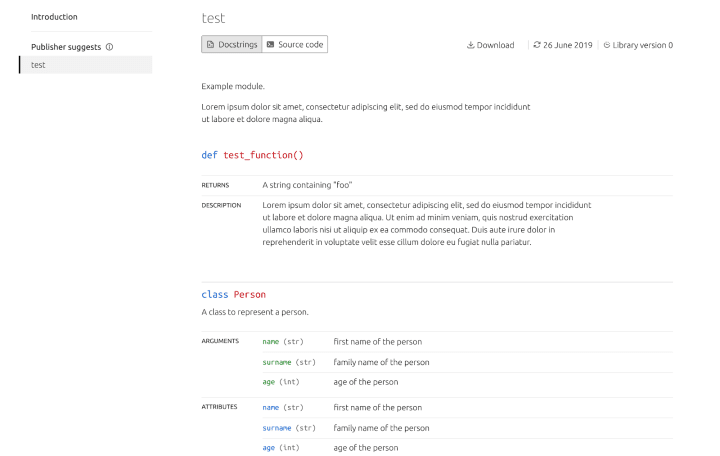
Charmhub documentation
Following the work done a few iterations ago on documentation management. The team started rolling out the new python module to Charmhub. From now on, documentation can be versioned!
Team posts:
- Open source, teamwork and mental health: my FOSDEM 2021
- Maas ui build artifacts
- MAAS UI: MAAS Instances and MAAS as LXD tenants
With ♥ from Canonical web team.
Talk to us today
Interested in running Ubuntu in your organisation?
Newsletter signup
Related posts
Showcasing open design in action: Loughborough University design students explore open source projects
Last year, we collaborated with two design student teams from Loughborough University in the UK. These students were challenged to work on open source project...
Design and Documentation clinics at FOSDEM Fringe 2026
FOSDEM is one of the biggest and most exciting open source events of the year, held at the Solbosch campus of the Université Libre de Bruxelles (Brussels),...
Open design: the opportunity design students didn’t know they were missing
What if you could work on real-world projects, shape cutting-edge technology, collaborate with developers across the world, make a meaningful impact with your...
