Design and Web team summary – 10th November 2020
Anthony Dillon
on 10 November 2020
Tags: Design
The web team here at Canonical run two-week iterations. Here are some of the highlights of our completed work from this iteration.
Meet the team

Hi, my name is Long. I’ve recently joined Canonical on the Web and Design team as a Lead Visual Designer. Joining Canonical during this weird time that we’re all going through has been a strange experience.
I’m generally a sociable person who likes those impromptu conversations and chance meets in the office, but having to work remotely I haven’t had the opportunity to meet any of them in person. That being said; all the guys have made me feel extremely welcome and everybody’s passion and enthusiasm is infectious.
My previous experience expands a wide range of sectors, which include Banking, Insurance, Retail, Sports and Media, Healthcare and lots of other fun projects along the way. I’ve been doing design in some form or another for the past 20 years and it never gets old. I’m always awed and fascinated by the design community who are always pushing the boundaries of design.
Although very cliche, my hobbies include keeping up with design trends, Fashion, Architecture, Product Design and everything else in-between that catches my eye.
If I’m not scouring the net for inspiration, I’ll be reading stuff about tech or chilling out with a good book (Fantasy, Sci-Fi).
Web squad
Our Web Squad develops and maintains most of Canonical’s promotional sites like ubuntu.com, canonical.com and more.
Takeovers from Discourse
This iteration we released the feature of pulling the takeover content from Discourse. All the top section content you see on ubuntu.com homepage is now loading its content from the Ubuntu Discourse. This completes a set of work to port a majority of the marketing content to discourse including the engage pages.
We use our canonical Webteam discourse module to pull the content by requesting JSON data from the Discourse API. We achieved this by creating a table with metadata hosted in the Ubuntu Discourse that we use to render these engage pages and takeovers. We also adjusted the parameters needed to display this content, to increase consistency and simplify our system across our takeovers and engage pages. As a consequence, this will drastically speed up the process of releasing marketing content on ubuntu.com now that the marketing team can publish, while reducing the achieved content in the website codebase
Documentation on how to add content (if you have access) has also been created to support people who need to create this content and we are continuously updating it to keep it up to date.
Ubuntu Advantage shop
We will shortly be releasing the all-new Ubuntu Advantage shop, which replaces our existing Shopify store, giving users a single place in which to manage, renew and add new Ubuntu Advantage subscriptions
Developed over the last few months, the shop allows users to select their product based on their needs (type of machine, level of support and number of machines). Using Stripe to safely and securely process payments, and integrates with our store API. The store API has been built concurrently by the Commercial Services team, which processes the payment and sets up the user’s products.

While this initial release represents a big step toward giving users a better Ubuntu Advantage experience, we are planning many more features in the very near future.
Rollout new cookie policy
To adhere to new cookie tracking laws we have provided more fine-grain control to the levels of tracking the user is comfortable with. There is now an option to display a modal with further types of tracking. This has been rolled out across all Canonical sites.

New managed Cassandra webpage
Similar to our Kafka offering Canonical now provides a managed Cassandra offering. Please visit to learn more about our managed applications.
Released Canonical’s get your first device to market offering called SMART START
We have built and released the marketing homepage and guides pages for Canonical’s SMART START offering.
Brand
The Brand team develops our design strategy and creates the look and feel for the company across many touch-points, from web, documents, exhibitions, logos and video.
Brand Hierarchy
The ongoing Brand Hierarchy project continued this iteration with the simplification of our first presentation document centred on the logo associations and hierarchy, with some experimentation using our ‘Suru’ pattern as a device for the logos to sit on.

Certified UBuntu Engineer (CUBE) Branding
We progressed our branding of the ‘badges’ for our in-development training programme called CUBE. Simplifying them whilst experimenting with colour and use at small scale.

Illustration support
We supported the teams this iteration with a number of illustration and UI icon requests.

Social media banners
Marketing requested some carousel banners in collaboration with Microsoft to promote our cloud capabilities.

Suru across the web audit
We began a large project this iteration to look at the ‘Suru’ branding across all our websites. We started with the analysis of its current usage across the sites and will continue with collating the findings and looking at areas for improvement and generating new patterns for the teams to use.


MAAS
The MAAS squad develops the UI for the MAAS project.
Event logs
In this cycle, our biggest UI transition is to migrate the machine details legacy code to React. Events and Logs tabs are the essential part of this work as they contain essential information for debugging a deployment. Earlier this year, we did some exploration work and iterated on how to make our Events experience better. So in this iteration, we put together the first minimum viable version in ReactJS migration in order to get the Events tab ready for the next release.
Our minimum version includes:
- Merging our Logs and Events tab together. An exploration earlier this year has indicated that most users clicked on the Logs tab, while they were actually looking for the information in the Events tab. They perceived logs as a place to find timestamp information of running tasks. This contextual issue is solved by merging these 2 tabs together under “Logs” and showing the event logs by default.

- Machine outputs in both YAML and XML formats are still available but in a downloadable form.
- On successful deployment, the installation output tab will be visible and also downloadable.
- On fail deployment, a cutrin-logs.tar file is available for download.
- The logs will show a summary of all logs and we replaced the “load 1 more day” button with pagination.
Making MAAS experience more cloud-like
Another mission for us this cycle is to enhance the MAAS experience to be more “cloud-like”. To further define our scope for “cloud-like”, the design team has created a 5-minute survey to reach out to the community on discourse to help us shape the future of MAAS experience.
From here we hope it would be a good starting point for quantitative data and we will reach out to volunteers to test out our prototypes for a more qualitative approach.
If you are also using MAAS, feel free to drop some feedback on the form. We are more than happy to hear from you.
PCI device modelling
PCI device modelling is our baby step towards approaching the SmartNICs in MAAS. In this project, we want to help users see the list of PCI devices on their machines from Intelligent Network Adapters, GPU, NVME Storage, Network cards, and other generic PCI devices. From this tab, we hope to help our users configure their PCI devices and customise their hardware in ways that are purposeful. We are still in the very early stage of figuring out how to show this information tastefully.
JAAS
The JAAS squad develops the UI for the JAAS store and Juju dashboard projects.
Highlights of Maintenance work
We spent a lot of time this iteration cleaning up small bugs and carrying out some essential maintenance work. Of this work, highlights include refreshing documentation on https://juju.is and converting the Juju Dashboard to use the Vanilla Framework application layout.
Action Wireframes
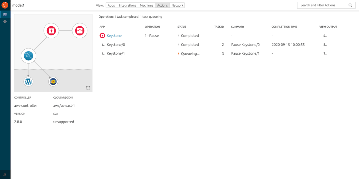
Juju Actions are special commands that apply to units within individual charms. In previous iterations, our team reviewed discourse feedback, conducted user interviews, went through new juju action feature sets coming in new versions of Juju and sketched out some feature ideas on JAAS in workshops. The first version of the wireframe came out this iteration, with potential new layout design that enables users to take action on specific units within the app panel. An action centre is also designed in the header tabs to view the pipeline of actions executed within this model. We will gather user feedback to this in the next iteration and push the design forward.


Vanilla
The Vanilla squad designs and maintains the design system and Vanilla framework library. They ensure a consistent style throughout web assets.
Explorations of responsive application layout
To improve how the side navigation and panels behave on various screen sizes in the application layout we explored different approaches and updates and prototyped them.
We discussed the ways in which we could reuse our existing side navigation component that we use for docs in the application layout without introducing too many changes to it.
We will also propose a couple of built-in sizes for panels and create detailed documentation when and how to use them, and how to build custom ones when needed.
Code snippet pattern

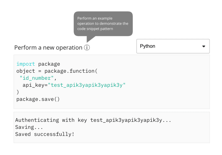
A ‘wireframe’ design example
We are proposing some changes to improve the way code snippets are displayed across our sites and apps. A key goal is code clarity – the user should be able to identify the code they need, either to copy and use or as a reference example. Our full proposal is available to read and respond to on Discourse.
Snapcraft and Charmhub
The Snapcraft team works closely with the Store team to develop and maintain the Snap Store site and the upcoming Charmhub site.
Review of SSO 2FA messaging
Simplified the 2fa messaging and design which has been rolled out on login.ubuntu.com.
Move discouse.juju.is to discourse.charmhub.io
This work included tidying up of the categories and switching the DNS to the Charmhub domain. Adding redirects from the old domain to the new one so no link is left behind.
We updated the discourse header and navigation to match the charmhub.io website.

Charm details docs integration
This iteration we introduced a new system of charm documentation. Previously charm docs would be represented in the README which results in a large document to parse. Charm owners can now publish and manage charm documentation from the docs category of the charmhub discourse. This allows community-driven suggestions and improvements to the documentation
So if you have a charm which you would like to add documentation for you can follow this tutorial.
Team posts:
CLI Guidelines
- Success messaging
- To new line or not to new line?
- Tone of voice
- Positional arguments
- Punctuation
- Incomplete commands
With ♥ from Canonical web team.
Talk to us today
Interested in running Ubuntu in your organisation?
Newsletter signup
Related posts
Showcasing open design in action: Loughborough University design students explore open source projects
Last year, we collaborated with two design student teams from Loughborough University in the UK. These students were challenged to work on open source project...
Design and Documentation clinics at FOSDEM Fringe 2026
FOSDEM is one of the biggest and most exciting open source events of the year, held at the Solbosch campus of the Université Libre de Bruxelles (Brussels),...
Open design: the opportunity design students didn’t know they were missing
What if you could work on real-world projects, shape cutting-edge technology, collaborate with developers across the world, make a meaningful impact with your...
