Design and Web team summary – 10 September 2021
Peter Mahnke
on 24 September 2021
Tags: Design
The Web and design team at Canonical run two-week iterations building and maintaining all of the Canonical websites and product web interfaces. Here are some of the highlights of our completed work from this iteration.
Web
The Web team develops and maintains most of Canonical’s sites like ubuntu.com, canonical.com and more.
This iteration the Web squad added two new pages to the download section of ubuntu.com. Our new Xilinx page has information about running Ubuntu on Xilinx boards.

And a new Ubuntu for Intel IoT platforms page with Ubuntu Core 20 and Ubuntu Desktop 20.04 based images for Intel IoT platforms that will be released on October 14th and are currently available as a private alpha.

We also rebuilt the consulting page for Openstack with updated prices and information.

Brand
The Brand team develop our design strategy and create the look and feel for the company across many touch-points, from web, documents, exhibitions, logos and video.
We completed a number of documents for the Marketing and Project Management teams from Whitepapers to Datasheets including many bespoke diagrams.


Along with 3 partners we are running an event in October to promote the use of Open Source in business, we were tasked with creating some branded slide decks for the teams to use when presenting at the event.
For the upcoming Kubecon event our engineering team is going to demo how you can make a coffee using Kubernetes! We created a custom front for the coffee machine to be used at the event.

We also created some event graphics for the forthcoming AWS event we are attending.


Apps
The Apps team develops the UI for the MAAS project and the JAAS dashboard for the Juju project.
Network and storage cloning in MAAS
After 3 iterations of UX and design phases, our work on network and storage cloning has come to the QA phase of our development cycle. In the up-coming release, you will be able to clone multiple destination machines.
Cloning works by selecting multiple machines from the machine listing page. These are going to be your cloning destination machines. Then click `clone from` to select the source machine. There is a small caveat that your destination machines can only be in one of these 2 states; failed testing or ready. However, your source machine can be in any state.

You can search for your source machine or select a source machine from the list. This machine list is ordered by last modified machines and will only include machines that are not selected as the destination.
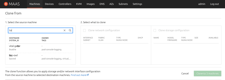

Once you select either the network, storage or both, MAAS will clone your source machine into your destination machines.
If there is a mismatch between boot methods, network interface, block device, or if the disk size of the source machine is smaller than the destination machine, the output will throw an error for those machines. A machine may have multiple errors after cloning, therefore, we grouped all machines with the same error together. When ‘show’ is click, it will filter the machines that are affected by the error.

LXD Cluster exploration in MAAS
In this iteration, we have been working on supporting the LXD cluster attributes in MAAS. In LXD, the concept of project is a given permission for a user to access resources from a LXD server or a group of LXD servers (LXD Cluster). Our goal is to allow people to register their projects in MAAS. If that project belongs to a LXD cluster, we will show all the LXD nodes that you have access to in that project. If it belongs to only 1 server, it should show a single LXD server that it has access to.
With this goal in mind, we have explored a few options in the UI to efficiently show that a project belongs to a cluster.

The first version we have explored is to revamp our current KVM listing table to show all the VM hosts that a project has access to.
We have also looked at an alternative option to make it look cleaner in case there are more than 1 VM host.

However, we’ve realised that the current way of showing this information is not very scalable. This is because a cluster can have up to 50 VM hosts, which is an edge case that can happen. This means that a user will be tired scrolling through pages to explore their options.
We’ve also thought about an alternative design that will allow us to show all the projects, yet list all the VM hosts in a way that is easier to digest.
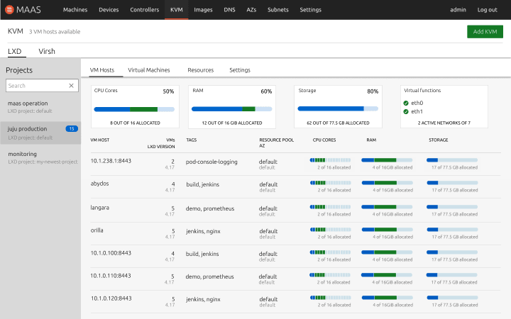
This alternative view requires you to select a project by default and you will have a listing view of all the VM hosts that you have access to with the aggregate resource information of a cluster.
These are not our final design. We are still looking at different alternatives that would be more efficient to show. Any feedback regarding our design or how you view LXD cluster from a MAAS perspective is more than welcome at this stage. Let us know what you think.
Moving forms in to the header dropdown
We’ve been trying to maintain consistency across all aspects of MAAS UI, and one part of that is making sure our forms have a consistent look and feel. To that end we’ve moved a few forms that had their own page, or section, into the header dropdown. This includes the “Add machine”, “Add chassis” and “Add KVM” forms. While it seems like this should have been an easy task, the reality was much trickier due to how coupled the header forms were to a model’s actions, e.g. machine actions like cloning, running tests or deploying. Well, they’re decoupled now so we have a lot more flexibility in what shows up in the header, which will also help in the inevitable transition to the new app layout.

Vanilla
The Vanilla team designs and maintains the design system and Vanilla framework library. They ensure a consistent style throughout web assets.
Checkbox alignment improvements
In this iteration, our guest developer Carlos has worked on a number of features and bugs. We aligned the ticker elements with help text, and fixed visual issues for long checkbox labels.

Accordions were missing a hover and were not properly aligned when checkboxes were used. This has been addressed in this iteration too.

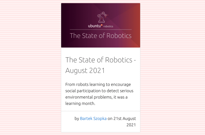
Cards updates
We updated our card pattern to allow content stretching from border to border while keeping the padding consistent when necessary.
Prototyping future of Vanilla design system site
As a part of a future vision of the Vanilla design system site we wanted to prototype the technical side of pulling the documentation from different sources.
We want the site to serve the design and UX related guidelines from Discourse, but keep the code related documentation with the code in the repository.
The prototype also explored wider layout with right hand side navigation and the possible structure of future component documentation.

Spacing refactoring
We have simplified the set of variables we use to control spacing. Among the changes:
- Removal of the distinction between inner and outer spacing
- Removal of the density multiplier
- We’re keeping the distinction between horizontal and vertical spacing, as it allows us to quickly see what values are used where
We were able to reduce the number of spacing variables from 20 to 10.
Since these changes require variable renames / deletions, it will be released as part of the upcoming 3.0 release, and we’ll include a detailed upgrade guide to ensure a seamless transition.
Marketplace
The Marketplace team works closely with the Store team to develop and maintain the Snap Store site and the upcoming Charmhub site.
Reviewer pages migration
As the migration from dashboard.snapcraft.io continues to snapcraft.io, we’ve been working on the Information Architecture of the reviewer pages and started to plan the coming UX work.

Brand store migration to React

As the work on the brand store continues, we’ve begun to migrate the application to React and Redux. The benefits of this are that it brings it inline with our other apps and allows us to easily share patterns across our products. This iteration was largely about setting up and structuring the application and we’ve also completely migrated the settings view.
Charmhub
K8s survey page
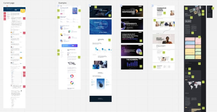
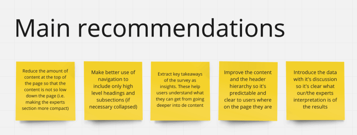
We have been reviewing the implementation of the “Kubernetes and cloud native operations report” page on juju.is in order to improve its performance and ensure that in future surveys we present this content in the best possible way. This review included an audit of the current page, a benchmarking, and a summary of takeaways for future designs.
Channel map
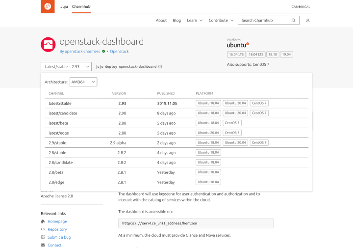
We have done some updates to the visualisation of the different release channels for a charm. The channel map now includes a drop down where users can select which architecture they want to get information about; and we also included more details about which OSs the charm is able to run on.
Workplace engineering
The Workplace Engineering team works with the Human Resources department. The team builds internal tools to make life easier for every employee at Canonical.
360 Historical views
Every six months we run a tool called 360 for every employee. It allows us to review the people that we work with and get feedback on how we stand in the company. This tool was built internally. This cycle we added the ability to see historical results and some visualisations showing the change in ratings.
With ♥ from Canonical web team.
Talk to us today
Interested in running Ubuntu in your organisation?
Newsletter signup
Related posts
From inspiration to impact: design students from Regent’s University London explore open design for their dissertation projects
Last year, we had the opportunity to speak at Regent’s UX Conference (Regent’s University London’s conference to showcase UX work by staff, students, and...
Showcasing open design in action: Loughborough University design students explore open source projects
Last year, we collaborated with two design student teams from Loughborough University in the UK. These students were challenged to work on open source project...
Design and Documentation clinics at FOSDEM Fringe 2026
FOSDEM is one of the biggest and most exciting open source events of the year, held at the Solbosch campus of the Université Libre de Bruxelles (Brussels),...
