Design and Web team summary – 10 April 2018
Anthony Dillon
on 10 April 2018
Tags: Design
MAAS squad
Homepage A/B test completes
The team ran an A/B test on two homepage designs. Based on Google analytics experiment data and Crazy egg scroll-map data for both A and B versions. The resulting winner was B. Which has now been made the permanent homepage.

MAAS Vanilla integration teething fixes
The MAAS squad have been hard at work fixing any teething problems, since the release of the latest Vanilla on MAAS. The main focus has been on the spacing and padding in tables, to stop columns from wrapping.
Snappy squad
Prometheus metrics for snapcraft.io
As traffic continues to increase on https://snapcraft.io, the snapcraft.io application now exports Prometheus metrics to help us understand the site’s traffic trends (see 50680 and 365bc).

These metrics can then be exported to a Grafana dashboard to give us live stats about the response time for snapcraft.io:

Market page improvements
Client-side validation has been added to the Market page. Which, helps to make invalid states more helpful. For example, a count of the characters you have gone over the character limit.

The apply changes button is only enabled when data has been changed. Also, there were a number of errors when saving data which have all been fixed.
The team have added an option to the page to allow charts to be shown publicly.
Maintenance
Refactored and tested the account section of the application.
Web squad
Download landing page
The designers in the web squad have been redesigning the download overview page on www.ubuntu.com. This page needs an overhaul for the upcoming 18.04 LTS release.
New insights homepage
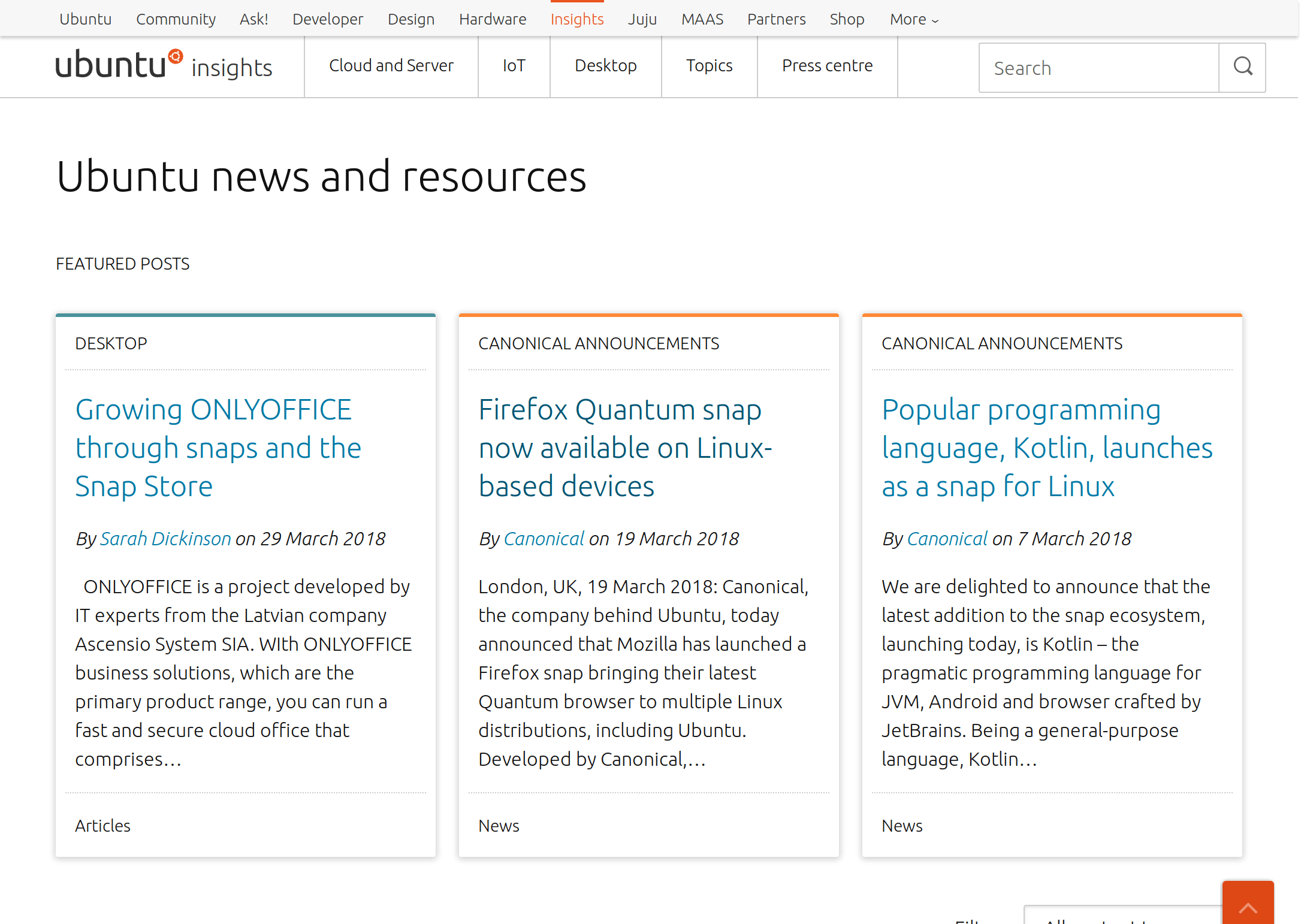
There has been a new design implemented for the insights blog. Which is currently undergoing an A/B test to measure its impact on usage.

New homepage banner for the China website
The web squad created a new homepage banner on the homepage of cn.ubuntu.com. This was to promote the new Ubuntu Core webinar.
Vanilla and base squad
Vanilla React components
The Vanilla squad continued to develop the final few Vanilla components. The two components worked on this iteration are:
These new components will soon be available in our implementation of Vanilla Framework using React.
Vanilla spacing rewrite
There has been a lot of focus on spacing and padding in this cycle for Vanilla. We have fundamentally rewritten the way in which Vanilla layouts its components. It’s a difficult problem to solve due to the number of combinations of components. This initial work has been completed and released as vanilla-framework@1.7.0-alpha-1.
We will be testing and fixing bugs over the next few iterations on the road to a full v1.7.0 release.
Update homepage of docs website
The team worked with the docs team to refresh the homepage of the company docs site. This now acts as a nice directory for documentation from all corners of Canonical.
Vanilla navigation redesign
One of the most complex components in Vanilla is the navigation. The team have researched and developed a new design. Some changes that were implemented was the removal of the divider lines between links and an updated to the selected and hover states.
![]()
![]()
Brand squad
Ubuntu desktop first use screen
The team have been working on a design for the Ubuntu desktop first use screen.
Documentation team
An issue with an out of date API document for MAAS led us to update and semi-automate the inclusion of code-generated API docs into. There were also some major edits of the text for the new subiquity installer and a long-awaited update to the Juju/OpenStack walkthrough.
Talk to us today
Interested in running Ubuntu in your organisation?
Newsletter signup
Related posts
From inspiration to impact: design students from Regent’s University London explore open design for their dissertation projects
Last year, we had the opportunity to speak at Regent’s UX Conference (Regent’s University London’s conference to showcase UX work by staff, students, and...
Showcasing open design in action: Loughborough University design students explore open source projects
Last year, we collaborated with two design student teams from Loughborough University in the UK. These students were challenged to work on open source project...
Design and Documentation clinics at FOSDEM Fringe 2026
FOSDEM is one of the biggest and most exciting open source events of the year, held at the Solbosch campus of the Université Libre de Bruxelles (Brussels),...
