App patterns applied: calculator key journeys
Canonical
on 7 March 2013
Tags: app design , app patterns applied , Apps , calculator , Design
A few weeks ago we introduced key screens for our core utility app designs, and we’ve been sketching key journeys ever since to unpack these concepts further.
We use key screens to communicate the overall, high level concept of an app, outlining key journeys is a design technique that gives us a feel for how users can accomplish a typical task when using the app.
Key screens
The main purpose of the calculator app is to enable calculations for simple day to day tasks; “rituals”; such as splitting the bill at a restaurant or working out your budget for groceries.
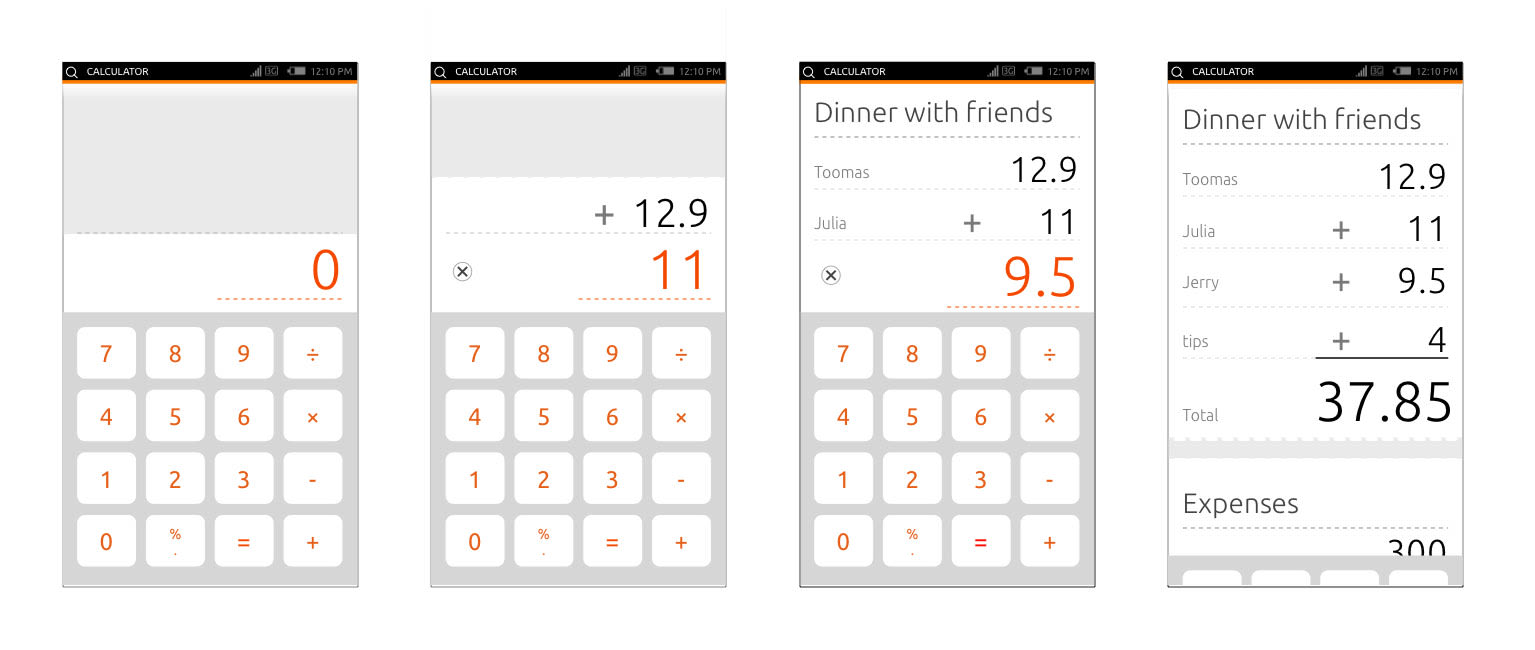
There were a lot of questions about the visual design of our concepts so far, so this week we thought we’d try sharing our key journeys in a different style of wireframe. Here is a closer look at the calculator app.
Enter a new calculation
There has been some interesting discussion on the mailing list about how to handle the order of operations (or ‘operation precedence’). The driver for this simple view is to support basic calculations. The order of operations will be handled as it normally is – with multiplication and division first, followed by addition and subtraction, without brackets ( ).
E.g., 1 + 2 x 4, will be read as 2 multiplied by 4, add 1, equals 9.

- A ‘0’ is displayed on start to indicate no calculation
- User enters ‘1’, a different colour (e.g., orange) is used to indicate the last input
- User enters ‘+’ and ‘2’, operators are displayed after a number input
- User enters ‘equals’ on the calculator numpad, and a dash separator line appears with the calculated answer and a line to indicate this calculation could be pulled up to create a new one.
Start a new calculation
We have also been brainstorming ways to create a new calculation. Our concept was originally inspired by the idea of a receipt tape, which we wanted to follow closely, and an idea that came through the mailing list was that of ‘ripping-off’ a calculation by pulling up; creating a new one (awesome idea, Bruno Girin, thanks!).
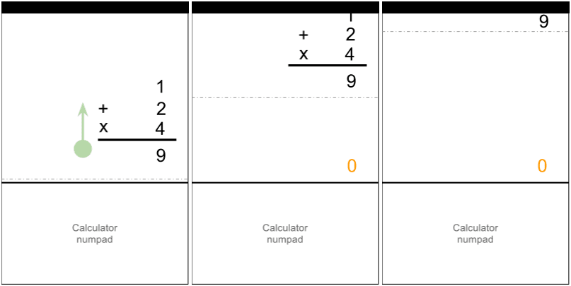
- User pulls up to create a new calculation, geo-location, date and time of the calculation will be added to the top of the calculation automatically (e.g., ‘@Tesco, 06/03/13, 10am)
- The previous calculation has moved to the top, remaining only as a visual hint.
View a calculation
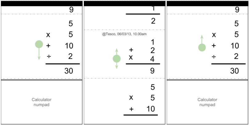
- The calculations are seen as a continuous list, user can scroll up and down the list freely
- As user starts to scroll down to view previous calculations, the calculator numpad transitions out. The numpad transitions back into view when user scrolls up and reaches a threshold of the last calculation
- An interesting note is that the QWERTY keyboard could appear at any time by tapping to edit labels. (This will be explained in the ‘Adding a label’ journey; keep reading).
Delete a calculation
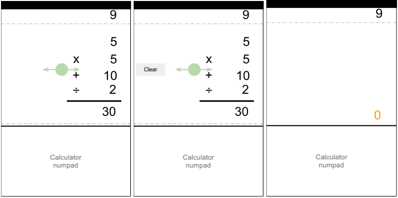
- To clear a calculation user swipes side way and a label (e.g, ‘clear’) transitions in
- If the cleared calculation is at the bottom of the list, a ‘0’ is displayed. If the cleared calculation is followed by another calculation, then that calculation will be displayed.
Add a label
We have included the ability to add titles and labels to the calculations to help us when we’re splitting bills or doing our grocery calculations!

- As mentioned above, geo-location, date and time of a calculation will be added automatically when a new calculation is created
- User taps to the left of a calculation to start creating and editing labels!
Numpad layout
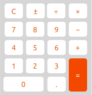
Also, there’s been a lot of discussion about the layout of the numpad! Based on our key journeys, here’s what we’re thinking to cover daily use scenarios:
As usual, sign up to the Ubuntu Phone mailing list and the IRC channel to discuss more.
Talk to us today
Interested in running Ubuntu in your organisation?
Newsletter signup
Related posts
From inspiration to impact: design students from Regent’s University London explore open design for their dissertation projects
Last year, we had the opportunity to speak at Regent’s UX Conference (Regent’s University London’s conference to showcase UX work by staff, students, and...
Showcasing open design in action: Loughborough University design students explore open source projects
Last year, we collaborated with two design student teams from Loughborough University in the UK. These students were challenged to work on open source project...
Design and Documentation clinics at FOSDEM Fringe 2026
FOSDEM is one of the biggest and most exciting open source events of the year, held at the Solbosch campus of the Université Libre de Bruxelles (Brussels),...
